Visual Journal Covers ~ Zentangles
Photo Credits & Artist Statements: Courtesy of Individual Artists ©2021 All Rights Reserved.
Photo Credits & Artist Statements: Courtesy of Individual Artists ©2021 All Rights Reserved.
|
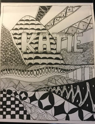
While creating this cover, I wanted to make the design resemble mountains and water with sun light rays. I switched between my thick and thin sharpies while working on the mountains to add some depth and contrast to it. I tried to make the sun rays as even as I could to make it seem balanced. I was inspired to make this resemble mountains because I have always enjoyed nature.
Artist: Katie Y. |
|
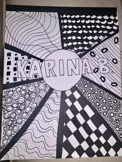
My visual journal has a variety of different and contrasting zentangle designs on it. It is representational, representing the sun. I made my journal represent the sun because I have always loved the sun and summertime. I incorporated many different elements of design in my piece, but my favorite one was shapes. There is almost too many shapes to count, but one place where you can clearly see them is on the middle left of my journal where there is numerous different sized squares. One principle of design I used was contrast. In every zentangle design I used, there was a contrast of colors, black and white.
Artist: Karina B. |
|
|
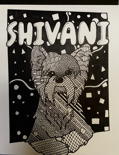
I chose the second option and made a representational zentangle of my puppy. I wanted the outline to be bold and clear so I used the thick sharpie to create the general shape of his body. Then I went inside and used a variety of different designs to express his energy and personality. I wanted him to be the main focus, so the background is intentionally a little plain to center the focus on the subject. To make it, I used references and had to redraw it several times before I got a nice clean shape without too much texture that would make the zentangle difficult to see. I used the line and shape elements of art and the pattern and rhythm principals of design.
Artist: Shivani B. |
|
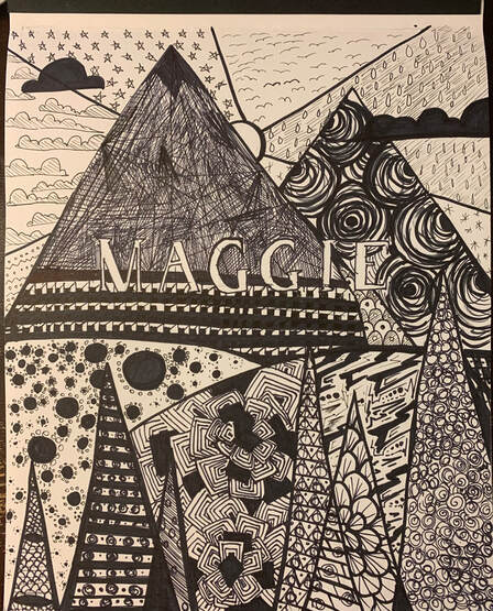
My cover is a scene with two mountain, some foothills, and some trees. While creating this, I first used thick sharpie to create sections and later filled each section with a different pattern. In the sky I drew patterns made of clouds, stars, etc; on the mountains I drew rocky patterns; on the hills I drew floral patterns (one of them resembling the COVID-19 virus).One principle of design I used was emphasis. On my cover, I used a dense pattern on the left mountain to emphasize it. One Element of Art I used was value. On the leftmost mountain, I drew intersecting lines, denser in some parts (becoming the dark values - shadows), looser in others (becoming the light values - highlights).
Artist: Maggie Z. |
|
|
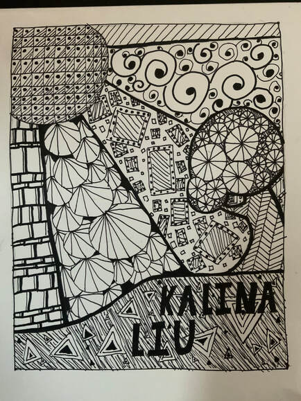
My notebook background is a bright sun shining on a small hill with a tree. I chose this because it is a relaxing scene, and for each section I tried to mix and blend the amount of white and black for contrast. The designs in each section are related to what it looks like realistically, the circle patterns on the the tree represent the fruit, the lines on the bark seem like the bark texture. this is my Zentangle.
Artist: Kalina L. |
|
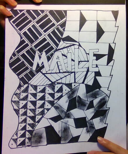
For these, I used inspiration from patterns that I look for online, then I took my own twist on it, and here it is!
Artist: Maile T. |
|
|
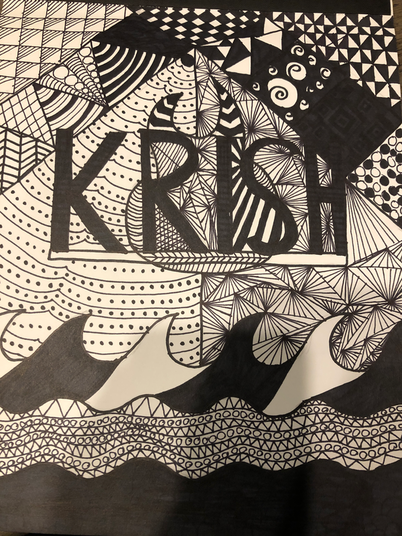
One thing I would want viewers to know is that this piece is entirely made of sections. The section in the middle is only straight lines, while the section at the top is a checkered pattern. 1 element of art I used was line. I used 2 different types of pens to make this piece. One was a thick sharpie which I used to fill things in, and the other was a thin sharpie which I used to add details. 1 principle of Design that I used was pattern. The entire piece is made of patterns from the wave pattern, to the triangle pattern.
Artist: Krish G. |
|
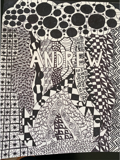
In this Zentangle Drawing, the artist is drawing about weather extremes, such as heavy rainfall and wildfires. Most of these designs were inspired from mistakes during the drawing stage. 1 Element of Art in this drawing was shape. There are many shapes of different sizes. 1 Principle of Design in this drawing is pattern. There are many repeating patterns in the art piece.
Artist: Andrew G. |
|
|
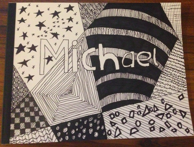
My visual journal has a variety of different and contrasting zentangle designs on it. It is representational, representing the sun. I made my journal represent the sun because I have always loved the sun and summertime. I incorporated many different elements of design in my piece, but my favorite one was shapes. There is almost too many shapes to count, but one place where you can clearly see them is on the middle left of my journal where there is numerous different sized squares. One principle of design I used was contrast. In every zentangle design I used, there was a contrast of colors, black and white.
Artist: Michael D. |
|
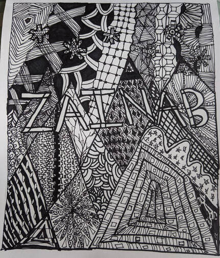
When I was creating this design I was inspired by mountains. So I drew mountains and i drew couple snowflakes on top to represent that there is snow on the mountains. One element of art is shape, because there are so many different types of shapes and sizes in this piece of artwork. One principle of design I used was pattern, because in the different "sections" there are different patterns. First I drew a border and wrote my name in the middle and then drew overlapping mountains on the bottom and on the top I drew couple snowflakes coming down. To fill up the gaps on the top part, I drew some squiggly lines. Then I filled each part with a different pattern.
Artist: Zainab K. |
|
|
In this work, one of the main elements of art I used was shape. All around the cover you see a variety of shapes from squares, to triangles, to circles. This variety makes the piece more interesting to look at than if it was simply covered with one shape. While I was in the process of creating this, I did not intend for it to be representational. What I realized soon after I started, though, was that whatever I drew took somewhat of a reference from the real world. What I might have meant to simply look like a pattern of squares turned out looking like a brick wall, and what I meant to look like a triangle pattern ended up looking like a mountain range. Our brains are trained to look for things that they recognize, making a piece like my own seem more representational than not.
Artist: Myrto K. |
|
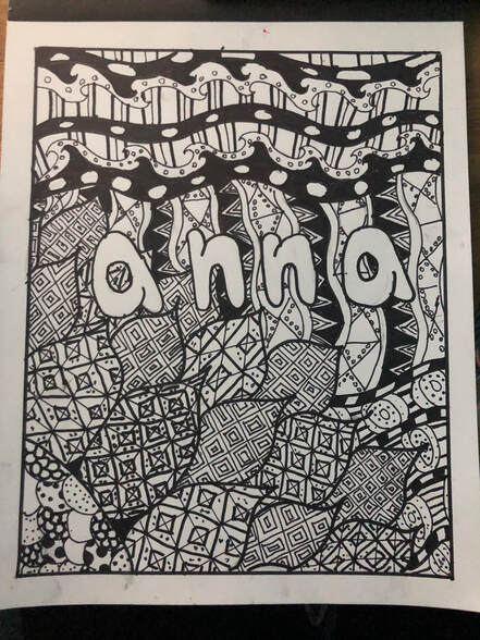
I made a representational zentangle. The background of my cover is supposed to represent a flower and the sky. I drew the cover with both thin and thick sharpies. One element of art I used was lines, the different thickness of sharpies helped create different kinds of lines.
Artist: Anna L. |
|
|
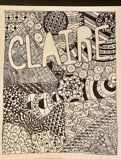
Designing the cover of my sketchbook in a way so that it incorporated Zentangles into the design, had its ups, downs, and components that contributed to the outcome. A component or "Element of Art" included in this artwork is shape. I used shape in my design when I broke my cover into separate pieces that would, overtime, contain the Zentangles. Another component, which could also be referred to as a "Principle of Design", that I used in my art was pattern. Pattern was used in this artwork when I drew in the Zentangles, the Zentangles themselves were patterns! The Zentangles were repeated designs consisting of shapes and lines which built up complexity, and for each pattern made, filled a different shape/space on the page. This project had its downs, like when you had to REALLY think so you could come up with another Zentangle design. It also had its ups, like how it put your mind at ease and relaxed you as you let the Zentangle designs flow onto the cover. In retrospect this project taught me how to build complexity off of the simplest of shapes or lines, it also taught me to work WITH my mistakes, and not against them. The process of designing the cover began with breaking the page up into various shapes, which, were later outlined with sharpie. Next, I wrote my name in bold, thick letters, which would also be outlined with sharpie. After that, I began the process of filling in shapes with Zentangle designs. I would fill each space/shape with a different design consisting of shapes and lines. After filling the entire cover with Zentangles I was able to view the final product of my work... My newly-designed sketchbook cover.
Artist: Claire K. |
|
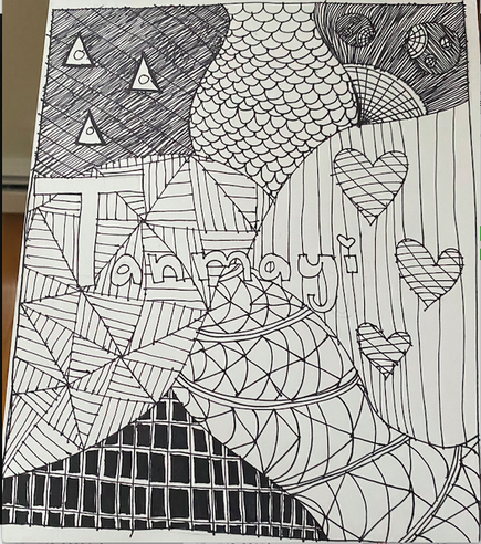
In my artwork I have separated the cover with lines and used different designs to fill in the empty space. I have used a repetition of square's and lines in my art and have added more design into my artwork.One Element of Art and one Principle of Design is that I used shapes and patterns in my artwork.
Artist: Tanmayi K. |
|
|
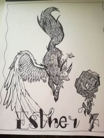
This piece of art was made with paper and two widths of sharpies. Texture is an element of art that can be found in this piece. line weight, value, and form were all present in creating the illusion that the fox's tail is increasingly fluffy, and the fox's wing becomes increasingly feathery. Movement (principle of design) is seen through the desperate flapping of the fox wing, and the wind through the falling of the fox itself, with the tail trailing slowly behind. To give substance to the animal, I used a slightly repetitive pattern of a jumble of flowers, grass, leaves, and lines to represent the nature that makes up the fox.
Artist: Esther M. |
|
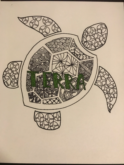
I drew a sea turtle since there shells are pretty and interesting. On this piece I split the shell up and put a unique Zentangle on each section. My principle of design is rhythm, since in Zentangling you repeat tons of lines and shapes. My element of art was space. Putting less space between lines/shapes forms depth and shadows.
Artist: Ridhi S. |
|
|
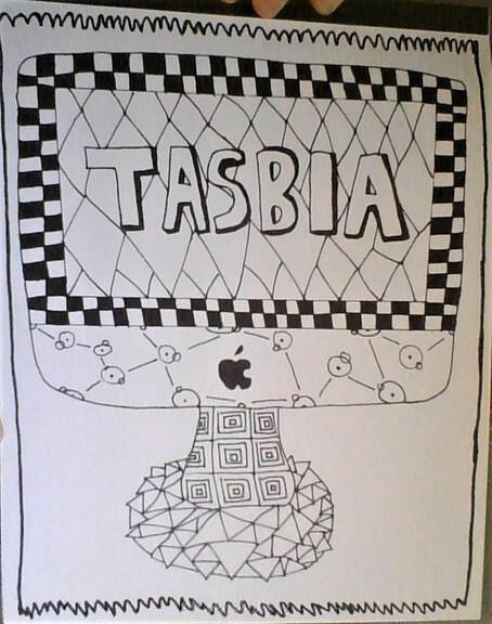
I want people who look at this to understand how much technology played a role in the pandemic. It was key for safe interactions involving everything social and helped keep everyone together during pressing times. Even if everyone would rather see their friends in person, they should still appreciate what they have. An element of art I used was shape, as you can see with all the circles, triangles, and rhombuses. Some principles of design I used were contrast and pattern with only using black and white and all the repeating patterns that are a part of zentangles. My process of creating the artwork was knowing that I wanted to do something related to the times we're going through right now and deciding on a computer. I kept the outline I drew of the computer and used patterns to fill the space in.
Artist: Tasbia U. |
|
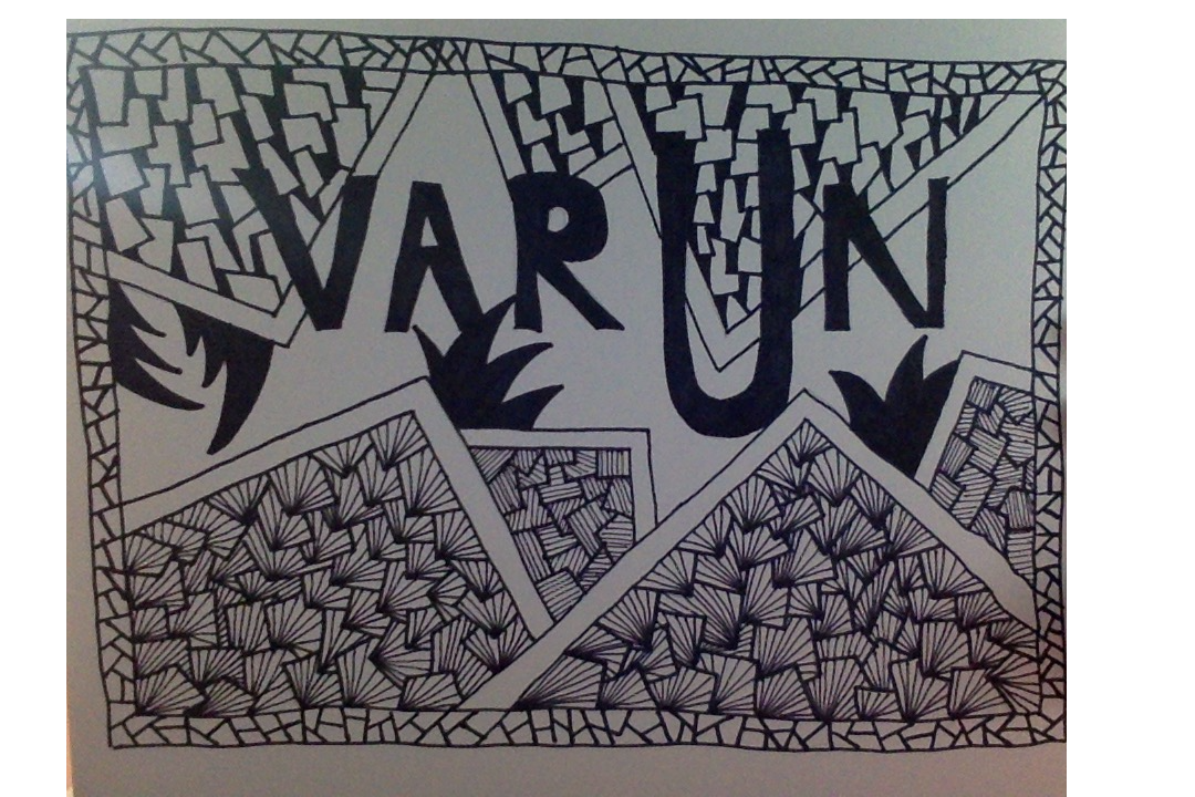
Artist: Varun K.
|
|
|
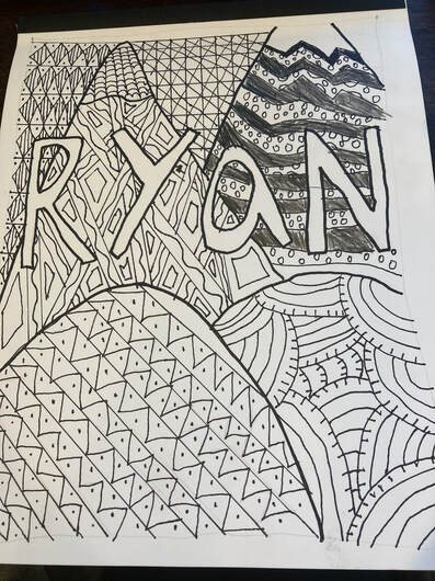
As the outline of the drawing, I decided to do a mountains landscape with some small hills too. For the left hill, I made parallel lines that go from top to bottom and left to right. With it, I also added zigzag lines inside the parallel lines with dots. On the right hill, I thought it would be cool to make a wave design. For the mountain on the right, I made a stripe pattern with zigzag lines. on the other Mountain, I outlined these poles coming in from all directions and had squigly lines in it. In between the mountains, I made a checker pattern with diagonal lines intersecting the corners. To the left of the mountains, I was thinking of some rhombuses with dots, and lines going between each row.
Artist: Ryan L. |
|
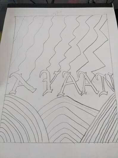
My cover uses different patterns in the same way, that all point somewhat toward my name. My name is drawn with a special font that I like and decided to use. The design does not take up the whole page, rather it is inside a box, in order to ensure that I did not confuse myself with the proportions of my designs. For the bottom three designs, I started with a curved design on the left, and a straight line version of the same design on the right. For the middle design on the bottom, I decided that it would combine both other designs to have it half curved and half straight. The top design is based on lighting of varying levels, going from right to left, the design gets progressively stronger and it is meant to look like it is striking my name.
Artist: Ayaan G. |
|
|
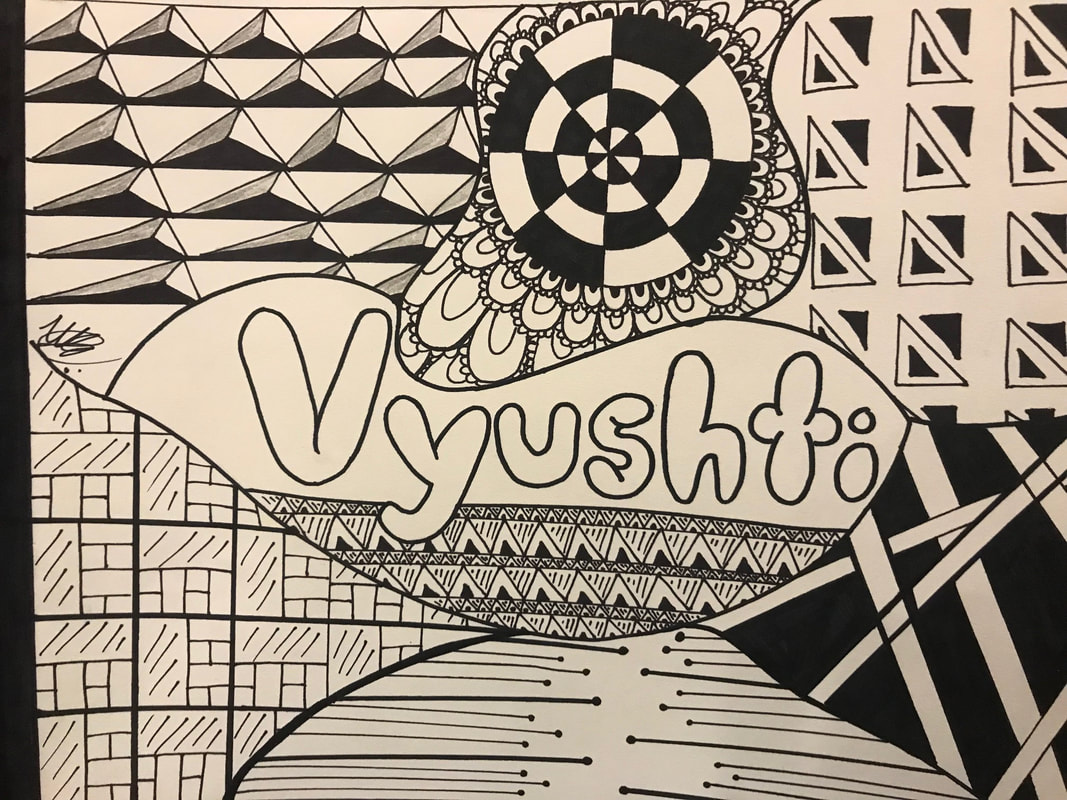
Colors can show feelings. But black and white show emotions, emotions are more detailed, more understandable, my piece shows a tripe of emotions. My lines are straight yet not perfect my curves so symmetrical. My patterns are eye popping. Using thin and thick lines my piece is eye catching.
Artist: Vyushti K. |
|
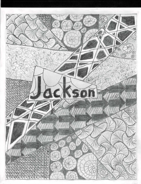
All parts of the zen tangle wer kind of a part of me. The shell looking pattern represents my love for the sea and swimming, the grey and black arrows represent the things can go both ways like kindness and love. because I kept smudging everything with my hands I decided to not try to erase it but to use the smudges as color instead, nearly everywhere where I wanted it to be white I smudged instead I also made some parts of the smudged areas darker in places and others brighter.
Artist: Jackson C. |
|
|
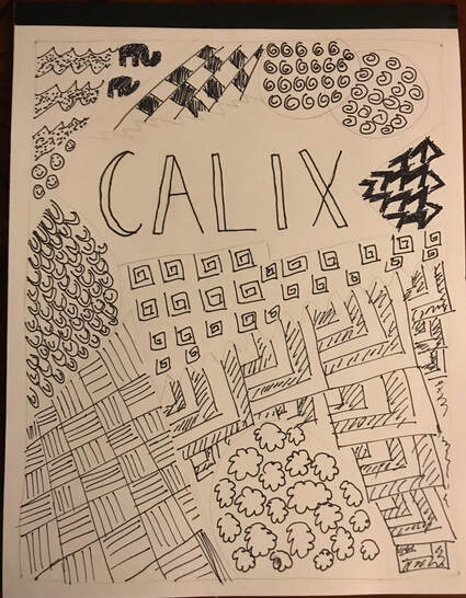
When I created this, I just drew whatever shapes came to my mind. I also looked at some patterns for inspiration. When I ran out of ideas, I started using representational subject matter. One element of art that I used was shape because I drew lots of them. A principle of design that I used is pattern because zentangles are patterns.
Artist: Calix H. |
|
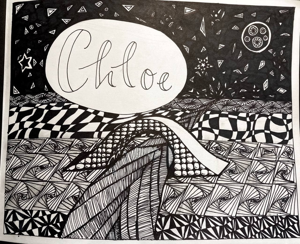
When starting out, I imagined one of those old mossy bridges over a small river. I drew a sketch of a river, then the horizon, and finally, the bridge. Then I outlined everything and started designing my zentangles. One of the Elements of Art I used (and the one that stands out the most) was value. I used this to make different parts of the zentangle darker than other parts, such as the sky, which is filled in, and the stars in order to make the stars visible in the dark background. I also used pattern, a principle of design, everywhere, which I guess is required when making zentangles.
Artist: Chloe W. |
|
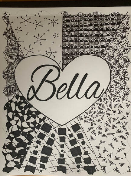
|
Artist: Bella Y.
|
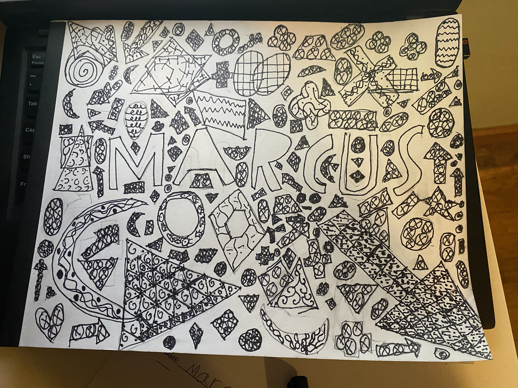
|
I would like them to notice how much effort and thought I put into my art work.Also that I tried make cool things out of overlapping shapes. One element of art I used was shape because on my cover I made different shapes in different sizes. One principal of design that I used was rhythm I used rhythm because I repeated certain sizes more than other sizes. My process of creating my artwork was finding some cool shapes that I might want to draw on my cover.
Artist: Marcus K. |
|
|
For my Zentangle art, I decided to make it abstract, so it is not meant to depict anything. A key element of art I used is shape. A key principle of design I used is pattern. I started my Zentangles from the bottom of the cover and made my way up, filling the areas with different and unique designs. I used fine and thick tipped black markers for my art.
Artist: Parnika M. |
|
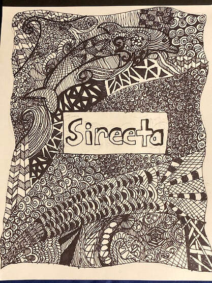
Hi Viewers!! This is a piece of art that I created to help people realize the beauty of the water. I also wanted it to have a sense of freedom and going with the flow. As you can see at the top there is a dolphin and some waves. That is the water, and the representational part of my cover. The 3 spaces closer to the bottom are all the free flowing parts because I didn't think abut what I wanted to draw in that area, I just drew what I felt at that time. I feel like I incorporated the elements of shape and line into this cover. I also feel like I incorporated the principles of Rhythm and Some of the principle of Unity into my piece of art. I hope you enjoy this piece of art as much as I do!
Artist: Sireeta B. |
|
|
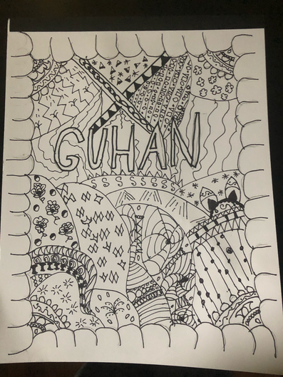
In this Zentangle, I drew many components of Nature to showcase the beauty. I drew things such as rain, clouds, the sun, animals, flowers and more. The elements of art I used were line and shape. The principles of design I used were rhythm and pattern. I also drew a circle border on the sides.
Artist: Guhan Y. |
|
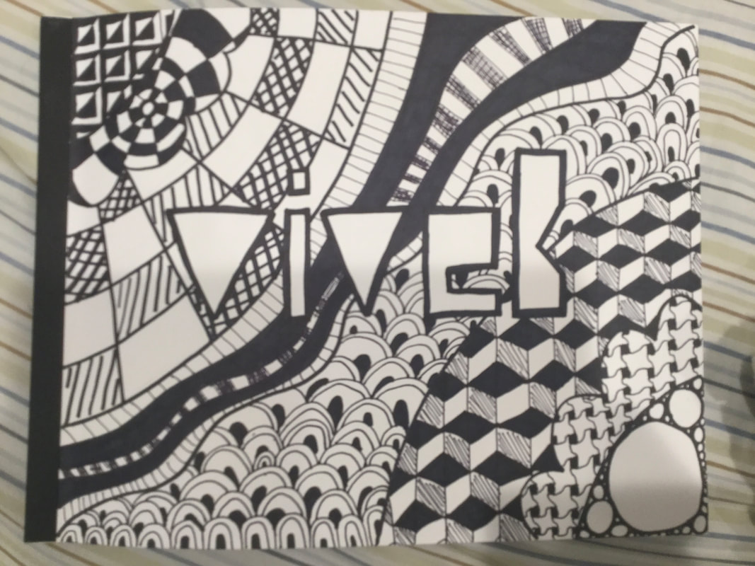
This piece is a notebook that has been decorated with Zen-tangles. This artwork was created by using sharpies, pencils, and shading. One Element of Art in this piece is "Value" because there is a variety of light and dark in this piece. Some areas are completely dark and some are completely light. There are also stuff in between as well. One Principle of Design I used in this piece is "Pattern" because the whole theme of Zen-tangling is the use of patterns and repeated shapes and designs. This piece is no exception with 8 different patterns around the piece. I made this by first creating a custom font for my name and then adding sections and filling them up with Zen-tangles.
Artist: Vivek M. |
|
|
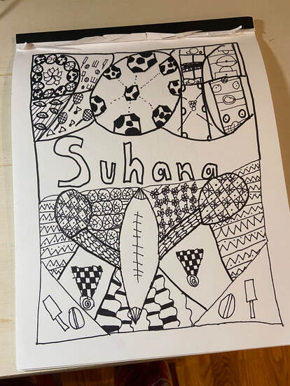
The first thing that I would want viewers to know is that I combined art with sports in a unique way together. One element of art I did was shapes. I used many different types of shapes, some which were actually shapes and some which I made drew by myself. This shows that my art work was unique because I used my creativity to design all the shapes in my art. One principle of Design that I used was pattern. I made so many different types of patterns all over my art work. Some patterns were simple and some were really complex, but I still had really fun with experimenting all the different types of patterns I can do and explore. The process of creating my artwork wasn't that difficult because all you had to do was think of a topic and focus on it which leads to so many designs and shapes and patterns you can do within that topic.
Artist: Suhana N. |
|
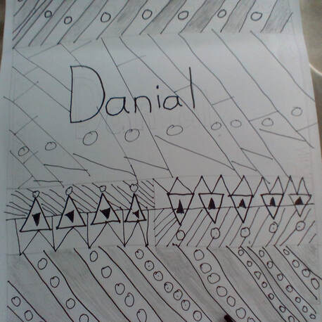
This artwork utilizes many elements of art. It firstly utilizes lines, through there us no color other than black and white. The lines originate different shapes. These shapes are used to try to mimic a texture. The artwork also uses principles of design, mostly irignating from pattern. In thiscontinous Zentangling, it is prominent that patterning will consist of majority of the principles of design.
Artist: Danial N. |
|
|
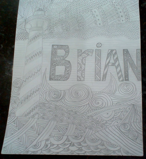
My cover represents my favorite place to go Maine. I chose the ocean because I love the salty smell and the fond memories I have of going to it. Swimming is also a big part of me because I swim for a swim team. I chose to put the light house because it is the most popular place to visit and also because light houses serve as warning for ships. Finally, I put a symbol of my favorite sport. I used a principle of design for the waves as they are abstract. My element of art is that it was that it was a very smooth cover.
Artist: Brian P. |
|
My art is showing how there is more bright times than less. The darker pars show how we can feel, but the lighter times show how we can be both! 1 element of art I used was space! I gave the lines I drew a lot of space to show anything can go through us! ! principle of design I used was balance! Balance was shown to say how we need to try to keep a balance in life.
Artist: Kenisha R. |
|
|
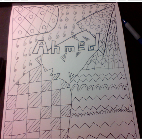
The top left is like the sun. the middle is like a tree falling which then the zig zags are grass.
Artist: Ahmed R. |
|
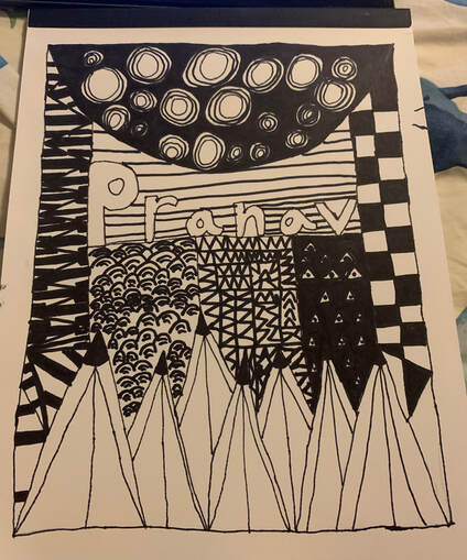
One Element of Art that I used in my Zentangle cover, was line. I used lines throughout the cover, as I tried to make both complex and simple patterns.Talking about patterns, a Principle of Design I used, was pattern. Most of my designs that I created had patterns in them, so it is a significant part of my cover. How I created my artwork was by sketching simple designs and slowly adding onto it, making it more complex over time.
Artist: Pranav S. |
|
|
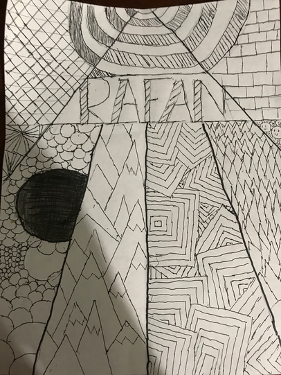
This art piece displays a complex mix of lines and shapes. It features a mixture of line drawings and zentangles, and has a grey, monotone color palette. The artwork is divided into multiple sections, each one containing a diverse variety of patterns. The artwork breathes with my name at the center of it all. All of this happens while keeping a more playful and abstract undertone.
Artist: Rafan S. |
|
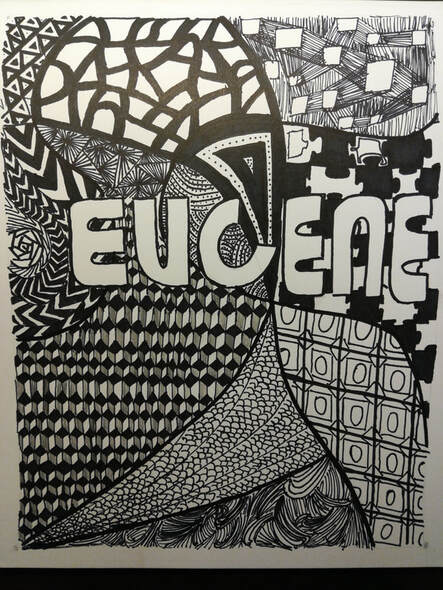
This zentangle, while not meant to represent any specific real life phenomena, uses many designs and patterns to create contrast and coordination. The piece itself includes many elements of art and principles of design. For example, its portrayal of contrast, as in contrast of light and dark coloring. Now the zentangle does not actually have different brightnesses in its color, however, there are areas with more black or white which cause that general region to feel more or less bright/dark than others. As for elements of art, there are many places where you can see an assortment of different shapes. The triangles on the top left and the group of other shapes pact together beside them are two examples where different shapes are used together to add more to the image as a whole.
ArtistL Eugene W. |
|
|
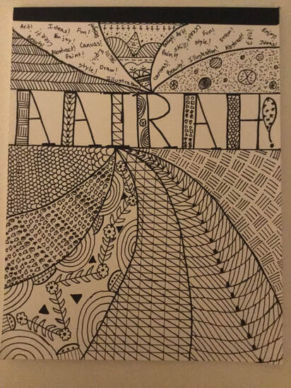
To make the piece of artwork I first drew a big rectangle near the top of the paper. Next I started writing my name along with the exclamation mark in the big rectangle. After that I drew a spiral design at both beneath, and above the rectangle. After I got my base down I bolding everything with a Sharpe. In every section of the spiral I drew a different a Zentangle patter, hatches, scales, shapes etc. After the bottom spiral was complete I drew some patters in the bold part of my name. Finally I drew some patterns at the top spiral above my name. An element of art that I used was lines, when I drew different curved lines for scales and straight lines for hatches. And a principal of design that used was patterns, I used this throughout my piece of work during my shape pattern, hatches pattern, and more!
Artist: Aairah A. |
|
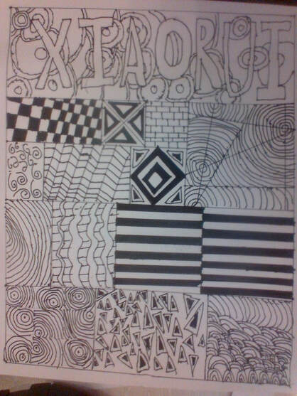
In this artwork, I first used my pensil to make a grid for my work. Then I started zentangling using my pensil, and finally I used the pen to trace on the pensil. I used a lot of lines to completely my work. I used many patterns. In fact, everything I draw is a pattern. If this were to be displayed for public view, i would want the viewers to know that this is definitely one of my best work, and that I am very proud of it.
Artist: Xiaorui H. |
|
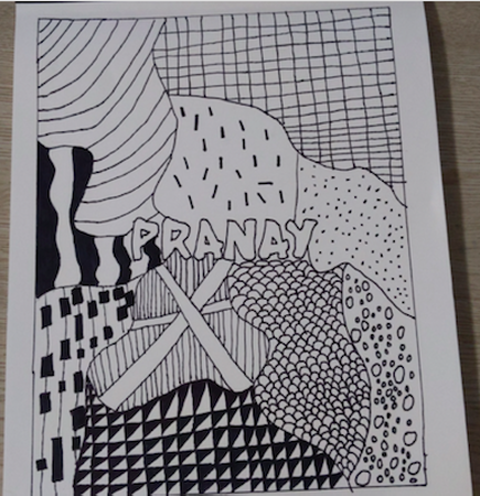
|
Artist: Pranay K.
|
|
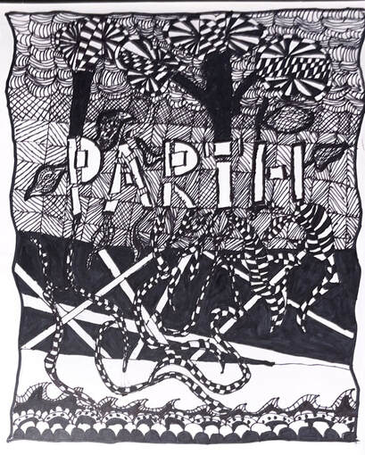
Based on the growing nature this piece of art is the perfect cover for any sketchbook. Using lines in a new unique way. The black perfectly contrasted with the white. Giving a new perspective for zentangle patterns. Each root and tree is unique with its repeating patterns.
Artist: Parth K. |
|
|
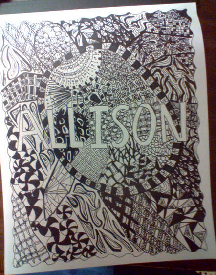
My artwork is supposed to be a sea turtle swimming in the ocean. I used different zentangle patterns for different spots on the shell or waves in the ocean. One Element of Art I used was shape. I drew the sea turtle with specific shapes that make it look like a turtle. For example, I had to make the parts of the shells the right shapes, and I had to make the head the right shape. One Principle of Design I used in my artwork was contrast. There is contrast between the letters that spell my name and the rest of the art, because the letters are left blank and not zentangled or colored in. This makes them stand out from the rest of the cover. I made this artwork by first sketching a border and my name in big, blank, letters, and also sketching out the shape and size of the sea turtle. Then, I outlined all my sketches in sharpie, and started zentangling. I filled the whole cover with zentangles.
Artist: Allison Y. |
|
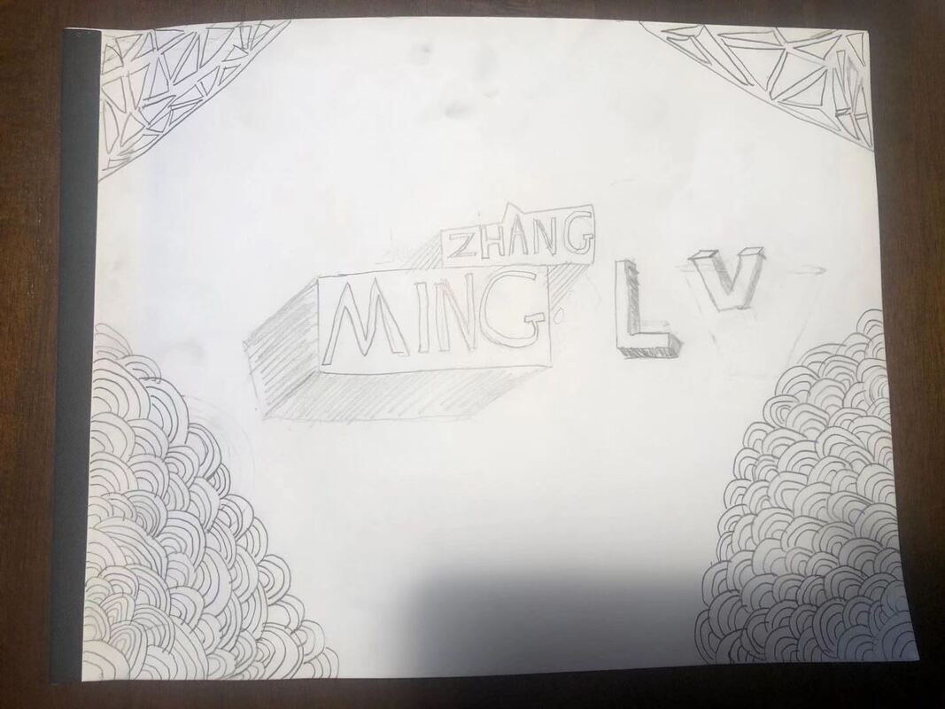
Artist: Zhangming L.
|
|
|
In the piece that I have drawn I showed one element of art and 1 principle of design. For the element of art I used shape to take up the space of the drawing and to contain certain patterns. I used many different shapes in my drawing including, triangles, squares, rectangles, circles etc. For the principle of design I used the concept of patterns inside the shapes that I had used so that I could emphasize the shape more. I had also done this to create a kind of oddness to my piece.
Artist: Nikhil V. |
|
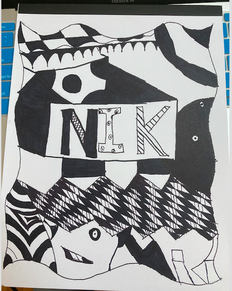
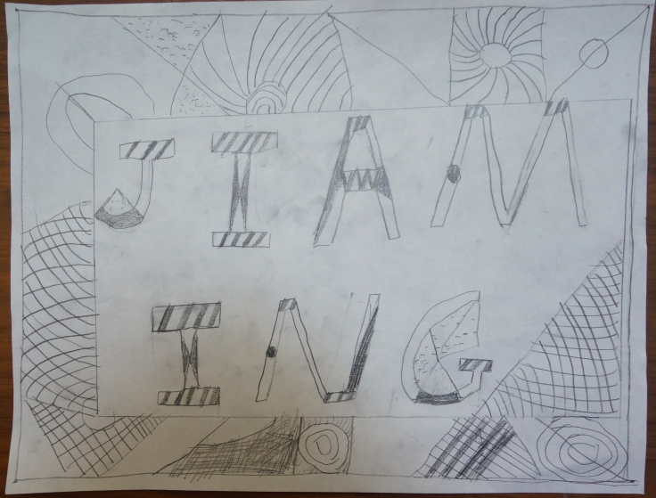
My name is written in bold, uppercase, and there are triangles, squares, and circles on the side to make the side look less empty.
Artist: Jiaming X. |
|
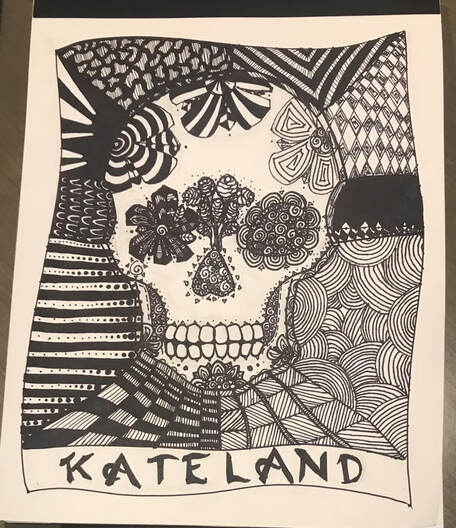
|
One element of art I used was shape. The most noticeable shape is the skull in the center of the art piece. A principle of design I used was emphasis. I used emphasis in this piece to draw attention to the skull by leaving some areas uncovered by zentangles so that it stands out more. To create this, I first sketched a skull, then I did the lineart with sharpie, and after that, I filled most of it with zentangles.
Artist: Kateland Z. |
|
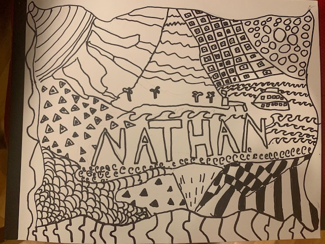
When people see my zentangle I wish that they know that the theme of the zentangle is traveling. The top part is like a island with a volcano that never erupted for a long time so people would go to the island for fun. The bottom drawing is the Victoria Falls .The Elemental of art that I used was lines. The element of design I used is rhythm.
Artist: Nathan O. |
|
|
When people look at my artwork, I want them to realize that I put design in every area. I also made this picture look like a waterfall scenery. I try to balance my artwork with different designs at every split. I want this picture to remind people that their is happiness all over the world. Also that people can see things in different shapes or sizes. Sometimes I even thought that this picture could be a picture of a farm because of how the design mixes it up!
Artist: Saifan I. |
|
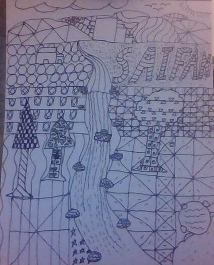
I think my artwork is using lines and dots. Those lines and dots is to present nature, there are also snowflakes. I used the swirl lines to present the ocean. Triangle to present mountain. The circle thing in the middle is earth, and the dots around it are stars and planets.
Artist: Yi-shiuan L. |
|
|
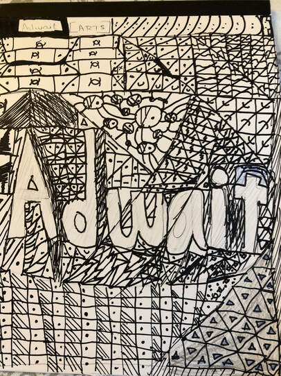
I during this cover put a lot of different patters. These patterns consist of faces shapes including squares triangles and circles with more shapes inside them. I did not intend for this to have some sort of inside meaning. I tried to put shapes around and a little in the shape of my name.
Artist: Adwait P. |
|
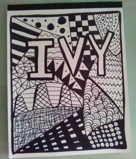
If my artwork was hanging in a gallery, I'd want people to notice all the different sections and patterns. In each section of the page there's a different design, but they all share one similar trait. They're all some sort of pattern. This kind of represents people. We're all different, but at the end of the day, we're all human. Maybe it's not that deep, but I would love for the people looking at my artwork to realize that. 1 element of art: Shapes. 1 principle of design: Pattern. The process of creating my artwork is pretty simple. I first outlined the boarder, then drew my name in blocky letters (with pencil). Then, I took my sharpie and outlined it. Next I separated the cover into multiple sections, drawing a different design in each. Now I'm done!
Artist: Ivy Q. |
|
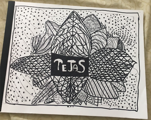
|
Artist: Tejas T.
|
|
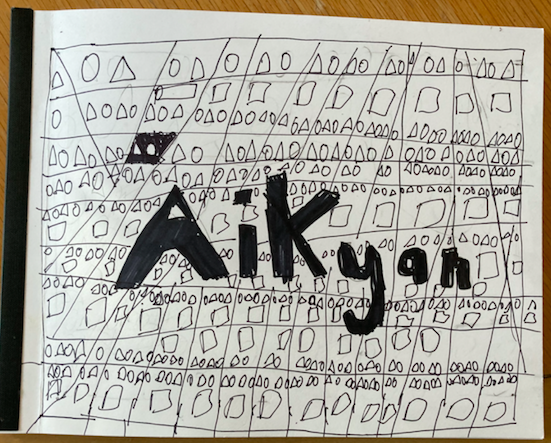
I put my name in Bold letters. I put different types of shapes around my name. I put lines to make it look like a pattern. I put circles, squares, rectangles and triangles. in the different spots. I put line as my element of art and pattern as my principle of design.
Artist: Aikyan V. |
|
|
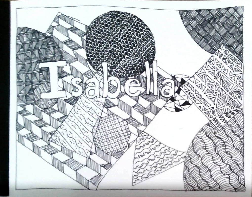
In this piece I really liked the look of non-representational art so I chose to do this in my zentangle design. I also experimented with having some shapes be "translucent" so they would overlap and create a different zentangle then the two original shapes, and some shapes would be "opaque", so the shapes wouldn't overlap and divide, they would just not change at all. And I chose to do that because I've seen that a lot with art but it would only be with solid colors so I thought it might be fun to try with zentangles. For example two shapes overlapped and they both had very straight lines, so the overlapping shape had wavy lines and dots. And one element of art I used was shape because I chose to do a non-representational zentangle so there are lots of different shapes. There are even triangles, within triangles, within a square, and trapezoids within circles. And one principle or design I used was patterns, because there are planned repeated shapes and lines.
Artist: Isabella W. |
|
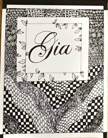
Artist: Gia C.
|
|
|
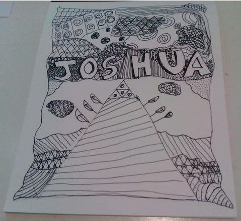
I first started with making my name, then I started to divide it. I drew the border then I started to zentangle. I think the best point to focus on is in the middle of the paper, looking at my name. An element of art I used is shape, my piece was filled with a bunch of different shapes. A principle of desing I used is emphasis, I tried to make my name stand out by leaving the space in it blank.
Artist: Joshua K. |
|
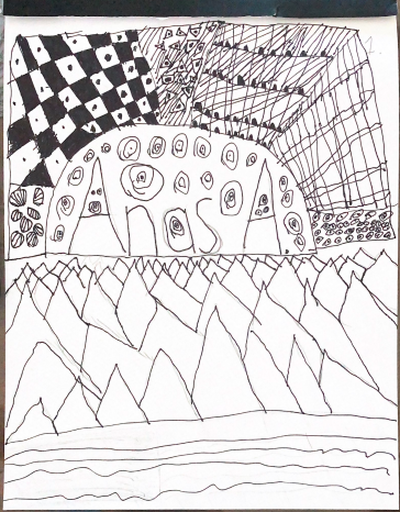
Artist: Anas A.
|
|
|
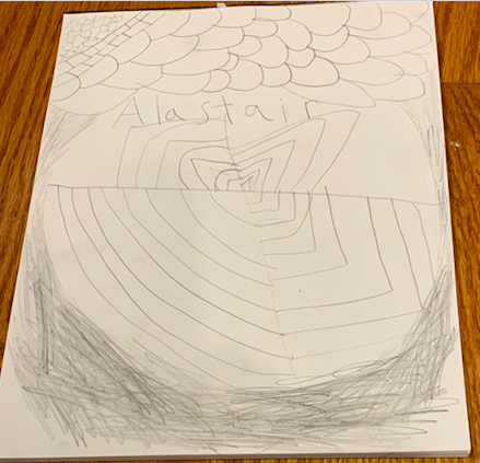
Artist: Alastair J.
|
|
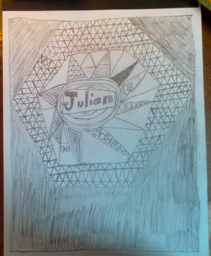
This piece is made up of many triangular formations, as a hexagon. It resembles a Pokemon called Meltan, which has a hex nut for a head. There are references to 2 popular Nintendo franchises in the piece. Each of the central triangles jutting out from the middle has a different pattern, almost like a multi-colored/themed flower.
Artist: Julian H. |
|
|
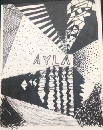
My art was all done in one day, I did it that way to make it more organized but spontaneous at the same time. What I mean is that its all the same kind of drawing and the same style, but with no planning In mind. I like this art a lot because a lot of it is mistakes that i turned into other art. This was a super fun project because I put a lot of thought into it and it took me a lot of time.
Artist: Ayla M. |
|
An element of art that I used was shapes. When I started my work, I thought about making two things colliding with each other. I worked on it and I realized that it would work better if they are just emerging from the sides.
Artist: Pano K. |
|
|
As you can see, I altered from top to bottom of the pattern on how its different as the bottom has a hill style and the top has a square style that is like a checkerboard. The value was just black and white from the sharpie.
Artist: Snehal B. |
Photo Credits & Artist Statements: Courtesy of Individual Artists ©2021 All Rights Reserved