May 14, 2020
Photo Credits & Artist Statements: Courtesy of Individual Artists ©2020 All Rights Reserved.
Photo Credits & Artist Statements: Courtesy of Individual Artists ©2020 All Rights Reserved.
|
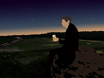
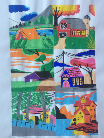
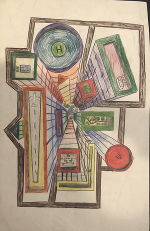
Lines are a tangible stretch of ink. However, they are also the edge of a silhouette. This piece, with the exception of the car lights and sky, uses only flat colors to simplify a composition of multiple photos, with lines being the only detail between these colors. The main focus is me, holding an Apricot La Croix. I am silently viewing scenes of the world that I appreciate most - the night, stars, landscapes, long exposure photography (in the form of the freeway’s light trails), the twilight of the horizon, and La Croix. This piece’s overall exposure is low, which encourages viewers to consume it in a dark room where a more fitting feeling can be evoked by it.
Artist: Calvin P. |
|
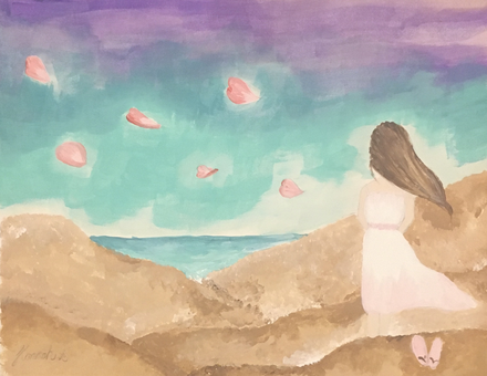
As we fix our gaze ahead in life, there lies a mysterious sea of opportunities, possible mistakes, and challenges to face. When looking back, there’s sure to be accomplishments we’re proud of, memorable moments, and regrets wanted to be forgotten, or given a second chance. Of course, turning back time for a “re-do” is simply impossible. However, just as the ocean breeze never continues stopping, just as time remains an ever-moving existence, we must proceed in our lives and focus forward. The sakura blossom petals carried by the ocean breeze symbolizes a time of renewal, a time to move on from past regrets and give it your all in the present with a new lesson learned. I often find myself unconsciously drowning in thoughts of “why did I do that?” or “if I only did…”; I believe an important, underestimated form of self-care is to examine previous remorse, add into your book of life-lessons another gained wisdom, and tackle present challenges knowing you are growing into a stronger individual than before.
Artist: Hannah S. |
|
|
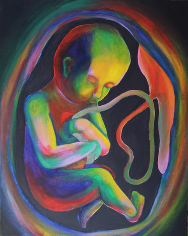
I chose to create a painting that relates to the themes from Assignment #1. On a thick piece of wood, I created a colorful and mature baby in the womb, representing new life to come soon. Right now most of us are safe at home, but little by little our city is opening back up. I think everyone’s life will be different after coronavirus due to both personal and societal factors. On a personal level, many people have acquired new hobbies, done things they haven’t had time to do, or became more appreciative of everyday things we used to take for granted. I also wonder if society will be different after this, and if so, how it will be different. I believe that this new life is coming soon, as shown by the maturity of the baby’s facial features and body.
Artist: Kalista V. |
|
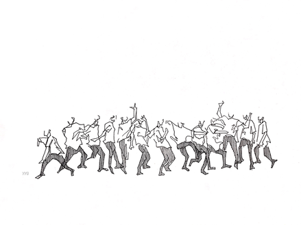
This is my exploration of "lines," one of the most basic element of art. The drawing is only consisted of lines, varied in length and shape. Simple lines captured the main character's movement in an abstract manner. The upper body of each position is composed of only one continuous long line, leaving the viewers with spaces for imagination yet also illustrating the basic structure. I wanted to showcase the power of lines, which, by only itself, can tell stories.
Artist: Eecho Y. |
|
|
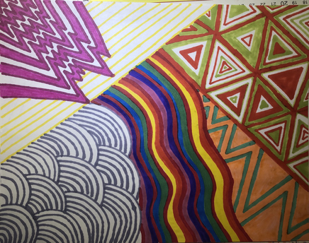
I used line to create an artwork that was bright and eye catching. I also used bold colors with separate color schemes in each small square. Using different color schemes while still incorporating the same bright color values made each square individual while still being able to tie the whole piece together.
Artist: Dillan Y |
|
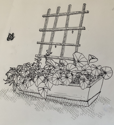
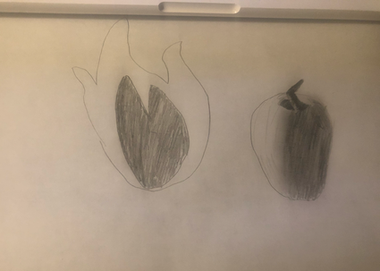
For this assignment, I took the prompt literally and made a pen and ink contour drawing of my plants. On the left are morning glories, and I don’t know the name of the plant on the right. Although neither have bloomed yet, I still find them beautiful. We’ve also had a lot of butterfly visitors to the backyard, and a couple chrysales are hanging from the trellis. I had fun drawing this outside in the sun.
Artist: Lilly C. |
|
|
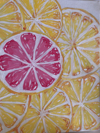
This is a acrylic painting. I painted all the lemons yellow except for one to create contrast and make the pink lemon stand out. I wanted it to be the focal point. I really like how it reminds me of summer time. The colors are very vibrant and happy.
Artist: Nirel B. |
|
As I was thinking of what to do with this piece I thought about doing a flat background or maybe lifting paint with darker pigment for a washed out look. Ultimately, I decided to paint stripes in the background varying with a very light blue wash and dark. Then painting the plants I chose to go for a more monochromatic look with light, dark and darkest shades of green, contrasting with a medium yellow. I made sure to paint everything but the pots of the plants, so that I had some concentration to go against the negative space. Lastly, I outlined everything with a bright purplish red to make everything pop, for a more lively and less toned down/ cool toned feel.
Artist: Angelina O. |
|
|
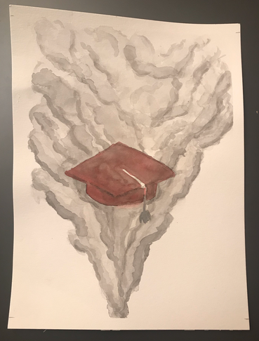
This piece is inspired by the emotions I felt while hearing a song about moving on to the next chapter of life. It reminded me of how I, like many other seniors, will be ending this chapter of our life but without the ceremony that we expected. In a sense, our expectations of graduation faded away like a puff of smoke. The smoke is created by contrasting white and black. The graduation cap is also emphasized through the only use of red in the piece.
Artist: Zoë C. |
|
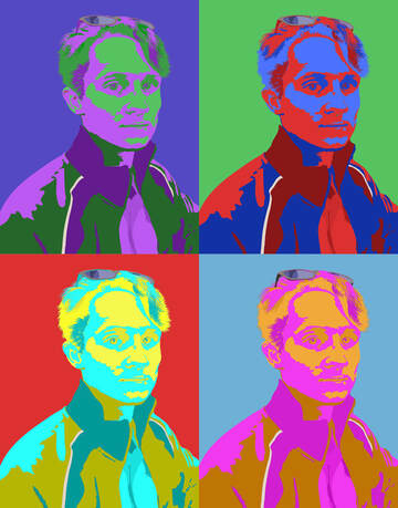
To explore the concept of contrast within my artwork, for this project I chose an Andy Warhol style self-portrait. I chose this style as I felt it had a high usage of contrast, specifically color contrast, and was a fun style to recreate. I used high- contrasting colors for all 4 variations of the portrait, alternating the color for each shading block of the illustration. There were 3 shades of each color used to show shadows and materials, and with the brightest shade used on the faces and generally getting darker moving down the image. This was made in Adobe Illustrator, roughly traced on a reference image using the pen tool and a custom art brush for the hair.
Artist: Keller E. |
|
|
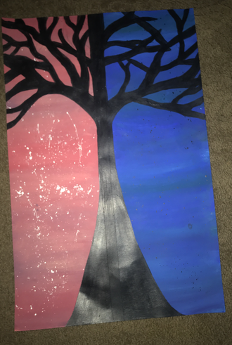
I would want people to know that this art piece uses contrast to make the black tree the center point. I first tapped down the middle and painted each side. Then i painted the tree. Then i splattered white in the pink and black in the blue.
Artist: Haley F. |
|
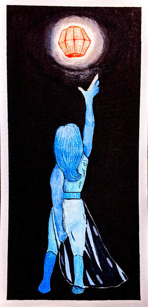
To explore contrast, I thought of a pretty simple idea to start - a lantern in a dark room. Then, I added a figure, and gave the figure and lantern contrasting colors. The most important part of creating this piece was keeping the figure light while still being able to differentiate different parts within it, which mostly came down to using slightly different tones and textures for different parts. It was also important to me that there was more than one way of showing contrast, which is why I focused on both light and color.
Artist: Daly G. |
|
|
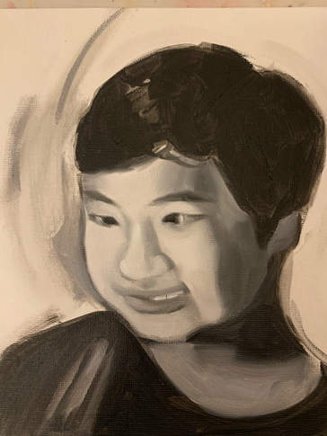
I tried to create contrast by placing opposite values (black and white) next to each other to make both of the values more visible and make the portrait a more dramatic. I painted a darker value around the side of his face to make sure his face wouldn't blend into a white background. I also tried to suggest a strong shadow on the side of his face by adding dark gray there and blending it minimally on the cheek area to create a visibly separate darker area. I think in these two areas I made some contrast.
Artist: Lucas H. |
|
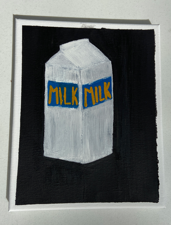
For this painting I implemented contrast by my use of colors. I made a dark background with a bright object in the foreground. While I was painting I ran out of white paint so I couldn’t make it as bold as I wanted to, but the milk carton pops against it’s dark background. By using both dark and light colors, a attention is drawn to the the light colors presented in the foreground. This contrast catches a viewers eye and makes the piece more dramatic.
Artist: Annabelle I. |
|
|
To me, contrast is all bout finding the beauty in conflict. In this piece, I wanted to showcase conflicting/opposing forces in a visually appealing way. I wanted to display this balance between two forces, such as good and bad or light in dark, in a manner similar of that to the common Yin and Yang, where there is darkness in the light and light in the darkness. The idea of contrast is a beautiful way of capitalizing off of a balance between forces, a neutrality that shouldn't exist. Since the eagle is my favorite animal and represents certain values to me, I decided to paint a cool/attractive piece to show contrast.
Artist: Lars G. |
|
If someone was looking at my work in a gallery, I would like them to see the sharp contrast in this piece. In this piece I made all of the darks the same black color. This makes the darks pop out of the piece. I think that this piece is a good example of something that shows a strong contrast of light and dark. I did this piece in a black brush pen.
Artist: Ruchira H. |
|
|
If my artwork was in a gallery...I would want the viewers to first know that the picture on the left is a fireball, and the picture on the right is an apple. The apple has light shinning towards the apple from the left side. I used contrast in these two photos by using two colors. Black and white. With the apple, the contrast appears as you gradually decrease the shading.
Artist: Zami H. |
|
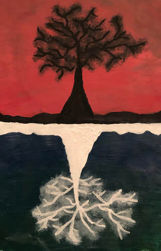
In my painting, I have a silhouette of a tree in a sunset, and below is a reflection of the tree in contrasting colors. I wanted to show contrast through the colors of the tree. To me, contrast is usually a reflection of an object or an object's colors changed. Adding contrast in the painting breaks it up and adds something different. In this painting, the contrasting colors give a different meaning and perspective.
Artist: Paige F. |
|
|
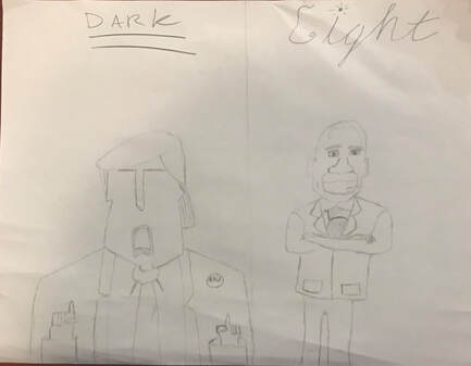
I’ve been watching much more politics during this pandemic, so I’ve been keeping up with politics much more. I decided to draw Obama and trump on opposite sides of the spectrum as I’ve been thinking more and more of the political divide we’re facing, as well as the difference of opinions of all of the Americans in this current state. I chose to draw Obama and trump as literal contrasts to each other, as Obama was more or less universally liked, while trump is practically universally hated, as well as a massive contrast in their ideals.
Artist: Dagin G. |
|
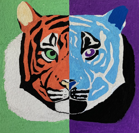
For this assignment, I painted a tiger. On the left side of the paper is a regular tiger that has contrast between the orange and black stripes. On the right side of the paper is the other half of the tiger with inverse colors. The colors used on the right are opposite of the colors used on the left on the color wheel. For this assignment, I used POSCA paint pens on a 4 inch by 4 inch piece of paper.
Artist: Francesca P. |
|
|
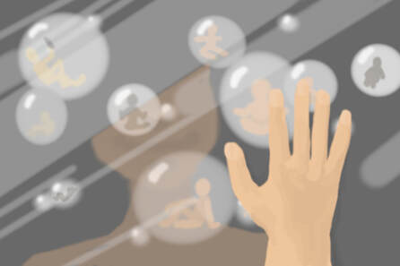
Since option #2 says: 'Create a painting/artwork that explores any one of and/or combination of the themes from Assignment #1, in a new way', I burrowed the one of my concepts from assignment #1 (PAINT! the quarantine one), which was to have people in isolated quarantine bubbles. I'm pretty sure that it was supposed to say option #1, but I already did it haha. The point was for it to be viewed out of someone in a bubble's eyes, looking at other bubbles. I also admit that I definitely could have done better drawing the hand. I realize that there isn't a whole lot of contrast going on (except for the black background vs lighter colored bubbles).
Artist: Liana X. |
|
I used contrast in my artwork by making one side more colorful. This makes the artwork have a visual different elements. My artwork is inspired by a character called Deceit. I made one side of his face stand out more then the other.
Artist: Katelyn K. |
|
|
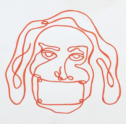
The way I decided to draw a contrast drawing was using white and red. Red is a bright color and makes people feel all sorts of different emotions, which contrasts the calm face on the person I drew. I wanted people to be confused, as red is usually associated as an "Angry" color. I also wanted people to depict this drawing in whatever way they wanted to. Contrast really brought this feeling to life, and inspired me to make something confusing yet beautiful.
Artist: Brooke L. |
|
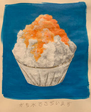
If my artwork is hanging in a gallery, I would want my viewers to know that I wanted to capture a fun, summer vibe in the colors. I used bright, complementary colors that have a strong contrast in my painting of mango bingsoo (Korean shaved ice with toppings). Orange and blue are on opposing sides of the color wheel, also known as complementary colors. This hue contrast creates sharp jumps between the complementary colors to display a visual effect. The colors in my painting have high saturation to give a powerful contrast.
Artist: Sarah L |
|
|
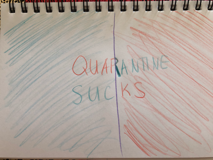
As my work is being viewed, I want people to know that it sucks being trapped in your home not being able to see your friends, especially when it is your last year before you go off to college. Not only is it touch but it’s also really upsetting because no one else will have/has the same situation as us. So I just want people to know that it’s really tough as a senior in school right now and that if we all do our part, we can go back to normal sooner than later.
Artist: Galina K. |
|
Artist: Kirsten N.
|
|
|
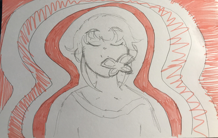
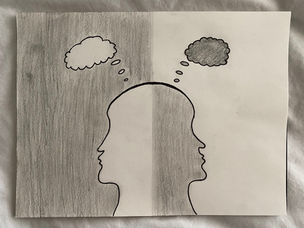
My art piece was inspired by the contrast between people who think positively and people who think negatively. Although the person on the left is in a dark world, she has her bright thoughts to protect her and keep her going. On the other hand, although the world on the right is bright, a persons attitude can reap havoc on any situation. I was aiming for a simple yet powerful drawing for the observer to take in. Lets all focus on the light in these tough times.
Artist: Zane S |
|
I particularly wanted to highlight the way contrast can divide and create distinct areas. I had a many different kinds contrast I tried to implement: The texture of the canvas vs the flat paint; the shine of the metallic tape vs the matte paint, along with the extremely sharp contrast between the pink, dark blue, and blinding white of the tape (I couldn't find a way camera angle and lighting to completely do justice to the the reflections on the scratch board work!!). I really wanted to do a self portrait around the idea of contrast. I have been thinking about the false dichotomy drawn between certainty and fluidity .I think the painting attempts to dissolve this line drawn; showing that certain things exist like the bright colors and shapes, yet can be changing and ultimately limitless, represented by the reflecting silver background.
Artist: Chase V. |
|
|
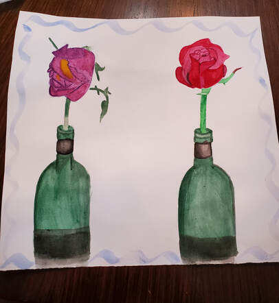
I wanted to show the contrast of life and death with roses. With roses, it blooms with life then only to wither way as it dies.
Artist: Vanessa V. |
|
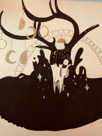
I really enjoy using contrast in most of my pieces. Since I mostly use inks the white and black already contrast with each other. To add more contrast I added gold to pop out some areas. I got the idea if this piece from my on room. I used the deer skull on my wall as the centerpiece and used my moon phase banner as the highlights on the antlers and face.
Artist: Marley W. |
|
|
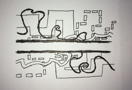
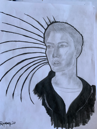
I wanted to incorporate the line element of art into my artwork as much as possible. I drew many different kinds of lines that came to my mind. There are thin and thick straight lines, curved lines, bent lines, and diagonal lines. A lot of the lines also go off the page. I wanted this artwork to look very chaotic, weird and bright.
Artist: Karina A. |
|
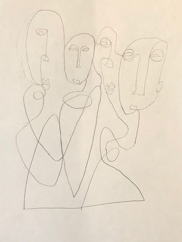
I would want them to know what this piece represents. It's not just a drawing of four people. It's a family. A family that is all cooped up close together because of this virus. That it resembles coronavirus and it's effects.
Artist: Jagger B. |
|
|
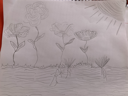
I want the viewer to imagine the flower fields. That is what inspired me, my love for nature. I was not able to spend as much time as I wanted to, due to my ap exams that I have been preparing for, but this alleviated some of my stress. I hope the viewer is inspired to sketch something they like, but in a unique way, trying to make things out of lines rather than shapes. Something so complex can be built from something as simple as lines.
Artist: Leili D. |
|
I would want people to know that one of my friends had actually wanted me to draw this for them and give it to them after quarantine. After i had drawn it i had thought that it would be good for this assignment.
Artist: Emily C. |
|
|
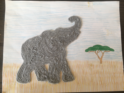
What I’d want my viewers to know about my artwork is where I used the emphasis of line. I started off with a background of a savanna biome and thought I could use many lines to draw the grass. Then, for the sky, I filled it in with straight strokes to make it more line-like. Lastly, the main part was the elephant, which is with curved lines and is made of yarn. I didn’t anticipate it to take as long as it did, but I like how it turned out.
Artist: Sammi D. |
|
I've really enjoyed staying at home and taking a break from school, and I've been trying to paint something in my spare time. Recently I ran out of a lot of colors (we didn't have many in the first place) but I found a lot of blues. So, I tried to stick to one color scheme using only black, white, and various shades of blue. This was just a basic tester, but I will try to make a more detailed painting using the same color scheme.
Artist: Lauren G. |
|
|
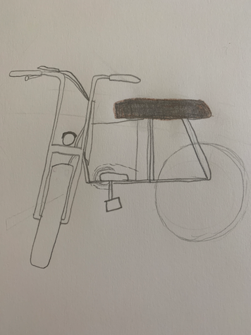
I drew a bike because it symbolizes the moving circle of life. Since we are stuck in quarantine and we might feel like everything is stopped life is still moving forward and we still have to get things done. When riding a bike you go over smooth edges and rough pebbles on the way. There are going to be bumpy times it’s not always going to be smooth all the time.
Artist: Mia E. |
|
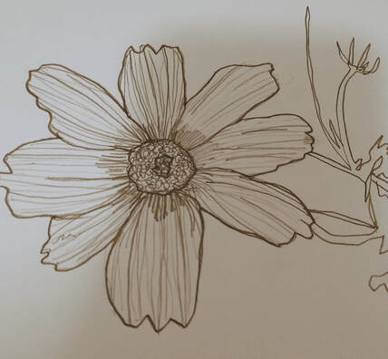
For this piece, I drew a flower. I decided that since we were to highlight the element line, I would try to use line to sort of mimic shading without combining the lines and trying to rely on different line weights. For different colored sections I would increase or decrease line weight and frequency in order to give the appearance of shades or tones. I also tried to keep my border lines more obvious in an attempt to highlight the different parts of the drawing without a need for shading. I also drew the flower stem in the background, however due to how thin it was I was not able to put any extra lines in to change the tint of the area.
Artist: Nora H. |
|
|
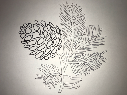
I wanted to draw a pine cone on a branch with the pine needles because surrounding my house there are lots of pine trees that are towering over my house. I made the pine cone the main focus because it is the most influential part of my drawing. I like how the shapes of the pine cone stand out against the straight lines of the pine needles. I think the gaps between the pine cone parts made it look a lot like a pine cone even with no shading or coloring. In the drawing I think that the pine needles going in different ways look really cool and draw your eye all around the drawing.
Artist: Whitney S. |
|
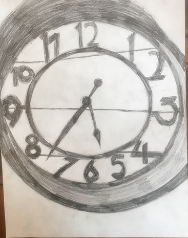
The artwork in the drawing is based off a ordinary clock that I found in my house. The art piece uses descriptive lines to help create the shape of the clock and the numbers inside the clock. The round lines in the piece also allow the shape to become a clock because of the round side of the clock being able to be shown by the lines. Implied lines finally allow the piece to show some of the more complex numbers on the clock like the number 10 where the edge of a straight line ends and the circular shape begins. The art piece perfectly shows the numerous type of lines and how they can help create shapes and objects like the everyday clock.
Artist: Ryan Z. |
|
|
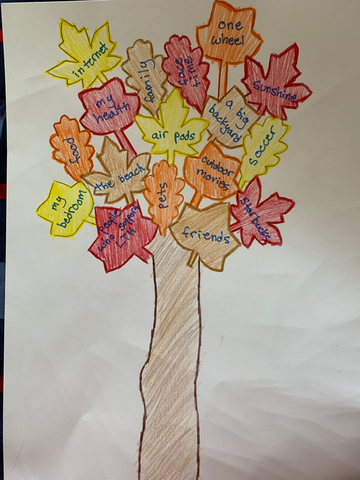
I thought of this art piece because when I was a kid every thanksgiving we would make a thankful tree that has each leaf with something we were thankful for and now more than ever I feel as if it is important to remember what you’re grateful for.
Artist: Kaden H. |
|
To fully encompass the element line, I drew the entire picture with (almost) one continuous curved line. Using this method, I drew a drawing of a woman wearing a face mask. First, I sketched the image with a pencil to get the basic shape. Then, I went over it with a marker and erased all the pencil marks. The woman is wearing a face mask to shed light on the current situation with COVID-19.
Artist: NIki H. |
|
|
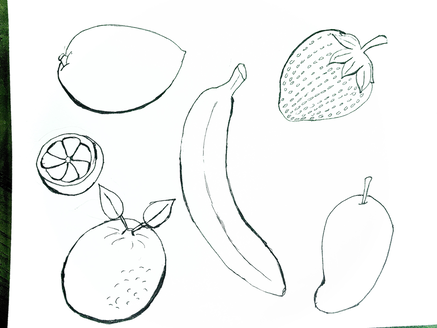
In my artwork I used "line" to draw some of my favorite fruits. I tried to use the thickness of the line on each fruit to make it more sharp. When you look at my artwork you'll see that the spacing between the drawings are all different. You'll also see that some of the fruits have more detail than the others. I decided to use line in my artwork to draw fruits because it's summer, and because fruits taste really good at this time.
Artist: Hila K |
|
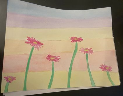
This piece of artwork uses lines all throughout it. The stripes in the background are wide long lines and the flower stems are shorter, slimmer lines. Each flower petal is separated by the line of another petal. I wanted to make this painting simple to show the use of lines in it so I made 6 pink flowers and a pastel colorful background to ensure the flowers pop.
Artist: Amelia M. |
|
|
If my artwork was hanging in a gallery, I would want views to see the buildings different shapes and sizes. I would want people to notice how the I made the building look tall with lines that started out wide and got smaller and tighter as they were closer to the ground, and how that showed the height of the buildings. I would also want people to notice how I made some sharp lines like the edges of buildings and some round lines like the top of the helicopter landing pad. In this artwork I used different line spacing to convey 3D buildings from 2D paper and lines. I also used shading to make the bottom of the building look more real with real shadows. This artwork was fun to experiment with different lines, shapes, and colors.
Artist: Emma C. |
|
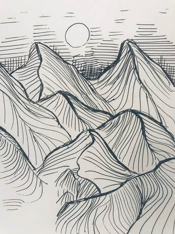
The artwork here consists of thin and thick lines. I wanted to show the mountain’s shape by using curved lines. Thicker lines to define the shape, making it visually bolder. The thinner lines are for the mountain’s details. The background consists of cross-hatching and hatching, by using horizontal and vertical lines it differentiates from the mountains.
Artist: Sophie D. |
|
|
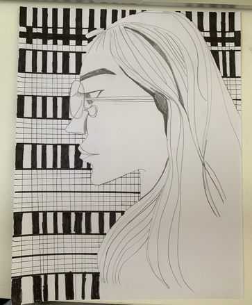
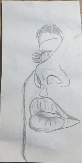
I used the line weight drawing techniques in my artwork, if you look closer there is some part in this woman's face has much deeper lines than other places. I have drew many soft, straight, or even hard edgy lines just to represents different line style in my artwork. In this artwork's background I have drew straight and horizontal lines by sharpie just to makes more lines occurs in this artwork and to show viewers a very cool background pattern.
Artist: Meijia H. |
|
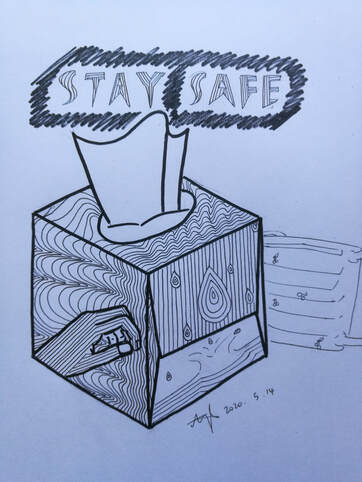
My artwork mainly explores the element of drawing: line. My inspiration came from the Kleenex tissue box because the box always contains repeating shapes and patterns. I decided to re-design the tissue box and include line in my design. Since we are in quarantine and need to keep ourselves safe, I drew a hand and some water to symbolize washing hands and personal hygiene. The actual "backgrounds" of the design were me playing around with lines and drawing whatever thing that comes to my head first. Also, I wrote "stay safe" because everyone should stay healthy and safe.
Artist: Angela Z. |
|
|
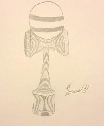
When I was looking through my closet, I found my old kendama that I used to play with when I was in fifth grade. The detailed drawing that I created is based on that kendama. I tried to add as much detail as I possibly could to this drawing to make it feel realistic. I used the element line to create a detailed wood grain on the kendama to show texture and pattern. Whenever I look at this drawing, I am reminded of the countless hours I used to spend practicing at home in order to challenge other people to tricks at school the next day.
Artist: Darius Y. |
|
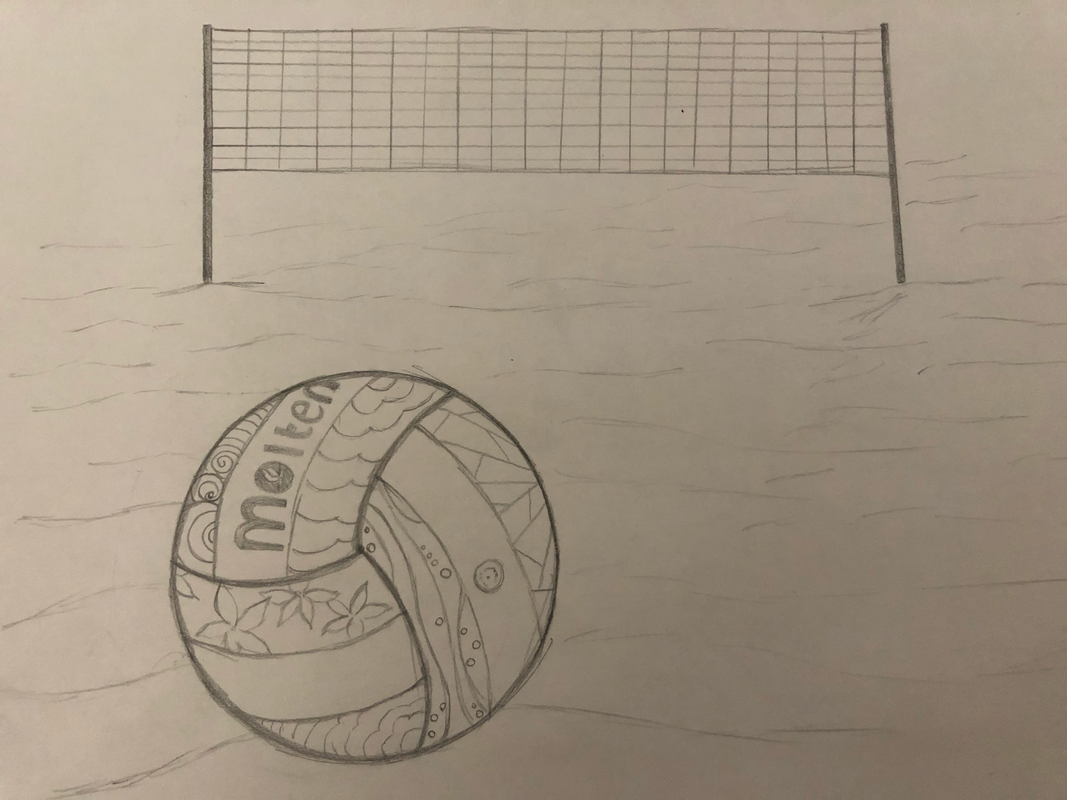
For this assignment I decided to choose option number two where I drew a picture based off of assignment one. From assignment one I chose the question that asked what was most challenging for me during this quarantine. For me being able to get outside and practice my volleyball and keep working out has been really challenging. Practicing my volleyball has been most challenging for me because In the sport volleyball, a net is required and I don’t have a decent net that I can practice on. This limits me to practicing either by myself or trying to practice my brother. When people look at my artwork I want them to think about what is most challenging for them and how they can change it so that it is not as challenging. If that is not possible I want them to think about what they want to do the most so that when they are able to do it again they will put their 100% effort into doing it. In my artwork I incorporated using the element of art “line” by drawing a volleyball and the mounds of sand. I also drew a volleyball net because, It has lots of rope or string that crossover and illustrate more lines.
Artist: Mya H. |
|
|
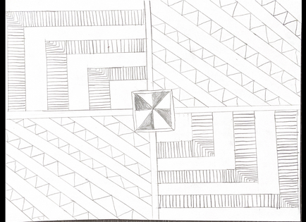
My drawing is made up of lots of lines. I start with a square in the middle, with an outline of the square right outside of it. In the middle it is split up in 8 pieces, and every other piece is shaded in. Then there are lines going out from all four sides of the square, so the paper is split into 4 pieces. The top left and bottom right parts both have diagonal lines going through them, with zig-zag lines in-between every other line. The other two parts are boxes, that continuously get bigger as they move on. In every other box, there are many lines between them, taking up the space inside the box.
Artist: Chris D. |
|
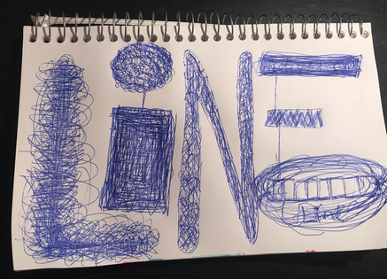
I liked doing this one a lot mainly because I was kind of in a frustrated state when I started and drawing helped relieve some of that frustration. Each letter in the word line I drew was made with one line. I even added another line word in the bottom right corner. This was cool very relaxing to draw and pretty simply too just scribbling a lot without lifting your pencil. Very fun.
Artist: Nemo L. |
|
|
This drawing was about exploring the element line. For this I drew a face. I decided to do this because normally when I draw faces I use more shading to show detail and facial features. I this drawing instead of shading I used a variety of lines for the detail. By doing this I challenged myself and discovered more ways to use this element.
Artist: Anonymous |
|
I decided to draw multiple different ways of the element of design line. I included zigzag, shapes, lines, and multiple designs. drawing this was very therapeutic because it’s very complex and has patterns. oh I kind of got inspiration from some of the other peoples artworks in the gallery then I took a combination of all of them and put it onto one. But I also added my own touch with the drips.
Artist: Mia L. |
|
|
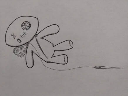
If my artwork was hanging in a gallery, I would like my viewers to notice the unfinished doll with the thread still attached to it. For shading, I mainly drew quick and thin lines, careful not to emphasize it thickly too much. I drew this rag doll based off of my mood today. Today, I felt like I have the worst luck, stress swooped into me, and other worries. By expressing emotion and feeling through art, I feel like it lifted up some of the weight of stress and anxiety on my shoulders.
Artist: Rosanne P. |
|
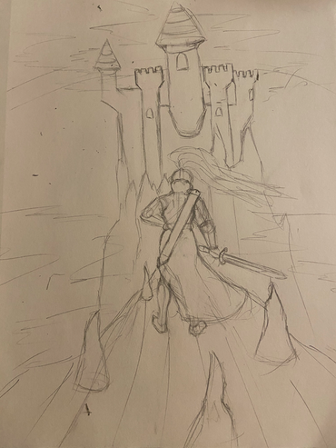
This piece was made with the Heroes journey in mind, as well as a sense of grandeur. The "hero" is the center of the sketch and is facing off into the distance at a large castle. He stands on a bridge, sword drawn hand on belt ready to face what awaits him inside. This takes place right before the climax of the Heroes Journey when the protagonist "Approaches the Inmost cave." I used line to do two things. One was to show a sense of space and guide the eye upward from the "Heroes" head, and the other was to give a sense of vertigo to the audience. The Heroes journey is marked by a constant testing of the protagonist as well as a sudden and abrupt change in their life which for many would create a sense of vertigo Protagonist included. Which is why I used line to extend the bridge the Hero stands on, narrowing it and stretching it to make the goal of the castle appear farther away than it appears. Kinda like a dolly zoom in cinema.
Artist: Ben T. |
|
|
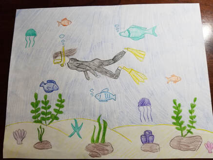
I chose Option #1 for my artwork. I decided to draw a person snorkeling because I enjoy snorkeling myself. I was inspired by the trips I took to the Caribbean. During these trips, I would snorkel whenever I had the chance and explore the amazing sea life. Furthermore, I incorporated the element of line into the flippers, kelp, seashells, fish, and jellyfish.
Artist: Elise V. |
|
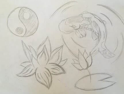
In my drawing, I drew a Koi fish, flowers, and a yin yang symbol. The yin yang is meant to show how lines can be used to create color, or shading. In the flower, I tried to vary the line weight in order to show a little bit of distance, since the darker petals appear closer to the person. Their are also lines to show the movement of the koi fish as it swims. Lines on the koi fish also show the details of the folds on his fins and scales.
Artist: Evan Z. |
|
|
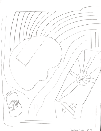
If my art was in a mesum or art gallery I would want my art piece to be interpreted in many different ways. When I started to create my piece I had no particular plan for how it was going to end up. During the drawing process I kept changing what I was drawing after a couple of shapes and lines. If my audience could give their own interpretation and view my artwork in a different way they could experience how I felt when I was creating this. In creating this particular art piece I had a lot of fun and it is my intention to show my viewers the process I used.
Artist: Nathan P. |
|
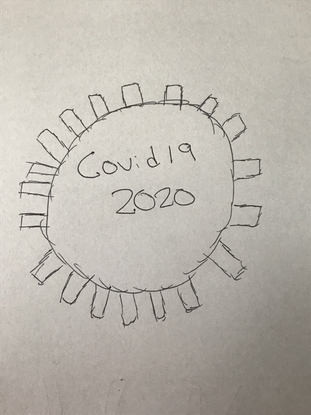
This is a symbol of the virus that has shocked the world and forced quarantine in many places effecting billions of people. I want to thank all the first responders, doctors and any other people on staff helping to fight and find a cure for this virus. These are very hard times for many but you just gotta know that soon everything will slowly get back to normal. You just gotta power through and know it will be better soon. The doctors and nurses and first responders are working so hard to help and you just need to thank them for there sacrifice.
Artist: Andrew S. |
|
|
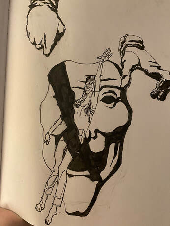
This piece for the contrast assignment is designed to show the sense of dread found in older horror movies like psycho and Halloween. The ink drawing features a floating female figure with a stance evoking memories of the original Evil Dead promotional poster. Gloved hands descend upon her and behind her is a mask similar to that of Guy Faux. A giant black streak runs diagonal across the composition illustrating the shadow of a knife. This piece was inspired by ideas I've had for a horror comic about witches. The black streak and the heavy shadows of black contrast heavily with the white portions and create a tone of gothic suspense and horror.
Artist: Gilmer W. |
|
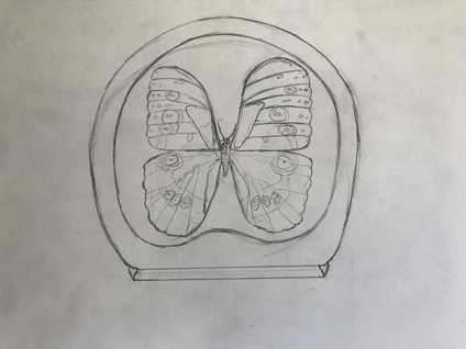
This is a drawing of a preserved butterfly souvenir I got from Costa Rica. I went to Costa Rica about three years ago. My trip to Costa Rica was my second time leaving the U.S. In Costa Rica we saw a butterfly exhibit. This souvenir reminds me of that, which is why I got it.
Artist: Tyler K. |
|
|
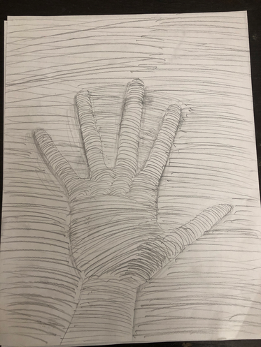
The drawing I made represents line because there are lots of continuous lines going across the paper. I traced my hand and then drew the lines and made bump like things around the fingers to make an illusion.
Artist: Liz X. |
|
This image is simply a pencil drawing a line drawn in pencil. I wanted to express the versatility of art in a simplified way: art allows you to transform and bend reality to anything you wish. It is, of course, common knowledge, but it is often expressed in obviously exaggerated formats. In art, though, it doesn't have to be exaggerated; you are in full control of every detail.
Artist: Carolyn C. |
|
|
In order to explore the element of line, I drew several different types of lines, each with different styles. Darker lines are closer to the top, while lighter lines are further away.
Artist: Alex T. |
|
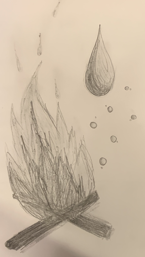
I decided to go with trying to do shading figures again while doing a spin on contrasting subjects. I chose fire and water as my subjects and tried to incorporate more values into it to give it depth and 3D. I wanted to try more pencil sketches.
Artist: Natalee C. |
|
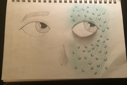
|
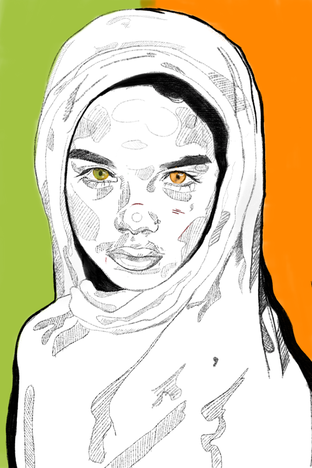
The orange represents youth and happiness where as the green represents growth and energy. The contrast between the two colors gives an identity to the girl drawn. I used a reference off the internet.
Artist: Megan W. |
|
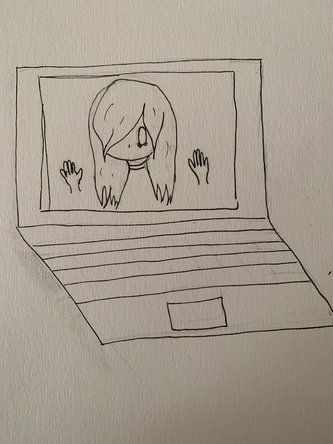
I chose to do option two again. I really enjoy drawing for the same concept but different art. In this drawing it shows how I feel during quarantine again. I feel slightly trapped in my computer. Of course I can always stop using it. But then my classes, contacting my friends, and just relaxing with shows all gets effected.
Artist: Nadia S. |
|
|
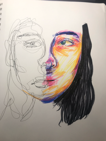
My drawing is of the actress Sonoya Mizuno as her character Lily Chan on the show Devs. I was inspired to make this drawing because I had been watching this show and it’s grown to be one of my favorites. There is also a lot of imagery/visuals in the show that uses complex lines and shapes, from characters to places. I also chose this character because of her unique look, which I felt would fit perfectly in the “graphic” style of design. It also gave me a great opportunity to try out new shading techniques, which I’d never been particularly good at in the past.
Artist: Liam R. |
Photo Credits & Artist Statements: Courtesy of Individual Artists ©2020 All Rights Reserved.