May 8-13, 2020
Photo Credits & Artist Statements: Courtesy of Individual Artists ©2020 All Rights Reserved.
Photo Credits & Artist Statements: Courtesy of Individual Artists ©2020 All Rights Reserved.
|
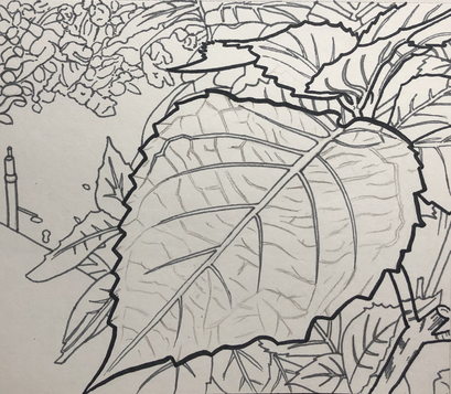
Before social distancing, my family and I very rarely went to our backyard. However, since we cannot go outside too much now, we take walks around the house after lunch and dinner. I drew a contour drawing of some of the plants in my backyard, with the focus being on a single leaf. The leaf may seem very simple, but it has many details on it. I used a darker pen to emphasize the more important parts of the drawing, with the gray pen marking the details and background. I used purely lines to complete the drawing.
Artist: Katherine Z. |
|
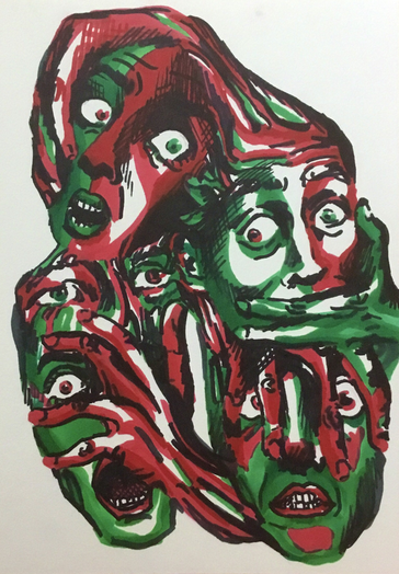
For my piece, I used an art prompt generator which challenged me to create the feeling of anxiety. I used contrasting shades of red and green to convey feelings of claustrophobia and anxiety. I chose those colors because they are complimentary and because of the anger associated with red and toxicity associated with green. This was a strange experience for me, because I don’t usually try to make the viewer uncomfortable with my art. I think contrast greatly helped me in making this creepy picture.
Artist: Annika B |
|

|
I painted this frog because I thought the contrasting colors of orange and black were super interesting. I used watercolor to make the painting and cut out the frog at the end. I wasn’t a huge fan of the green leafy background, and putting it on a black magazine page gave it even more contrast. I think contrast in nature is very intriguing. This frog was the perfect subject, but I also think albino animals and animals that camouflage are very interesting.
Artist: Margaret W. |
|
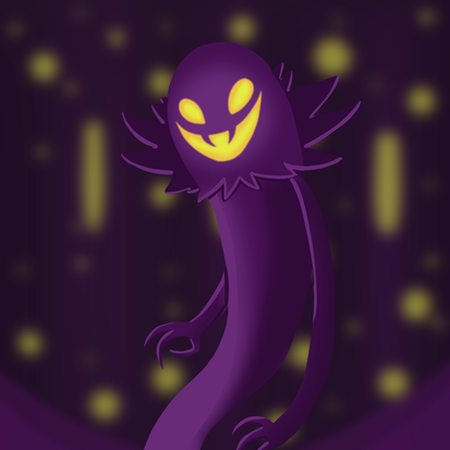
I recently discovered a new game, which I'm really fond of and love with my whole heart. The character I drew here is named "The Snatcher," and with his purple and yellow appearance, along with his ghostly nature, I thought he would be perfect for this art project. (Game: A Hat in Time)
Artist: Elizabeth C-B |
|
|
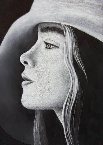
I chose to draw a white charcoal portrait on black paper for this assignment. I created contrast by putting very different values next to each other to make them stand out, as seen in how the bright white highlights pop out against the black background. The contrast between the light and dark tones creates the dramatic effect I was trying to achieve with this portrait.
Artist: Sonja R. |
|
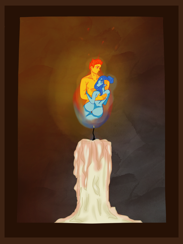
If my art was hanging in a gallery, I would want the viewer to see the contrast and aura this work has. This image models the connection that the two flames have with each other. The contrast of the blues and reds give it a underlying tone of opposition but somehow makes it very complimentary. I’d like to imagine the viewer feels the differences between the two but how they come together and make a whole.
Artist: Paisley J |
|
|
My sibling has called me Bambi for a while because I cannot run right so I've had clogs ever since and this was made for them.
Artist: Jessica S. |
|
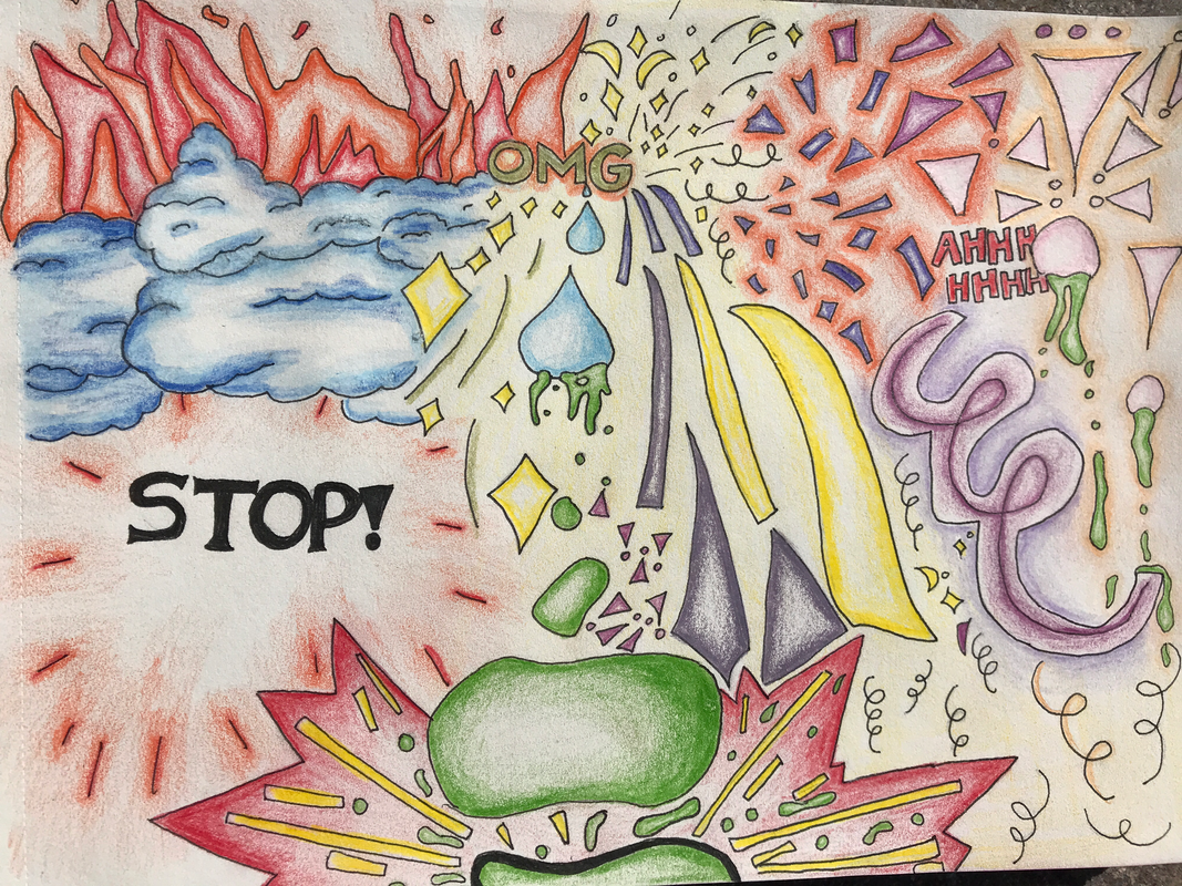
I used line in this piece to create outlines of shapes and to emphasize points of interest in my artwork. I tried using simple lines and curly q's to create the effect of bursts or explosions. Additionally, I used a heavier line weight on the "STOP!" and the glob of goo that was hitting the ground in order to draw the eye to those sections of the piece. Although most people don't have much to do right now, that is not the case for me. In fact, I am feeling overloaded by the amount of assignments, studying, and training for ballet that I have to motivate myself for each week. With AP tests right now, I feel extremely stressed. This piece of art is a depiction of stress in the way that I see it visually. Drawing it relieved some of the pressure that I was feeling over the weekend.
Artist: Haley P. |
|
|
Since the project had loose rules, I decided to draw a character from a game I like. It’s been a while since I did digital art. So, I tried to get back into the medium. It was pretty fun to practice. Overall it was a good experience.
Artist: Ariana T. |
|
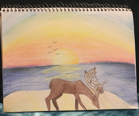
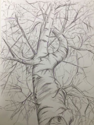
My piece is based on line and line weight. For the birch tree I used heavier lines to make the tree more clear and focused on than the background. The background has thinner lines, with some heavier ones scattered throughout. Since the main focus is lines, I wanted to create a piece where there is a contribution of depth with each individual line. I also wanted to show that single lines not only make up a simple picture but also can create depth and perspective.
Artist: Shawnette W. |
|
|
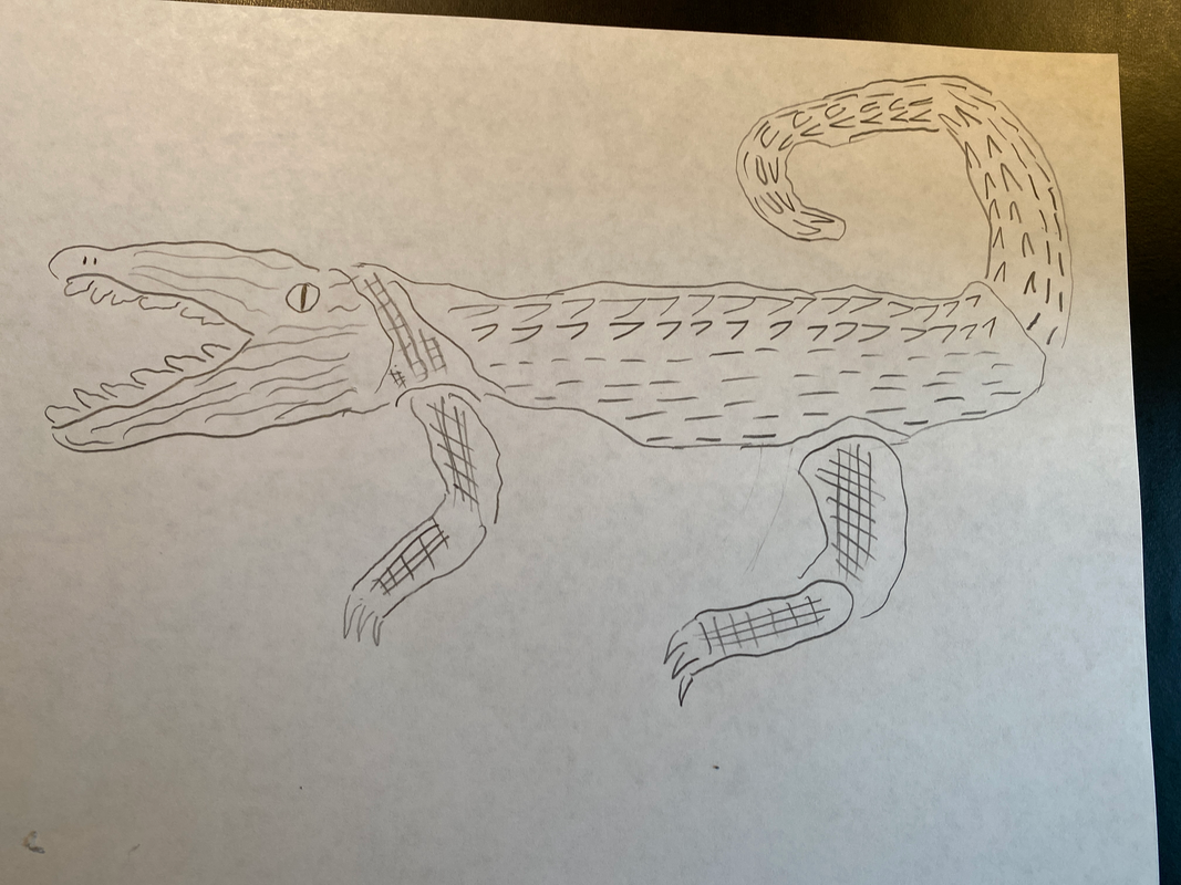
I used separate lines to create the basic crocodile shape. Then I used lines in triangular shapes for the teeth and main scales. Then I used a line checkerboard patter from arm and leg details. For the assignment I used separate line that apart would be nothing bur together form a crocodile. Crocodiles are my favorite animals.
Artist: Ethan B. |
|
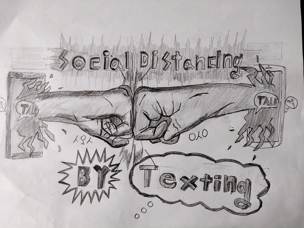
I chose option #2. I drew about how me and my friend in Korea communicate through texting. Even though we haven't met in person for nearly 4 years, we still talk to each other using Korean messenger app called Kakao Talk. In a week, Korea will allow their students to go to their schools. But, for us we have to endure more hardships.
Artist: David K. |
|
|
I used pencil for this art. There is a lot of reason I draw this art. I mixed two thing together one is from the art I did in assessment one thing I don't know the name and the other one is the apple with lines, which it just came to mind because I like apples but I added few things to make it better and I did these because I couldn't choose between them so I just drew both of them. Overall my art is great I am happy with it.
Artist: Samim K. |
|
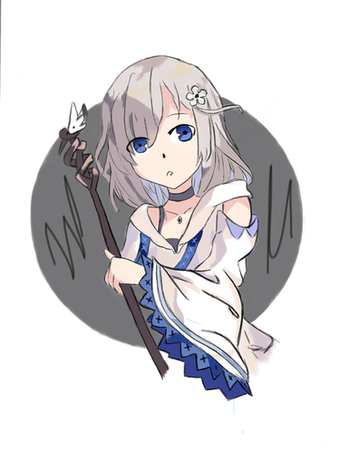
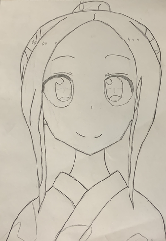
As someone looks at my artwork in a gallery, I want them to wonder what this drawing is. I want them to recognize the type of style it is drawn in. I want them to know that this is an anime character based off of the eye structure and general figure. I also want them to wonder maybe how this artwork incorporates the element of Line.
Artist: Ethan Z. |
|
|
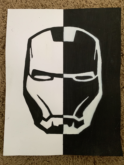
For this assignment I decided to do a contrast of dark and light using black and white. For my subject I used my favorite superhero, Ironman, since I am a big Marvel fan. I kind of just decided to do something simple for this project, so i went with the basic black on white and vice versa approach to this painting. Watching Marvel movies is definitely a must during quarantine.
Artist: Gabriella K. |
|
I originally was just trying to draw something that imitated stairs, so I made slanted lines, and added shadows, giving the illusion of depth. Then I fiddled around with a few other shapes, creating the rainbow-like shapes on the right. I added shadows to those as well. Then I copied the drawing, and pasted it back onto the drawing, but making it smaller each time. I also lowered the opacity the bigger the picture was, adding on to the depth-perception. Then I added a few lines along the edges of other lines, creating solid lines out of implied lines.
Artist: Kyra R. |
|
|
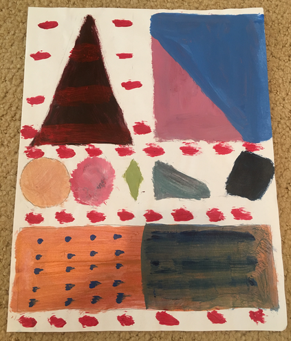
If my artwork were hanging in a gallery, I would want people to know that I used contrast in my painting. I used a bunch of different shapes to show contrast. In addition, I used a variety of colors. I used very dark and very light colors. Also, I showed a variety of textures. Lastly, I painted the shapes in different sizes.
Artist: Rebecca B. |
|
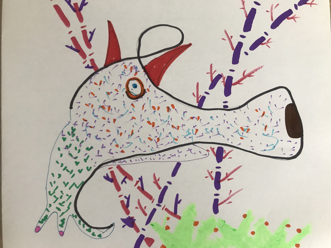
I chose option 1 to do this assignment on. What I decided to do was to blindly draw a random continuous line and then find ways to make that line into an object. The line that I drew is the in sharpie. I decided to connect the line and make it into a weird cartoon-y character. When making this I was first considering making it an anteater (due to the very long nose) but then I realized there's not enough room for me to fit all parts of an anteater in my artwork. I also explored different thickness of lines from the weirdly colored bamboo shoots in the background.
Artist: Katie W. |
|
Photo Credits & Artist Statements: Courtesy of Individual Artists ©2020 All Rights Reserved.