|
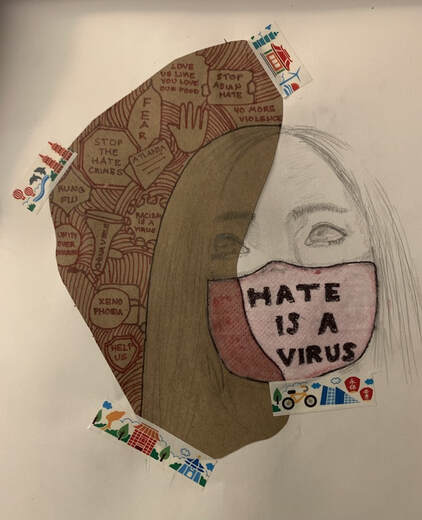
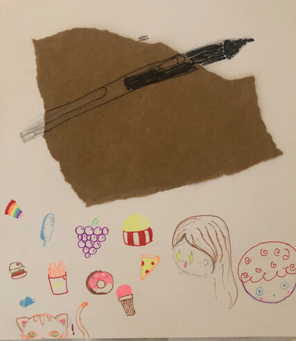
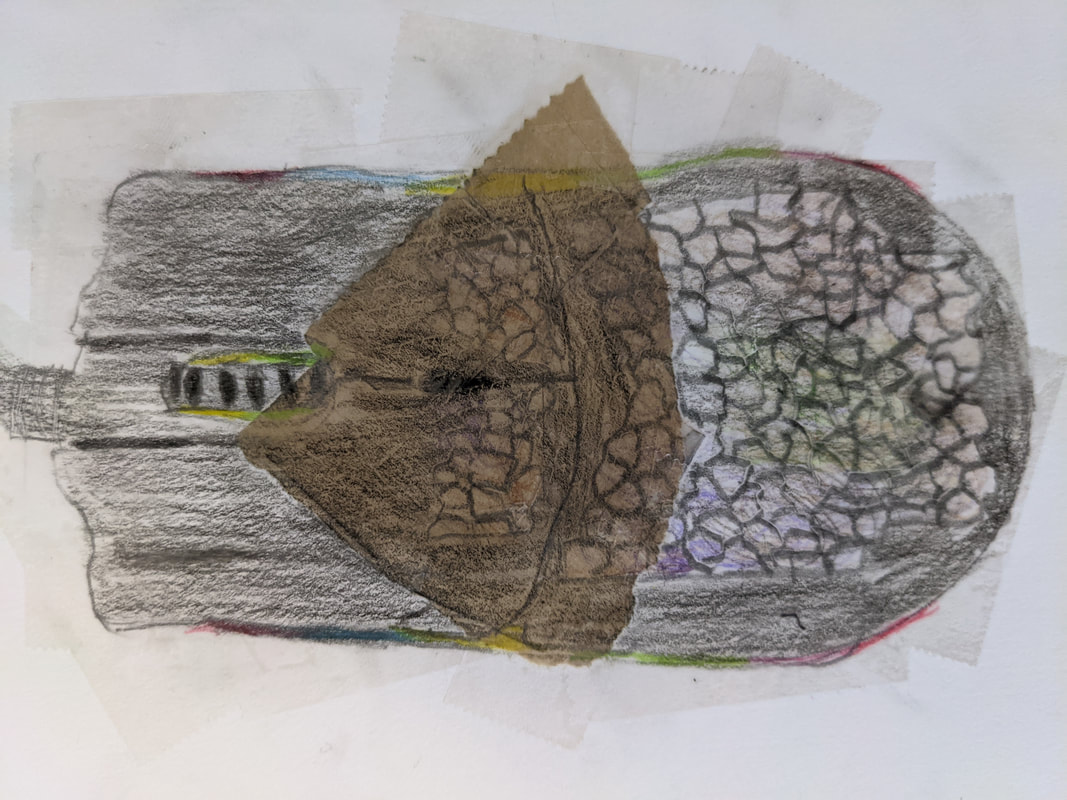
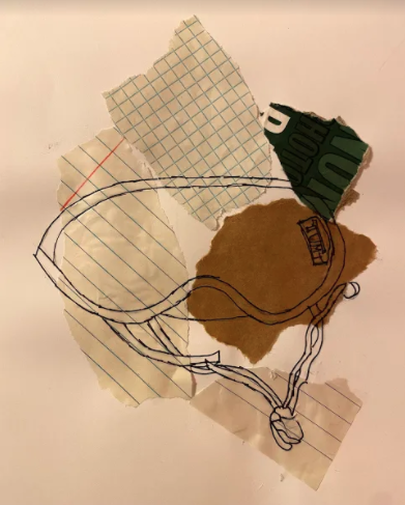
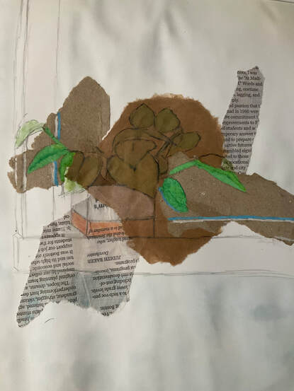
If my artwork were hanging in a gallery, I would want this piece to inspire my viewers to look at the world around them. There is so much happening in our country right now, and xenophobia is becoming a prevalent issue. Every week I hear a new story, a new hate crime, a new experience that could've happened to my neighbor or best friend at school. There are not enough statements in this piece to stand for what some families are going through. I chose a mask, because during COVID-19 racism and anti-Asian sentiment have increased, and all over social media, I've seen people doing their part. Spreading awareness, reposting, sharing their stories among others. I chose this theme because I wanted to do my part to help bring awareness to this issue. One element I used is shape. Some statements are enclosed in a symbol that represents what they stand for. For example, the word Atlanta is enclosed in a newspaper to represent the hate crimes we hear about on the news, and how we should help the families who were targeted. A principle of design I used is contrast. I used red to stand out from the dull colors because the mask and words show the meaning behind this piece.
Artist: Shivani B. |
|
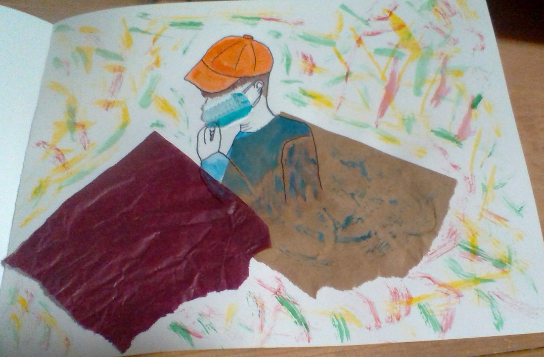
We are going through the pandemic all together and we all look the same. Our faces are covered with masks and all the kids wear either baseball caps or hoodies. My work represents present day and probably the near future. I lit up the background in multiple colors with the hope of a better and brighter future. As mixed art, I used part of a real mask and that represents my wish that all people will be healthy. The focal area of my work is the average person hidden under paper which represents isolation and my pieces of paper are different colors because for some people isolation is a blessing and for some torture. We are all different so we view our world differently.
Artist: Brian P. |
|
|
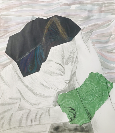
My artwork revolves around the subject, which is my cat laying his face on my hand. I chose to draw my cat because he has been an important figure during quarantine, socially and emotionally. To create this piece of art, I first glued down my two paper surfaces.Then I sketched out my cat and my hand, and shaded his fur. On the black construction paper, I loosely based his fur pattern off of alebrijes, and on the green card stock, I used Sharpie rather than pencil to shade. An element of art that I used was Value, to sketch out the patterns in his fur as well as try to shade. I also used the principle of contrast, to make the colorful parts stick out more.
Artist: Olivia B. |
|
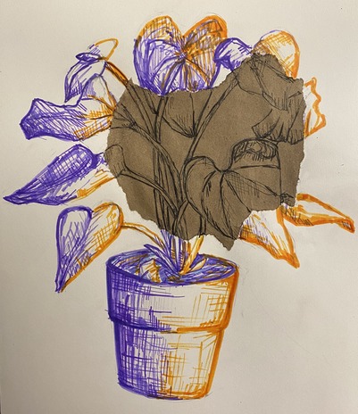
In my artwork, I drew a potted plant with pen and markers. I also glued down a piece of a paper bag onto my paper. The drawings done on the paper bag part are by pen, while the section of the drawing that is on the white paper is done by marker. I choose this potted plant because it has been with me through quarantine. Even when the world seemed to be falling apart, my potted plant still grew. One element of art that is in my drawing is texture. My artwork shows texture because of the different textures the paper bag and the white paper give to the piece. One principle of design that is in my artwork is contrast. The colors I choose are contrasting colors.
Artist: Grace C. |
|
|
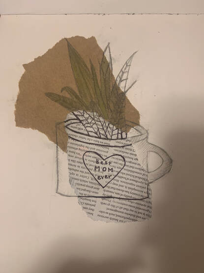
For my Mixed Media Observational Drawing Artwork i choose a plant that says best mom. i choose this because during tough times like covid it is important to keep your family close. My object has value in everyday life in the way it can be considered a gift or something that can be meaningful. like i said before this object is especially important in the pandemic because it is a reminder to keep our family close and to treasure the time we spend with them. An element of art I used was color added green over the pieces of brown paper to make it pop more and not to be as Bland .Then lastly I Use Balance as a principle design by shading on the plain white paper so then it would not seem as it had no pattern or something else to it since the other parts of my Piece had patterns and color .
Artist: Seraphina D. |
|
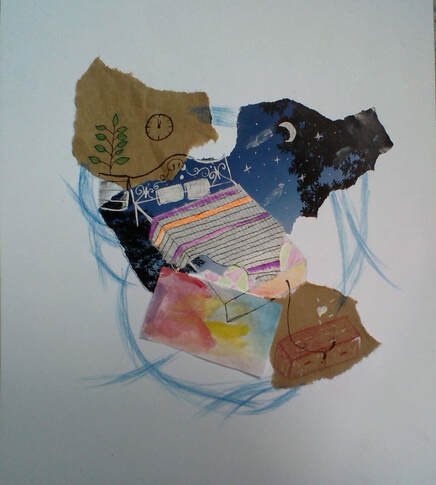
This piece of artwork created by Emma mainly shows a bed surrounded by colorful things. The artist chose to draw a bed because it plays an important role during the quarantine- people sleep more. The artwork contains magazine paper, grocery bag paper, kitchen towel, and watercolor paper. The bed was drawn on the magazine using white pen and on the white paper using color pencils. The artist uses kitchen towel to represent the blanket on the bed.
Artist: Emma H. |
|
|
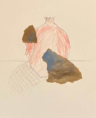
I wanted to chose a very interesting object that would feel weird to draw. Before I started making my drawing I knew I wanted to make it so that the parts overlapping the darker paper are the opposite colours of what the actual object has. One element that I used was lines, I made sure to add curved lines and an outline to show where all the indents and bumps were on the object. An element that I used was contrast, since the two different parts of the drawing were opposite colours, it made it pop out.
Artist: Panagiotis K. |
|
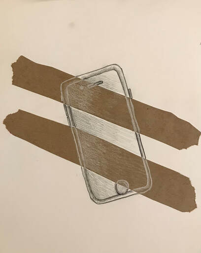
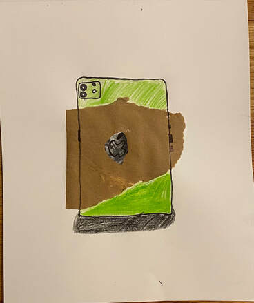
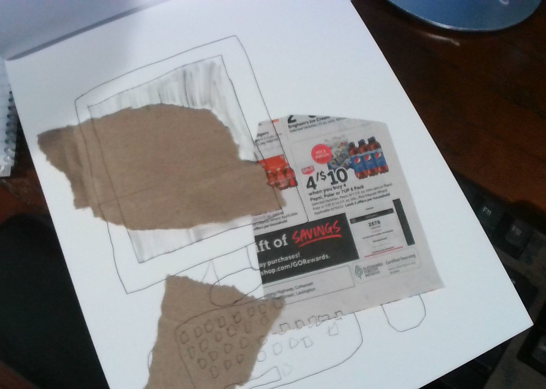
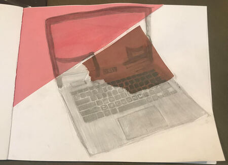
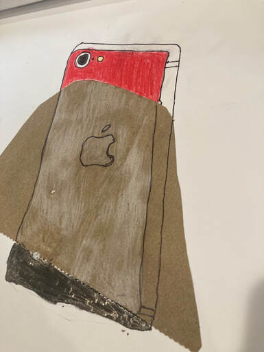
My piece of art is an iPhone on white paper with 2 stripes of brown paper. I first glued the brown paper on, and then I sketched the phone with graphite, and used color pencil for the final result. I used shape as a element of art, and I used contrast with the black and white as a principle of design. I chose to draw an iPhone because it symbolizes the digital world, and ever since the lockdown, I've been using computers a lot more.
Artist: Luke L. |
|
|
Artist: Neal M.
|
|
My piece of art is an iPhone on white paper with 2 stripes of brown paper. I first glued the brown paper on, and then I sketched the phone with graphite, and used color pencil for the final result. I used shape as a element of art, and I used contrast with the black and white as a principle of design. I chose to draw an iPhone because it symbolizes the digital world, and ever since the lockdown, I've been using computers a lot more.
Artist: Riishit S. |
|
|
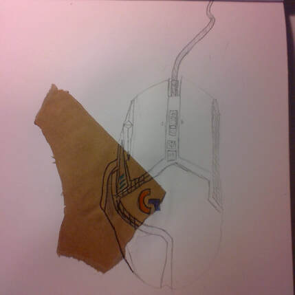
This is my gaming mouse that I have been using almost every day since I got it over a year ago. I chose my gaming mouse to draw because during the pandemic, I have been playing a lot of video games and it has helped me to de-stress and become more relaxed. I first got my mouse, then I put it in front of me. I looked at each separate section of the mouse and drew them one by one, such as the side buttons on the mouse first, then the 2 main clickers second. One element of art I used was color, because I colored only the logo and the DPI indicators on the right with bright, neon colors. I thought this color pop would look nice. One Principle of Design I used was Contrast in the Logitech G logo, when I used 2 different colors for each part of the G.
Artist: Kaden S. |
|
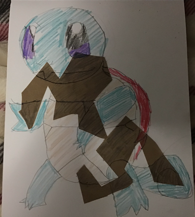
The picture I drew is squirtle in the game pokemon. I like playing pokemon so I thought I might like creating this. I utilized the texture and balance aspects of Art. I used a cardboard bag, cut it out and glued it onto my page. I went through some of my pencil to sharpie, added a lot of color and added different parts in onto different bags.
Artist: Safin U. |
|
|
This drawing of a phone is significant because my phone helps me stayed connected to other people during the COVID-19 pandemic. I can use it to text and call other people. Also, it has been a source of entertainment. When feeling bored, playing a quick game by yourself or with others makes time fly. Additionally, it has been useful in making memories (photos, videos) during this long stay-at-home time. Materials used for this drawing include : a pencil, a sharpie, color(paint, colored pencil, etc,) brown paper for drawing, and white piece of paper for drawing on.
Artist: Monish V. |
|
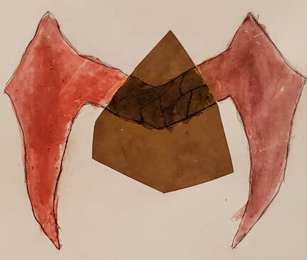
The object that I picked that was very valuable to me over the pandemic is the crown of Scarlet Witch. I chose this because, throughout the pandemic, I gained interest on superheroes, like Wanda, that would protect others. One part of the design shows the darkness people went through and the other is the light. In the middle shows the gateway of what people think they are. One Element of Art that I used was the element of color. The right to the left are never the same shade. One principle of design I used was the principle of Contrast so the viewer could see the difference of the crown.
Artist: Aman V. |
|
|
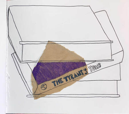
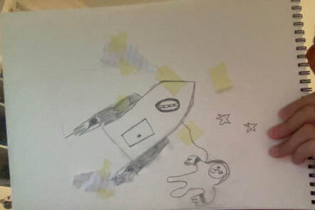
If my art were to get hung up on a gallery I want want my viewers to think that space isn't as far away as you think. I tried to incorporate tape and paper that you can find around the house that way it shows that even at home you can see the starts. I first put on some tape then I added paper and then finally I did the sketch where I first drew the outline and then I drew the astronaut. I think that one element I used was emphasis since I really wanted to emphasize both the astronaut and the spaceship. I used a picture I found inside of my house that I could copy.
Artist: James X. |
|
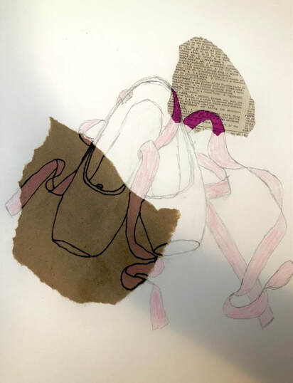
I chose my pointe shoes as the object to draw because dance has been something I have really enjoyed doing while in quarantine. The first thing I did in the process of creating my artwork was to sketch out the shoes. Then, I outlined a part of the shoes in Sharpie, and colored another part in a pink sharpie. Finally, I colored the ribbons of the shoes with a pink colored pencil. I intentionally left some parts of the drawing in "sketch" form because I thought it looked interesting. I used the principle of design "emphasis" in my artwork because I emphasized different parts of my drawing by coloring/outlining them differently. In addition, I used the element of art "form" by drawing the shoes as a 3D object.
Artist: Audrey Z. |
|
|
I decided to draw a pen because I like to doodle sometimes. One element I used was different lines. I outlined the part in the brown paper with a sharpie to make it pop more. In the background, I just doodled food because that's what I usually will doodle with my pen.
Artist: Sophia Z. |
|
Artist: Hakan B.
|
|
|
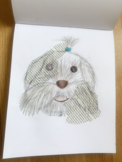
I chose to do my mixed media project on my puppy, Guppy. He has been immensely important to me during the pandemic because he is always by my side if I need him. Looking at my project, you can see that I put a lot of thought into the shape that the magazine is cut out in. Shape is the element of art that I used. The principle of art that I used was pattern. If you look at the magazine, you can see that the words on the magazine make a pattern. My puppy Guppy is a really significant part of my life, and that is why I wanted him to be the main idea of my mixed media project.
Artist: Karina B. |
|
Throughout quarantine music has been an important part of keeping me sane. Music has been one of those things that continued to remain constant after so many things changed and shut down. During quarantine I started to listen to more music and it has become an important thing throughout quarantine for me.Through each of the lines I tried my best to add value to certain places and make them a little darker than others. As well I tried to get a good balance with a black border on white paper and full black on brown paper.
Artist: Michael D. |
|
|
I drew my mouse because I have been using my mouse everyday, and I wanted this mouse for a long time. I used the shape element of art, because I traced my mouse on the papers. I used the emphasis principle of design because I showed that the middle part of the mouse is lower than the rest by using darker colors. I decided to tape all over my drawing because the way the light reflects makes it look better, and the colors look different underneath it. I tried to copy the patterns on my mouse to the paper and the color patterns on it, I also drew a faded circuit board above the tape so that it is evident that it is under the holes. I tried to use the white colored pencil to show where there is light, but I am not sure it worked.
Artist: Ayaan G. |
|
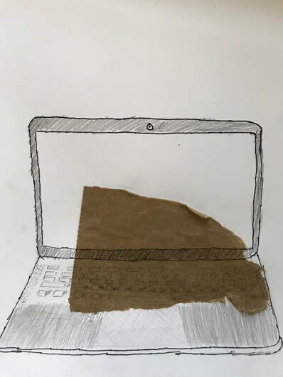
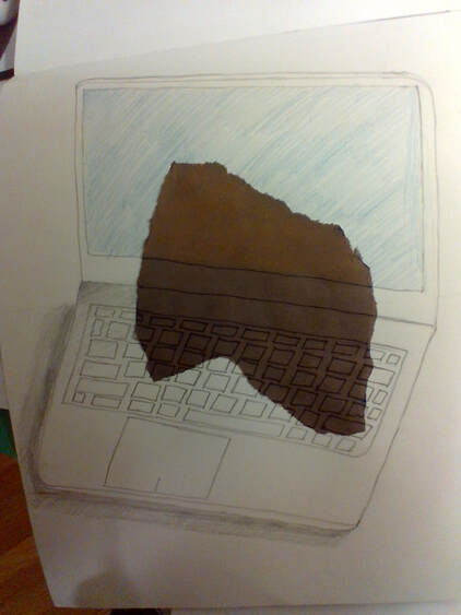
I chose a computer because I've been using it a lot during the pandemic. I started by drawing it with pencil, then went over most of the lines with sharpie. Then I added some shading and color. An element of art I used is value. A principle of design I used is rhythm.
Artist: Calix H. |
|
|
What I would want viewers to know is that I wanted my artwork to relate to what is going on right now. I choose the objects a phone and a mask because a phone is really important right now because it helps us keep contact with family members, help get help if you think you have Covid-19, and keep updated on the latest vaccine or Covid-19 news. I also think just to stay safe so like record on camera someone not following public Covid guidelines or to call the police if someone was coughing on you or risking you to being exposed to Covid-19. I choose a mask becaus that is the reality right of just going anywhere other than your house you always need a mask. 1 element of art I used was color, I used color by adding color to the phone. The principal of design I used was rhythm, and I used rhythm by repeating the shape rectangle.
Artist: Marcus K. |
|
This is a drawing of the globe. When the drawing passes through different pieces of paper, it shows a different pattern. I chose a globe, because this whole world was affected by the pandemic, and not just one country. I first drew the globe with pencil, then outlined it with sharpie, and then colored it. One element of art i used was line, and I used it through out the whole drawing when creating the globe and then the countries and lines on the globe. One principle of design I used was pattern, and I used it when the drawing was passing through the different colors of paper.
Artist: Zainab K. |
|
|
This piece was made with paper, glue, tissue paper, brown bag paper, and a little bit of book. I was inspired by the outside world and how uplifting it was during and throughout the pandemic. Whether it be the sounds of noisy birds outside your open window or a full face of sunshine on a walk, nature is a great way to boost positivity year-round. One element of art found in this piece is the usage of texture. The combination of all the different types of paper next to the dried glue made the piece more interesting to look at. The use of contrast, a principle of design, is present in this piece as well. The striking colors of red and brown and beige found on one piece of paper really drew the eye to certain parts of the design.
Artist: Esther M. |
|
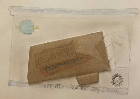
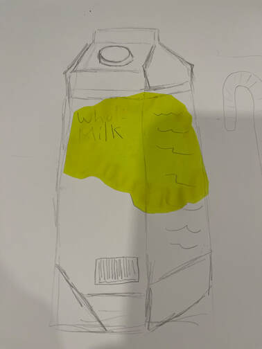
I chose this object mainly because it was the first thing I saw but I was feeling a bit hungry too. I first started out drawing a box because it's a square container. I added the lid right after then I added the logo and some of the brandings on there. After that i noticed a little tiny bit of information about the container on the bottom so I just wrote down what it said.
Artist: Adam N. |
|
|
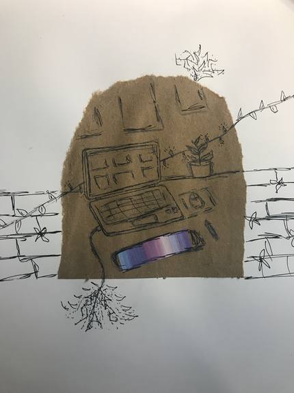
For my mixed media artwork I decided to pick my desk as an object. I picked it because lately during the pandemic that's where I spent most of my time, whether it's playing videogames, doing homework or something else. Some materials I used are sharpie, pencils, brown paper bag and colored paper. One element of art used is lines, I made the lines more rough and shaky to give a more comforting look. One principal of design used was contrast, with the colored paper and the paper bag. Through this drawing I was trying to show how your desk can take you into another world, especially when you play videogames hence the string lights turning into vines and the brick wall with flowers.
Artist: Ridhi S. |
|
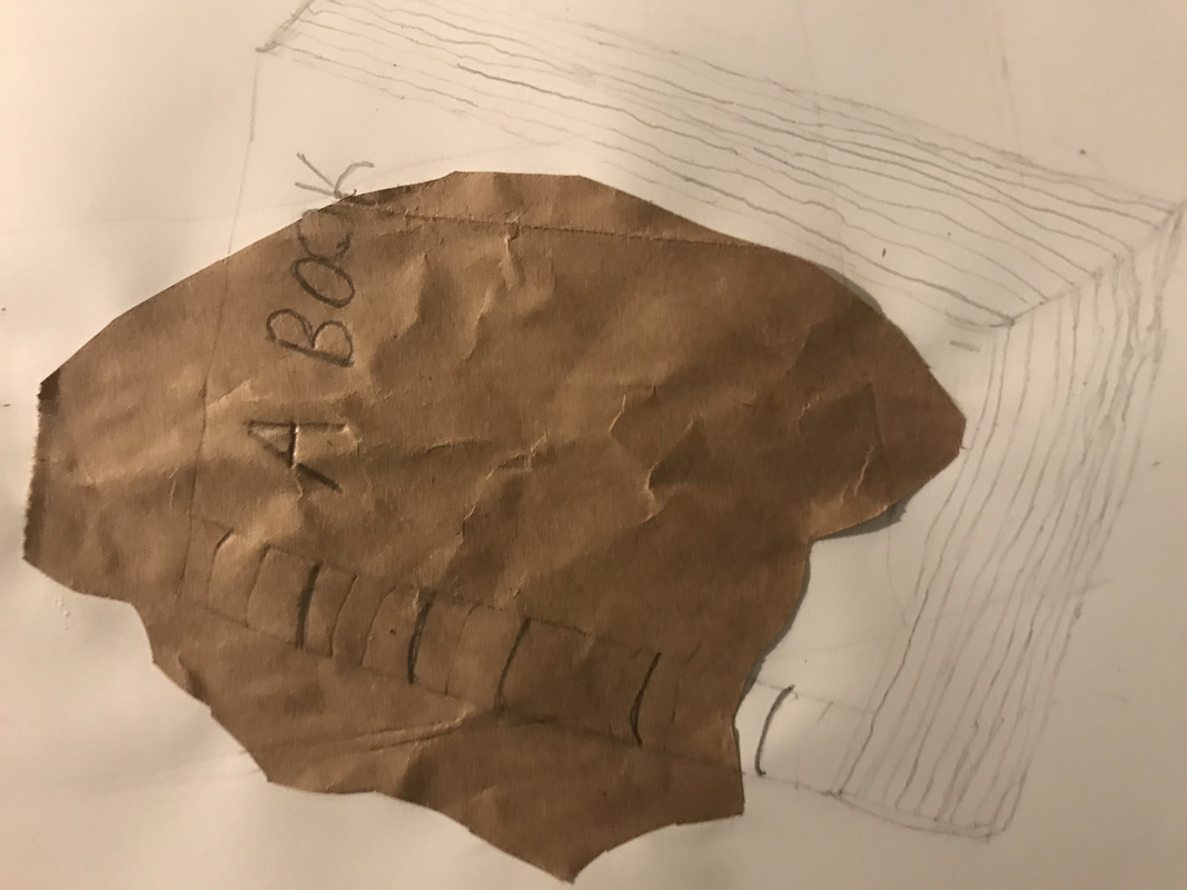
If my artwork was hanging in a gallery, I would want others to know the significance behind it. I recently read Fahrenheit 451 and my art was based on it. Books have always accompanied me throughout my life so far and I'm an avid reader. If they were to go away, I'm sure at least some of the world would be in havoc. Although I've never been one for much social interaction, what I've missed out on because of the pandemic is helped to be forgotten because of books. I can enter a new world and forget about reality even if I don't NEED to. It's a choice, and I'm all about choices. I've somewhat already explained why I chose my object, but my process included finding an old book that seemed like many people loved it in its lifetime and incorporating some fun aspects with color and texture to show how a book can attract many people.Some elements of art and principles of design I included are color, emphasis, contrast, and shape. I think they're all connected but it was mostly because of the different style of the book when it went over the brown paper and the net texture.
Artist: Tasbia U. |
|
|
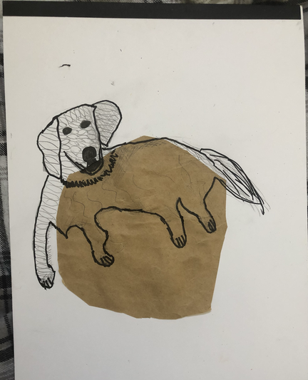
For this assignment, I drew my dog, Amiya. I got her in July and she is a Golden Retriever. Throughout the pandemic, Amiya has always brought me joy, and so, I decided to draw her. First i glued the brown paper onto the back cover. Then, I drew Amiya and added other details (shadow, patterns etc). One element of art I used is texture, when I drew lines in the tail to make it look soft. A principle of design I used is pattern, when I drew diamond-like shapes on the white part of the drawing.
Artist: Guhan Y. |
|
I drew a picture of my computer because my computer helped me learn during the pandemic and helped me connect with my friends. Without it, I would be much more lonely and sad. First, I started by drawing the outline of my computer and then I refined it. Then I drew the keyboard and the screen. In my artwork I used value in my shading to show where the shadows were darkest. I also used form to show my computer is 3D. I used patterns of parallelograms to draw my keyboard.
Artist: Derek Z. |
|
|
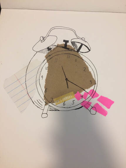
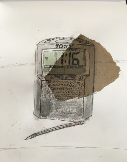
Hi Viewers!! As you can see in the photo, I drew a clock, and a pencil. I chose these items because they are the items that have been most useful to me during RLA learning. The clock because it helps me keep track of time when I am not on the computer, and the pencil is useful because I use it in essentially every class. The process of drawing this was pretty much like any other observational drawing I have done, except that for this one I had to take a picture of the clock, because otherwise the time would have been changing while I was drawing. I think the element of form is incorporated in this drawing because you can tell it is a 3D object by looking at the picture. I feel like the principle of rhythm is used, because the same shapes, and lines are used repeatedly in this drawing. I hope you enjoy this piece of art as much as I do!!
Artist: Sireeta B. |
|
My object is book, and it helped me through quarantine because I could actually have something to do with my life, and I could learn about other characters and how unique they are. I made this artwork by getting a sheet of brown paper, and glueing it in the middle.
Artist: Kevin C. |
|
|
I would want to have my viewers know was, that when I drew this I decided I would find a picture that I thought was normal and boring and make it more interesting. How I did this was by first getting a picture it was on a piece of paper of some kind of pepper then I started by drawing the peppers like they were a little bit scarred then I thought how do I make this interesting I thought if I made it look like they had fallen on a dirty kitchen floor it would look more detailed for a background. I think this shows that you do not need a idea in your head to draw something.
Artist: Hugh C. |
|
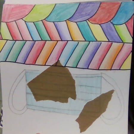
I used a mask because i t helped me stay safe during the pandemic. One principle of design I used is pattern I used patterns in the background space. one element of art I used was line.
Artist: Adhiti H. |
|
|
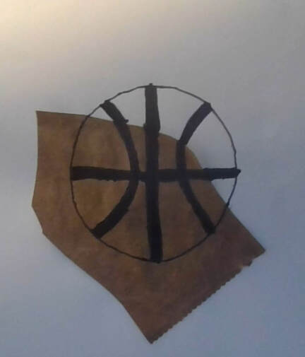
This basketball has been important during the pandemic because it relieves stress. Just to dribble a basketball refreshes my mind. When people look at my artwork, I want them to notice how I kept my artwork simple and filled. It represents that it has been important. Notice that all the shapes inside the image come in many different sizes. Also notice how I emphasize how the ball looks in a simple way.
Artist: Saifan I. |
|
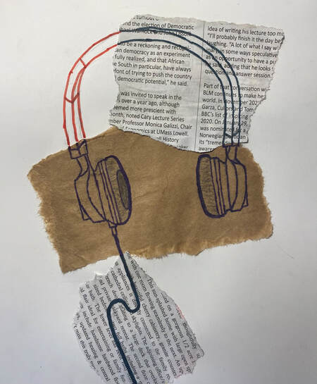
I chose headphones as the subject of my artwork because they have been important to me during the pandemic, they provided a way to escape for a few hours with music, movies, and more. To draw the headphones I started off by gluing down the 3 pieces of paper I would use and letting that dry, then I sketched out the headphones’ shape and slowly added in detail. Once I had “refined and defined” my drawing I started working on my “creative twist.” From the beginning a part of my creative twist was having multiple paper surfaces, but I decided to add on more than that. I decided to go over different parts of the drawing with marker, and some parts with colored marker to add a twist of color to it, but it ended up taking away the detail of the drawing that the pencil lines had created. In the end one Element of Art that my drawing had was color. This element could be found in the different sections(paper surfaces) of the drawing due to it being the “creative twist.” One Principle of Design in my drawing was rhythm. There is rhythm(or is supposed to be) in the part of the headphones that goes over your ears. The same shapes and lines are drawn about the same and were repeated to create a symmetrical similarity between the 2(parts of the headphones that go over your ears), like on the real headphones.
Artist: Claire K. |
|
|
In my Artwork I drew my sleeping mask because, during quarantine I had trouble sleeping and the sleeping mask helped my sleep better. One Element Of Art that is in my piece, is that I have inserted shapes into the artwork. For a Principle of Design in my Artwork, it would be Contrast because, of the different type of paper I glued on. I also choose the paper because I ended up drawing a bit during quarantine.
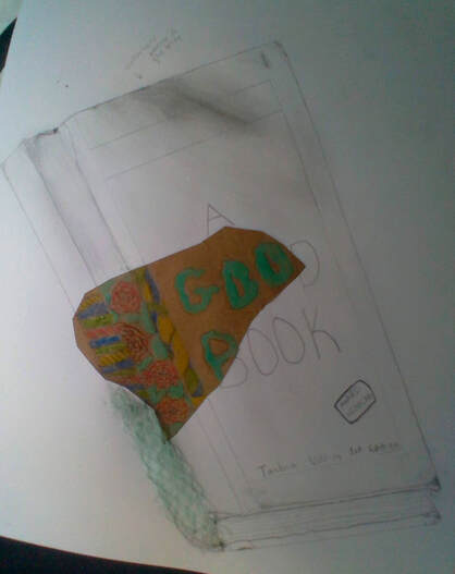
Artist: Tanmayi R. |
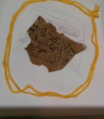
|
I chose Monopoly because over quarantine, my family started playing Monopoly a lot, and we have been having fun playing it. 1 principle of design I used was contrast. I used it in the way that the paper bag in the middle is a different color, and all the lines in there are sharpie, compared to the pencil lines on the page. 1 element of art I used was shape. I used it the way that there was the box, which was a shape, and then I had to draw more shapes on the box.
Joshua K. |
|

|
This collage means a lot to me because humans spend around 1/3 of their life sleeping. I think especially during covid we all spend a little more time in bed and I think thats good. I think its good to get some downtown time and time to relax in this stressful period. I also think its important to remember to take care of your body during this time and sleep is a huge part of that. these are just come of the reasons my bed has been super important to me in quarantine.
Artist: Ayla M. |
|
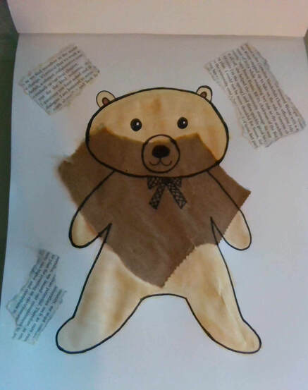
I would want people looking at my artwork to kind of get the idea that things might have several different sides to them. My drawing is on 2 surfaces, one colorful and one not so colorful. You could interpret this in a few ways. Maybe this could be about things being good and bad sometimes. Maybe it doesn't mean anything at all to you. It depends on how you look at it. I chose my teddy bear because it may not be something I can't live without, but life would feel a little strange if it weren't there. You can't tell in the photo, but the teddy bear in real life is pretty big. I've had it for a while, and every day it sits in my room. Whenever I wake up, go to sleep, or even just walking in my room I'll see it. During quarantine we've been spending even more time in the house, so this teddy has become pretty important to me. One element of art I used was shape, because the teddy bear has different shapes (such as circles, ovals, or rectangles that make up the bow). One principle of design I used was contrast. There are 3 types of paper in my drawing, and none of them are the same.
Artist: Ivy Q. |
|
|
What I drew is a basketball. This is one of the most important things to me during the pandemic. During the pandemic I practiced basketball almost every day. I used shape for the basketball. I also used Rhythm.
Artist: Armaan T. |
|
I chose my object (my plant) because my plants have been a nice thing to have around my room and taking care of them or just having them has been a nice distraction from all the craziness in the world. I chose my background (my windowsill) because I love looking out the window on sunny days or at night when the sky is clear because it's really calming to me. When I was starting this piece, I looked around the house for materials. I found some old paper bags, a newspaper and a paper towel tube in the recycling, I chose that because in the paper towel tube you could see that there was bits of other paper and they were colorful, which I loved. I tore the pieces up, glued them onto the paper and began to draw. One element of art that I used was texture, not only because of the varying heights of the paper and paper products but also because with the ripped up paper towel roll you could feel the literal paper pulp. One principle of design that I used was rhythm, for example the leaves of the plant are all a heart shape just ones are thinner or shorter or whatever!
Artist: Isabella W. |
|
|
Artist: Snehal B.
|
|
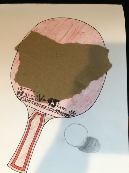
One thing I would want the viewers to know is that this piece of art has a piece of a paper bag in it. This made it a little harder to make the drawing. It was harder to draw on the bag then it was on the normal paper. I chose the table tennis racket because, during quarantine, that was the one thing that I never had to stop doing. It was a part of every day and the only physical activity I was getting. One element of art that I used was line. I used both pencil and sharpie for different types of line. One principle of design that I used is rhythm. The bottom part under the v15 has a repeated pattern which makes a good rhythm.
Artist: Krish G. |
|
|
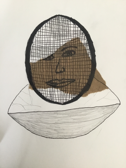
This is my Fencing Mask. The three changes I made to the mask were adding color (although it doesn't look like it), sharpie-ing lines, and adding a unique face on the brown paper area (though that made the drawing look worse). My fencing mask has kept me motivated through quarantine as I have not been able to return to fencing, which inspired me to keep practicing at home. One Element of Art shape, coming from the brown paper. A principle of design may be pattern, where the protective black strips of my mask lays.
Artist: Andrew G. |
|
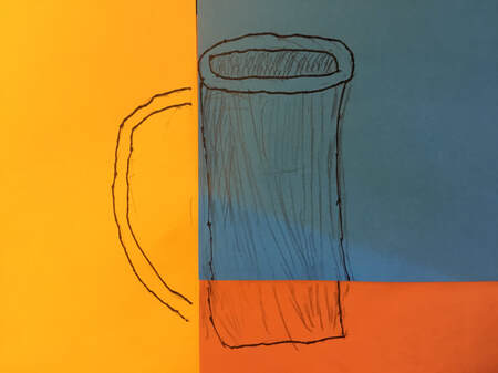
What I want to say about this artwork is that I had gone through a lot in order to make it. My health condition get worse, get better, get worse again and get better again. I would want the people who look at this artwork to know that I was working hard on it:). I choose three piece of colored cardboard because cardboard had become part of my life. We don't get things from supermarket anymore, we get them from amazon and other website. I used color, using it to create a contrast in the drawing. I used emphasis, using it to emphasize the cup.
Artist: Raymond H. |
|
|
Artist: Yi-shiuan L.
|
|
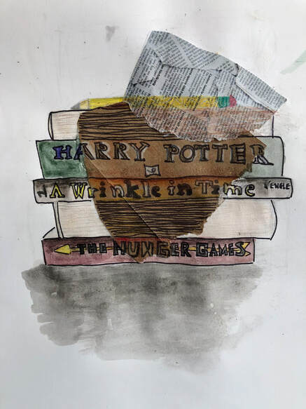
I chose to draw a pile of books because reading has always been something comforting and enjoyable for me. I specifically selected these books because they are my favorites, and I could reread them so many times without getting bored. To make this, I glued two pieces of paper onto my sketchbook page and sketched out my design, then added color. I used different colors and materials for the different surfaces that the drawing crossed on to. I used mainly watercolors, colored pencil, and sharpie. One Element of Art I used was color. I tried to incorporate light and dark when the drawing crossed onto different surfaces and change the color slightly. One Principle of Design I used was contrast. I tried to have the parts with the light watercolor contrast with the bright colored pencil and the dark sharpie and colors on the brown paper.
Artist: Allison L. |
|
|
Artist: Zhangming L.
|
|
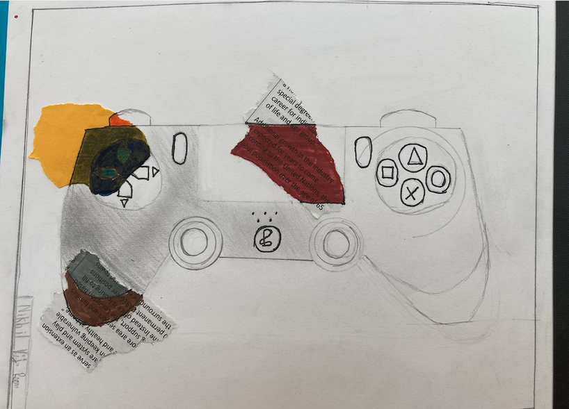
The reason that I chose a PS4 controller is because I use this everyday. I use this so that I can watch TV and play video games. This has been very helpful during the pandemic because it has kept me entertained while we were in quarantine. The first thing that I did to make this piece was to first draw the PS4 controller. After that I decided where to put the pieces of paper, then draw over it. Finally I colored in the paper areas to make it abstract.
Artist: Nikhil V. |
|
|
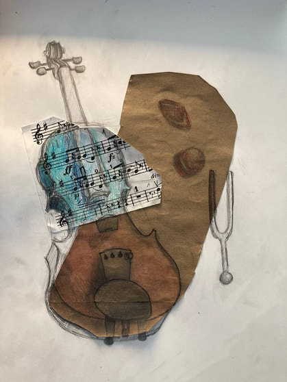
During the pandemic, I've had a lot more time for violin, so it was one of the first things to come to mind when I thought about what to base my work on. I took angled photos of the subject, then drew what I saw in the photos. After I had the rough sketch done, I decided to keep it to match the slightly unkept feeling of the three different textures underneath. For COLOR, I made some parts CONTRASTING colors to show how I both love and hate violin at the same time...
Artist: Chloe W. |
|
This is a broken vase with a flower in it. I created it using colored pencils, magazines, advertisements, and paper.
Jiaming X. |
|
|
I drew my computer combined with a book because these objects were extremely important to me during the pandemic, that I depend on every day. My computer grants access to the web, social media, and countless other things I have the freedom to explore. Books also contain vast knowledge and creativity, so I decided to merge the two together, showing the significance of both in my life. One element of art I used was texture, as my drawing had three layers (paper, brown craft, newspaper); one principle of design I used was contrast, as one section of my drawing is black and white, while the other is colorful.
Artist: Muzi Y. |
|
I chose a computer because it helps me connect with people and also keep me entertained, especially during quarantine. One element of art I used was value. One way I used value was to distinguish between the keys and the rest of the computer. One principle of design I used was emphasis. I tried to put emphasis on the screen of the computer by placing the colored paper in the area the screen is. I wanted to put emphasis on the screen because it seemed like the most important to me. To create this, I sketched the basic shape of the computer, glued the colored papers on, finished the sketch, went over some parts of the drawing in different shades of gray paint, and went over lines of the drawing on the pink paper in a translucent red and for the brown paper, I used brown paint.
Artist: Kateland Z. |
|
|
Artist: Varun K.
|
|
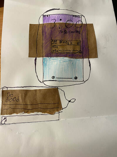
For my object, I chose my iphone because I didn't really have that many things to choose and my phone was important. I had my phone leaning against something and outlined it. For the creative part, I wanted to try having different colors for the papers. So I chose Red, white, and blue. But as I started drawing, I noticed drawing white on the brown paper wasn't easy, so I tried my best and got this.
Artist: Sennan L. |
|
|
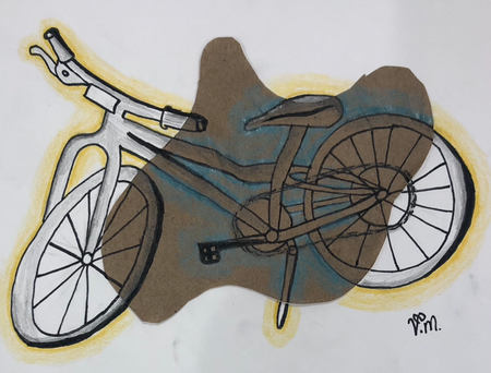
This illustration highlights my bicycle, which is a key part of my day to day life during the pandemic. It was my way of getting exercise and fresh air. This mixed media piece was created from pencils, sharpie, fine liners, and colored pencils. I started off with a rough pencil drawing and slowly added pen and color to make the finished product. The Element of Art that is in my piece is "Value", which is the dark or light in a piece, shown in this with the different tones, tints, and shades of grey. The Principal of Design in this piece is "Contrast", which is the difference between elements in a certain artwork, shown in my illustration by the two colors, yellow and blue.
Artist: Vivek M. |
|
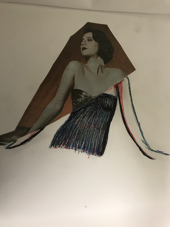
My artworks represents how the most boring people can have the most color ( excitement ) in themselves. We need to help others to be strong in themselves and be confident. I used this particular image o show how the model looks very edgy but could actually be a out-going sweetheart. My Elements of Arts I used lines to how how 3 colors can make more colors in themselves. I also used movement from the Principle of Design. I used it from how I moved my lines.
Artist: Kenisha R. |
|
|
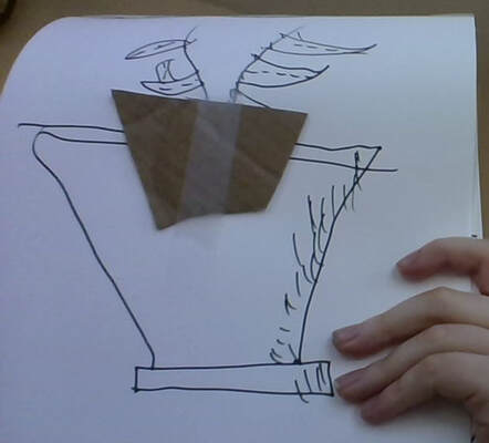
I drew a plant, which means something to me because every month we go out and buy a plant as a family tradition. I decided to add cardboard at the base of the actual plant to represent soil. I drew it in a pot instead of a vase to symbolize a long life. Instead of flowers I drew a kind of bean plant, because that is another plant that sort of means something to me. This is because we plant beans every year in our backyard.
Artist: Samuel T. |
|
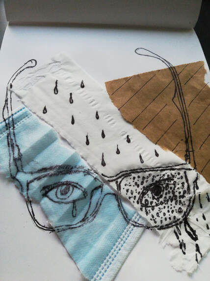
For my drawing I drew a pair of blue light glasses across pieces of mask, napkin, and paper bag. Using observational drawing, I able to mostly accurately capture the shape of the glasses. The different medias represent the events and influences of the coronavirus pandemic. The mask obviously represents how everything was held back by the pandemic, the napkins represents the tears shed in its wake. The paper bag is meant to add a sense of age to the piece. All of the medias have large contrast and different emotions, but through it all, my blue light glasses have helped me get through it.
Artist: Eugene W. |
|
|
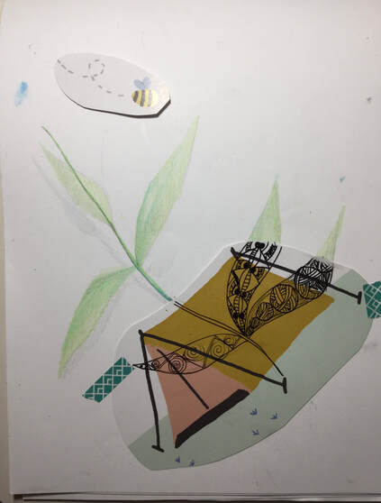
For this artwork I found scrap pieces of paper with designs on them that I had saved from old calendars. I decided to go for a nature theme since the design on the paper was a tent. To balance the drawing out, I decided to keep the leaves simple. I want my viewers to know that nature has it's beauty and we should do the best to preserve that.
Artist: Katie Y. |
|
For this artwork I found scrap pieces of paper with designs on them that I had saved from old calendars. I decided to go for a nature theme since the design on the paper was a tent. To balance the drawing out, I decided to keep the leaves simple. I want my viewers to know that nature has it's beauty and we should do the best to preserve that.
Artist: Emily Z. |
|
|
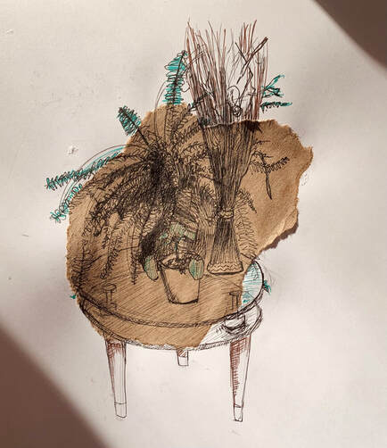
For this project, I drew a small table with some plants on it. These plants, which we got near the beginning of quarantine, make each day of my life full of joy and hope. To draw them, I used lines to make out their shape. Then, I used techniques like hatching, cross-hatching, and scribbling to bring value to them. I also used contrast in values between the plant in the back and the plant in the front to bring emphasis to the plant in the front.
Artist: Maggie Z. |
|
My art work is of a leaf. There are 5 different colors of paper in the background. In each one, i tried to color the leaf as a different season. In one there is red, and in another there is pure green. I choose the leaf because i love how one object can be so many different colors. I started by placing the pieces of paper in the patters i wanted. then coloring over them with the colors i wanted.
Artist: Jackson C. |
|
|
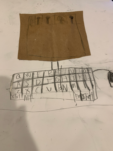
I made this as a computer since that is the main thing I would use during the remote school. It is the main thing I would use during this entire remote school.
Artist: Alastair J. |
|
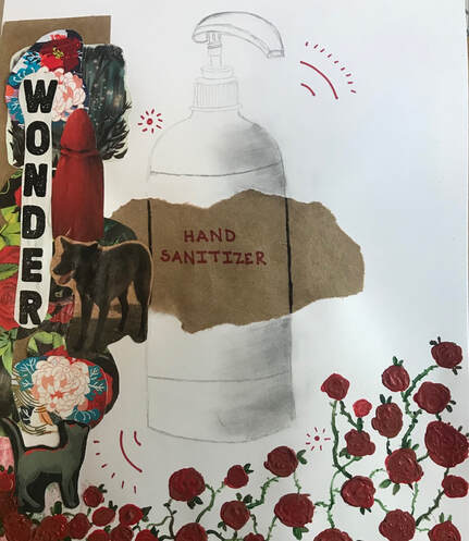
To symbolize something that helped me during this pandemic, I chose.......Hand Sanitizer! On the hand sanitizer bottle the color of everything was either red or black. So I chose red as my theme! So I put the brown paper as a label on the bottle I drew, and because of my red theme I wrote the label in red. I actually had two themes, my first theme was red and my second theme was "wonder". I chose "wonder" because this pandemic period has been a time of wondering. My collage around the theme were red pictures of wild flowers, little red riding hood and more. And last but not least I chose to paint roses because of their red and because of their curious vines. I used modge podge for my collage, and acrylic oil paints for my roses to add texture. My shading was for the shape of a cylinder.
Artist: Vyushti K. |
|
|
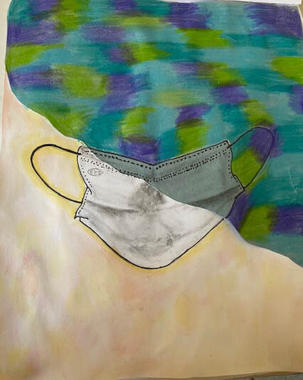
During the pandemic, masks have saved and protected us in countless ways. My mixed media artwork depicts a mask with a colorful background. I covered half of the paper with light blue paper, then drew my sketch over both the white and blue paper. I used a graphite pencil and some basic shading for the mask, then outlined it in marker. I made the white part of the background in translucent watercolor, and the other half in vibrant colored pencil for a nice contrast. An Element of Art I used is color. A principle of design I used is contrast.
Artist: Parnika M. |
|
When I made this drawing I thought of something that has helped me through the Coronavirus and I thought of my mouse because thinking about it my mouse if one of the few reasons my hands haven't basically broke at these points as the massive amount of time I spend moving around my mouse is enormous. Also, I thought about a special thing to add, and normally I would have added my normal mouse pad, but instead I added a mouse pad which in my head I though was cool and helped the design of the whole entire drawing.
Artist: Adwait P. |
|
|
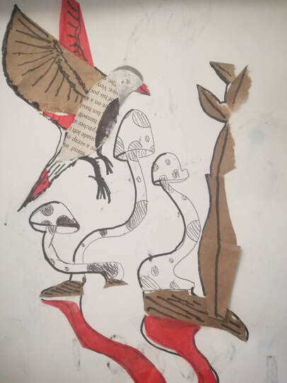
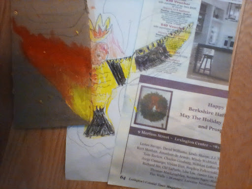
This art work i have made represents, a phoenix, and a king, The phoenix is represented by the flames on his left wing. The king is represented by the crown. And i added a little coloring on the right. I also tried to make the crown look like a flame at the same time. Also i then i added a little pigeon head.I chose this object because i wanted it to represent peace like the peace bird, and i thought it would look cool too! A element of art i used was line on some of the right wing.(Sorry if this is really bad)I also used some patterns! I hope you like it if you don't then that's fine!.
Artist: Alexander T. |
|
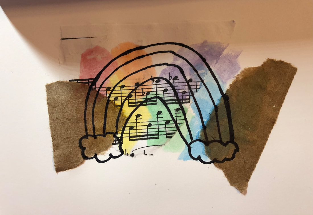
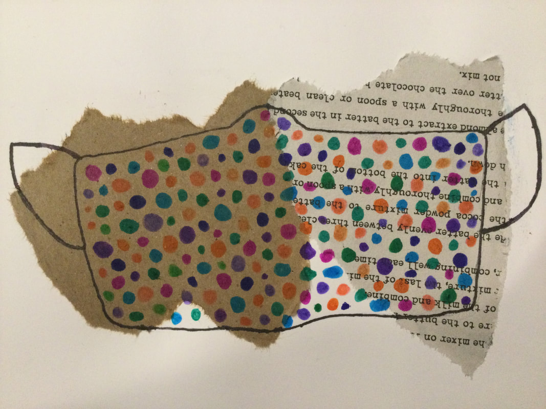
During the pandemic my rainbow dotted mask has been especially important to be because it gave a new meaning to mask wearing, fun and creative. I started this drawing by gluing down a brown piece of paper and a newspaper. Then, using a pencil, I drew the outline of my mask. Next I outlined it with a sharpie. Finally I used colored markers to draw the rainbow dots all over my mask. An element of art that I used is the element of color when I drew all the colored polka-dots on my mask. And a principal of design that I used is the principal of pattern when I use the dotted pattern all over my mask.
Artist: Aairah A. |
|
|
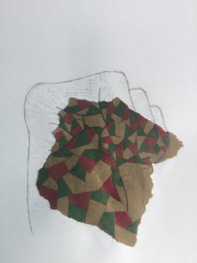
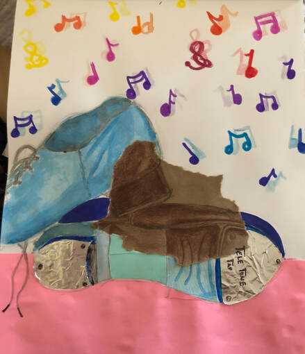
The object I chose are tap shoes. I chose this object because during the pandemic dancing was something that kept my mind off everything that was happening. In addition music that dance created and that I danced to was important to me. One principle of design that I used is contrast. I used contrast colors, near the paper bag the colors are very dark while the rest of the colors are bright and colorful. One element of art I used is shape. On the tap shoe on the bottom I noticed different shapes and cut out different papers that corresponded.
Artist: Anna L. |
Photo Credits & Artist Statements: Courtesy of Individual Artists ©2021 All Rights Reserved.