Environmental Art Installations
Photo Credits & Artist Statements: Courtesy of Individual Artists ©2021 All Rights Reserved.
Photo Credits & Artist Statements: Courtesy of Individual Artists ©2021 All Rights Reserved.
|
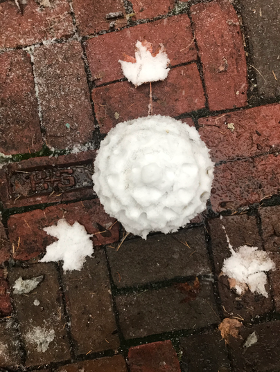
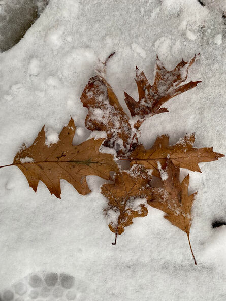
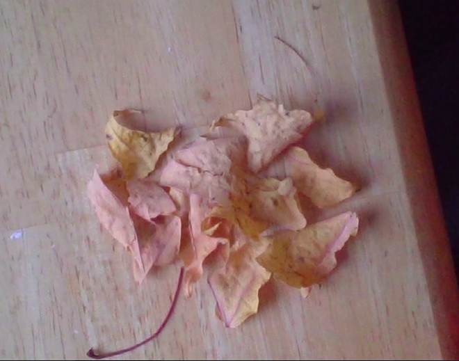
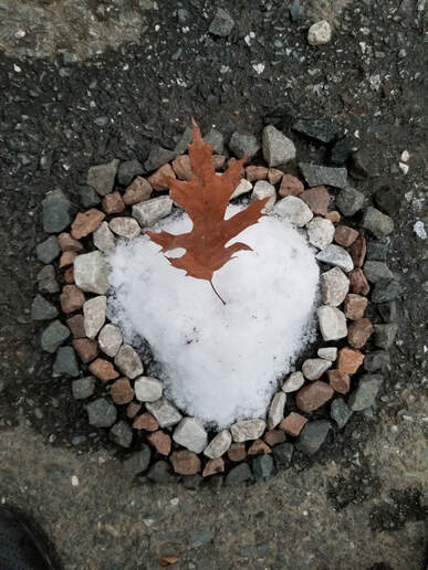
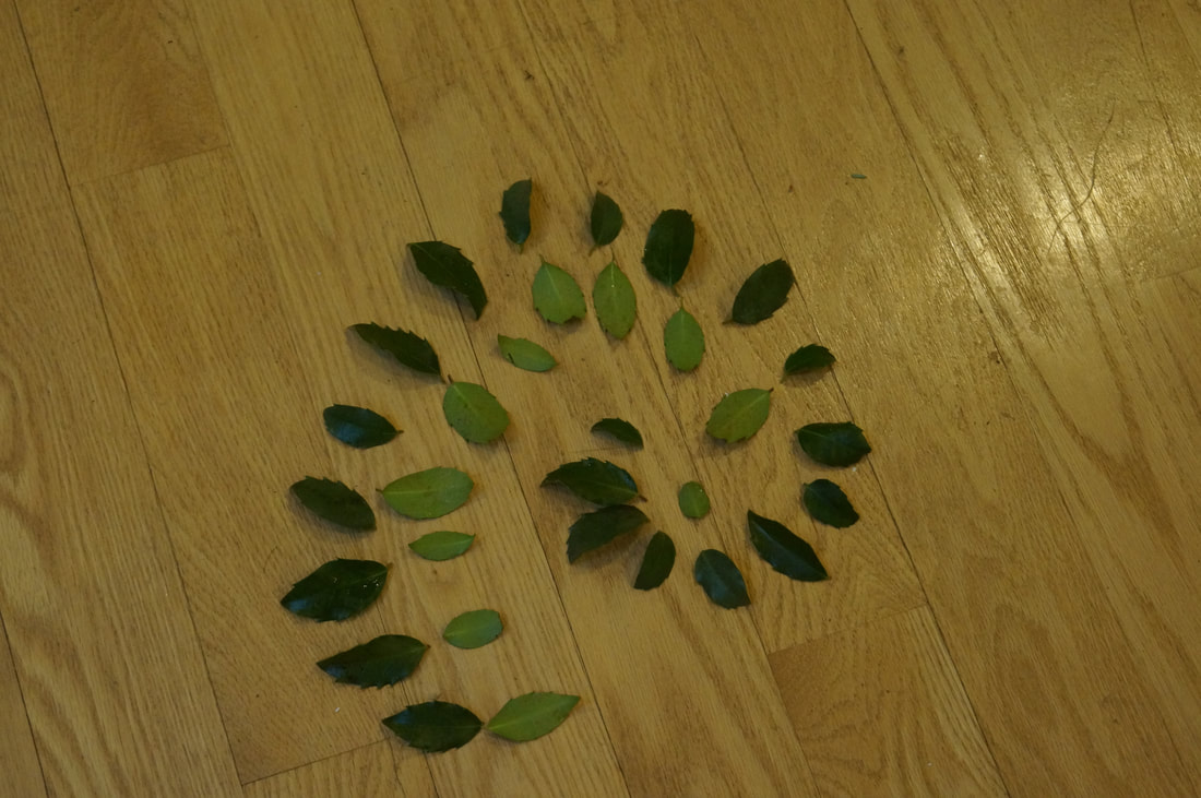
For this creation i made a leaf. I was still trying to think of something to do when it snowed and after i watched the leaf's falling so i made one. It is made out of leaf's and the snow where it is placed on is elevated to make it stand out. For the stem I also used leaf's because the stems of the leaf were too unwieldy. To make it I twisted the leaf's to make a thin strip and then placing it in a leaf format. That is my Leaf creation.
Artist: Jackson C. |
|
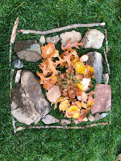
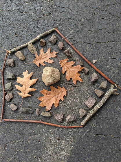
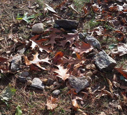
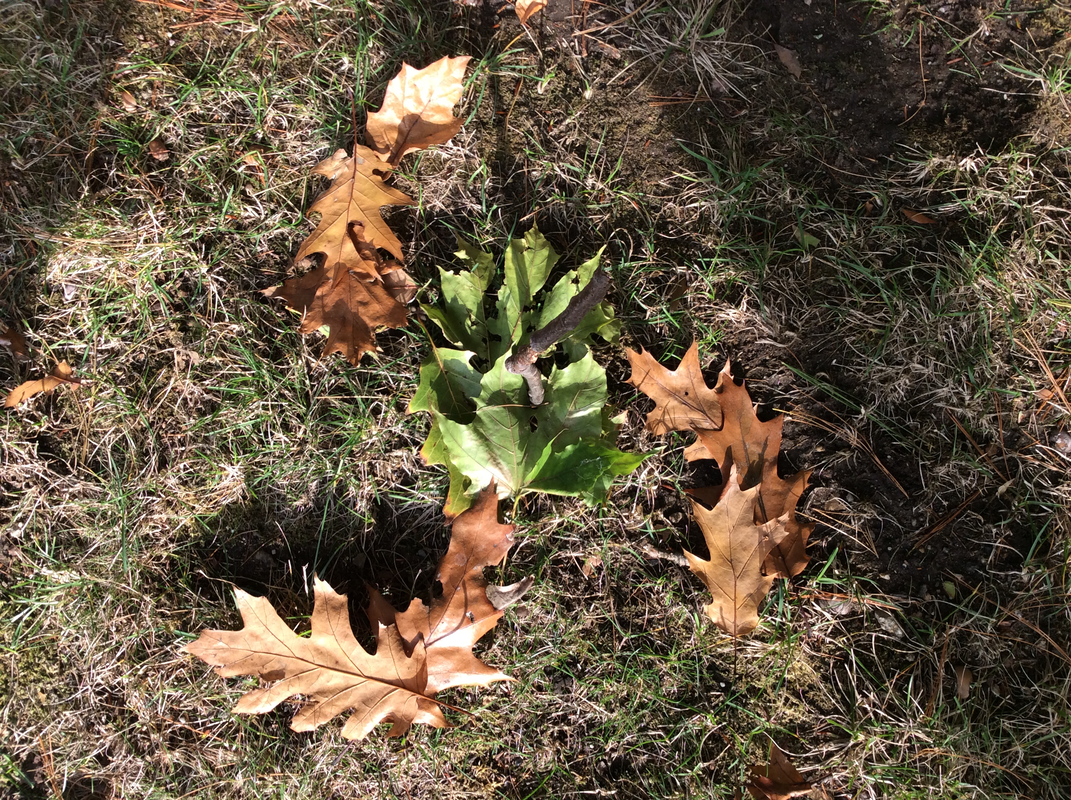
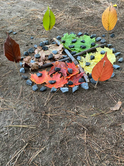
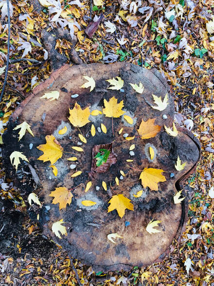
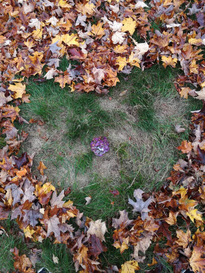
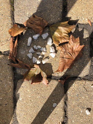
I decided to make it like the earth the sticks and rocks are like the people and the dirt and rocks and stuff and the leaves were supposed to be the core of the earth as I picked the leaves out leave by leave so yeah this is my project tell me if you like it! I used rocks Sticks and these type of leaves and flowers I found and decided which ones to use. My element of art is the fact that I wanted it to be like the earth with multiple layers. The principle of art is the leaves and flowers because not only did I find them but I had also picked just the right flowers and leaves to resemble a fiery core like the earth. First I found just the right size of sticks and then the same with the rocks and then ran around trying to get the leaves and the flowers that were already on the ground.
Artist: Adwait P. |
|
|
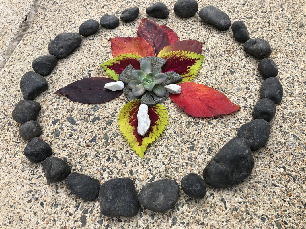
Nature has given us many things. It has given us life and color. In my art piece I show a contrast of color with black and white, but I also expand on my piece by making it colorful but still giving it some contrast by using different choice of colors. My art piece symbolizes the contrast of color it shows how colors can make you feel. My piece suggests calmness and peace. It shows how calmness can be seen in a piece of art. I used rocks, but all my rocks were subtle and smooth. I showed leaves, but all my leaves were bold yet not only one color. My shrub in the middle symbolizes something that shows the freshness of the art piece. And all together they make a sight that is calming but at the same time aesthetically pleasing.
Artist: Vyushti K. |
|
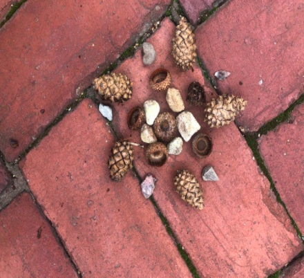
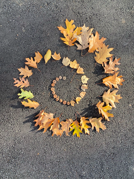
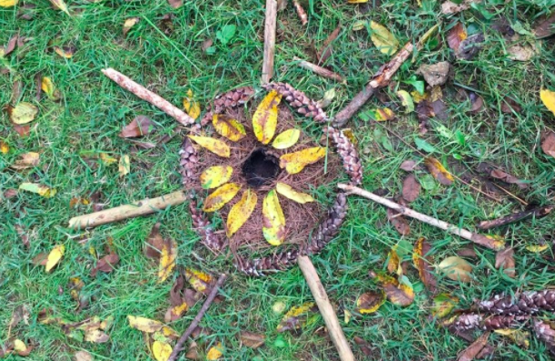
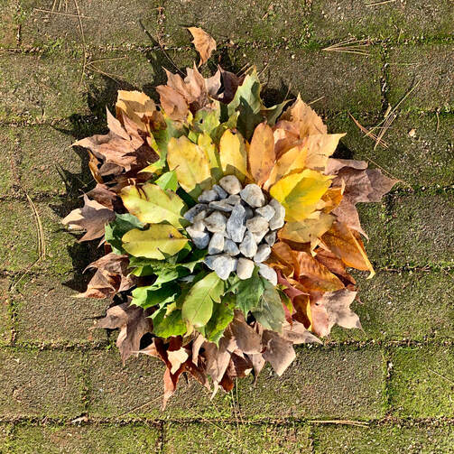
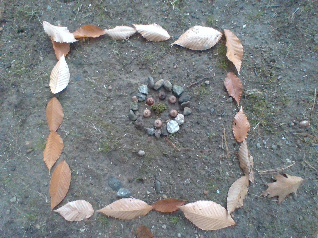
For my environmental art, I used, acorn caps, pinecones, and rocks. An element of art I use was shape. A principle of design I used was pattern. I did my art on my patio, because it was relatively smooth and gave a nice reddish brown background. First I started with an acorn cap as the center, and then I put rocks around it, and kept going outwards. My art was circular, like mandala.
Artist: Parnika M. |
|
|
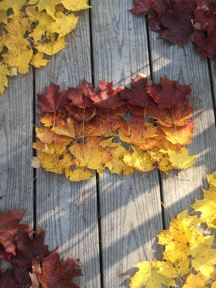
I made this with warm colors (which I like more), and since fall is here, I decided to use that to my advantage, and make an ombre-like color.
Artist: Maile T. |
|
Artist: Aikyan V.
|
|
|
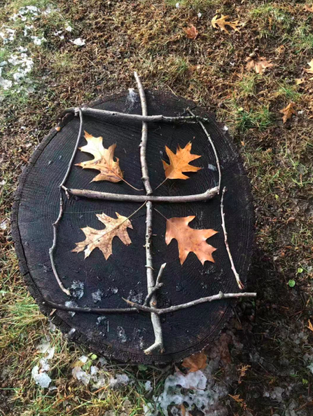
At first, I found some wood sticks and leaves in the yard. There is a cool stump standing on the lawn. Then I picked the thickest stick and put it in the center of the stump. Many Chinese characters are pictographs. For example, the Chinese word “田” means cropland in English. So I spell the sticks as “田”. In the end, I put some Leaves in the field as planting rice in the cropland.
Artist: Zhangming L. |
|
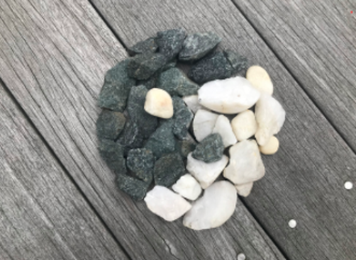
The materials I had used to create my environmental. The shape of my design was meant to be a yin yang and. The principal that I identified of the yin yang was unity because, both sides had a connection on the yin yang. One of my original idea was, to make a circle out of black rocks, make a spiral in it. After that, I would get rid of half the spiral then fill it up with a different color rock.
Artist: Isaac Z. |
|
|
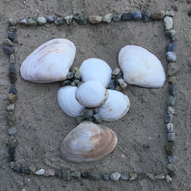
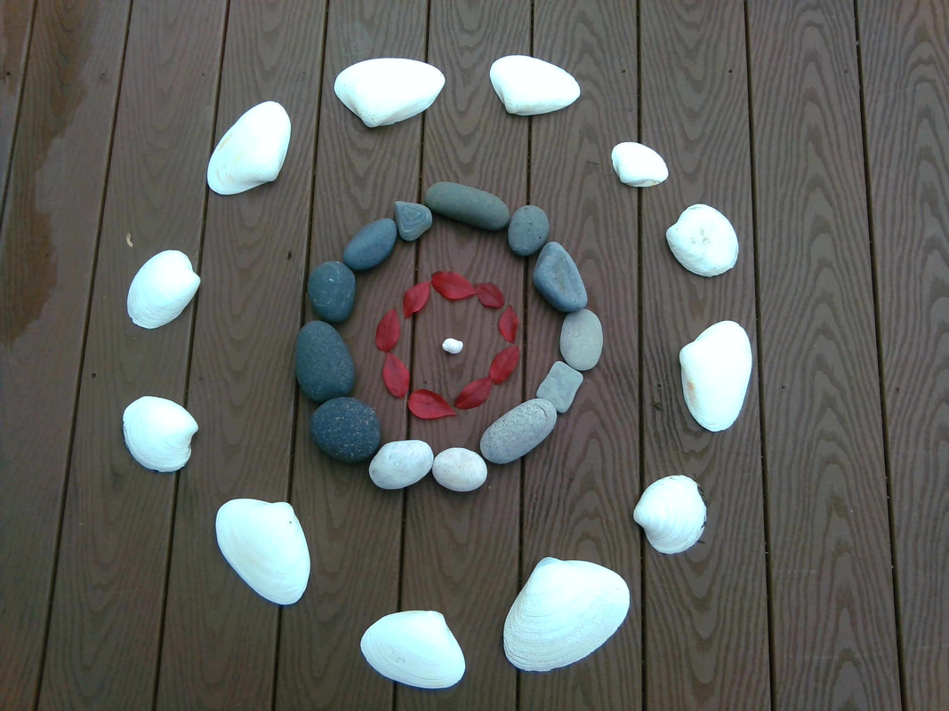
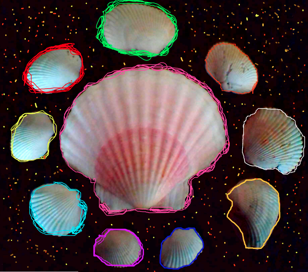
In my environmental art piece I used seashells and pebbles. An element of art that I used was that I used materials from nature and created a design, the design the I created is kind of like a flower surrounded by a border. The flower are the seashells and the border are the pebbles. I made a flower shape with the seashells and then in the gap between the big seashells and the small ones I put in tiny pebbles, then I created a square border around the seashell flower with more pebbles. The background is a sand pit in my backyard and I had to smooth the sand over so I was able to place the seashells and pebbles.
Artist: Aairah A. |
|
I used leaves and small rocks to make my art. One element of art I used was shape. The shape I made was a spiral. One principal of design I used was rhythm because I kept repeating between leaves and rocks. To make this art, first I raked all of the leaves in my yard so that I had enough leaves to make the art. I also did this so that my work space was clear. Then I started putting down leaves. I put a couple rocks down on each leaf so that they wouldn't fly away. Finally I added a rock pattern going parallel to the spiral of leaves.
Artist: Krish G. |
|
|
I used leaves and acorn heads and I used black concrete as the background. 1 element of art I used was texture and 1 principles of design I used was pattern. I first rounded up all the materials that I needed and then decided what I was gonna do with the materials. After that I started putting the materials together to form the final piece of artwork.
Artist: Andrew G. |
|
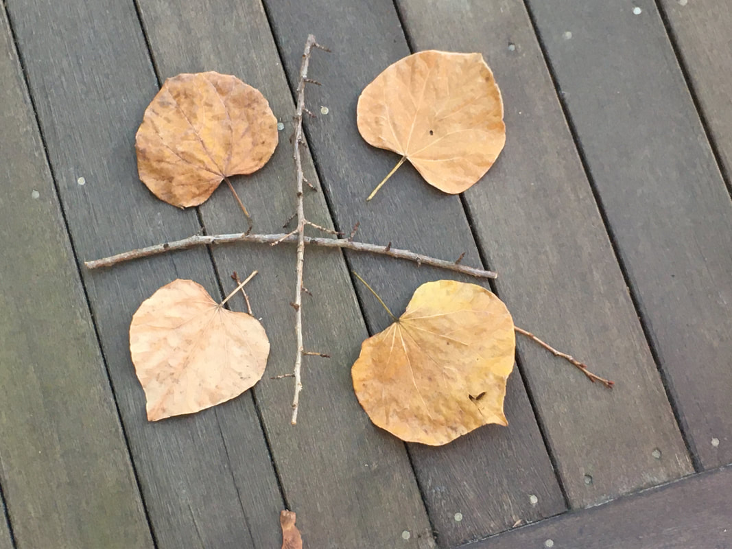
In my work I used leaf and two sticks. I used shape, line for element of art and balance, alignment, proportion and repetition. I sit in front of my computer with a piece of paper, and I came up with this design. Then when me and my dad went out to clear the yard, I found these 4 leaf that look almost the same and a long stick that I felt like I can use.
Artist: Xiaorui H. |
|
|
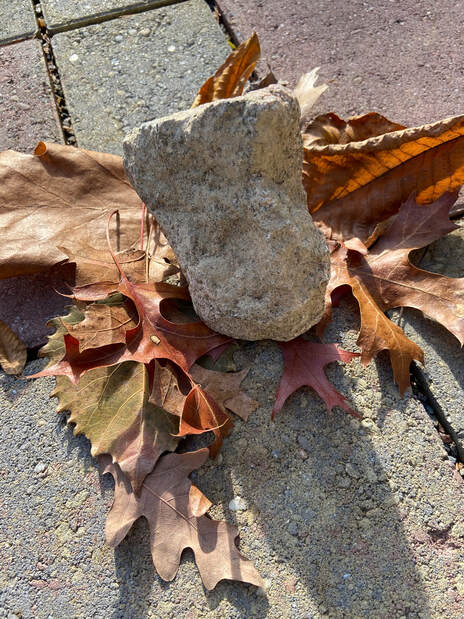
One of the materials I used were stone. I used stone to create an outline for my work area. after I had placed down the largers rcocks and the pebbles between, I had a area to work and had some more ideas about what to do. one principle of art that i used was color. the stones i picked were mostly grey and dull. then you moved in to the next layer which were brown, but had some more color. finally, at the center, I put in a red and yellow leave to stand out. One principle of design that i used was contrast. The entire piece was mostly dull with only a little bit of color, but then in the middle you get a red and yellow leave standing out a lot more than the rest. The way i created my art piece was by first gathering the stones and placing them, then i went and got some dull brown looking leaves. Finally i found that red leaf and got a small pebble to raise it and put them in the middle of it.
Artist: Pranay K. |
|
Artist: Yi-shiuan L.
|
|
|
I used wood sticks and leaves and grass, and some acorn and rocks. My artwork shows repeat pattern. I first find the materials and then started to think what should I make, and then I started doing it.
Artist: Yi-shiuan L. |
|
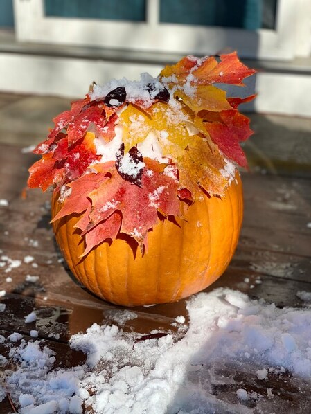
I used a pumpkin, fallen leaves, and snow to make my installation. I used color when I used all orange materials, then having a bit of blue in the background, which provided some contrast. The many reddish-orange leaves on the pumpkin also add a rhythm because there are many very similar leaves. I created this by adding some snow from the top of a bush to the pumpkin, then adding the different leaves and shaping/weaving them in with the snow. Next, I sprinkled more snow on top and took a photo of the finished result.
Artist: Allison L. |
|
|
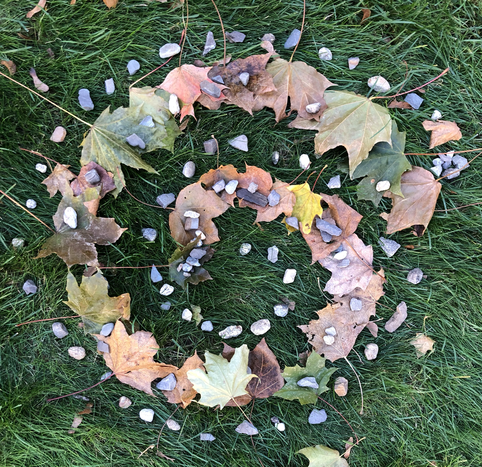
I want viewers of my environmental art is that when I rearranged the leaves and rocks/pebbles, I noticed that there are multiple patterns. If you look closely, you can see that I put the leaves in between the rocks, gradually descending, until there are no leaves. I would also want them to know that I tried to create an inward spiral with the pebbles. Finally, when faced with the color scheme, I tried to use the "fall colors", and instead of doing it on pavement, I did it on the grass.
Artist: Neal M. |
|
The materials I used were different colors of leaves and a twig. One element of art I used is color. I used color in the middle, where all the leaves were green, and the leaves became brown as the spirals went outwards. One principal of design I used is pattern. I used pattern in the spirals that faced away from the green center. I spaced all 3 "arms" equal ways apart. I made this installation by first gathering different colors of leaves. Then, I arranged them into pattern I liked. Finally, I got a dead twig on the ground and put it in the direct center of the pattern, making the twig the axis the "arms" spiral around.
Artist: Anonymous |
|
|
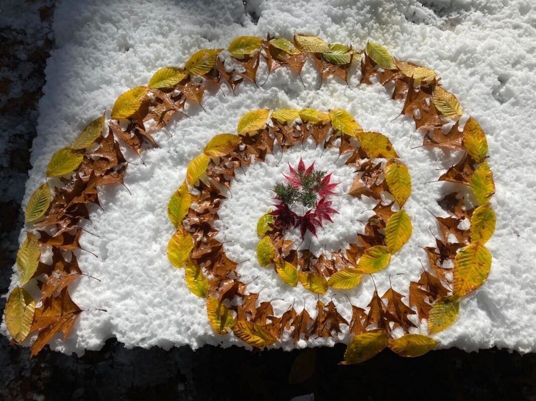
When first starting this project, I really didn't know what to do. Our backyard was quiet spacious, but there weren't many rocks or spare sticks to be found, especially with the extra layer of snow. After thinking through and walking up and down our street for a while to no avail, I gathered some random types of fallen leaves (some from my neighbor's trees) and let inspiration take the reins from there. I thought back to the environmental artists that I had learned about and the different ways that they used to resources they had to their advantages. I looked more closely at the different colors and shapes that could be found in the area that I was in, and was surprised that there was a lot more than I had originally thought, despite the lack of some materials that many other people used for their creations. In the end, I settled for a spiraling pattern (similar to many other artists), with brown oak tree leaves on the inside and green/yellow American Beech tree leaves on the outside (I used one of the Elements of Art, color, in order to draw attention to certain aspects of my work - the different colors of the leaves, and the eventual bright red of the maple leaves in the center). Deciding the center piece was the toughest overall, since the center had to be emphasized in order to draw viewers' attention, one of the Principles of Design. I just couldn't find much in my surroundings that stood out a lot, since I had already used the bright red maple leaves (I had originally planned on using that as my center piece, but finding the circular pattern, I changed my mind). In the end, with a bit of my mother's help, I ended up finding a spare branch that had fallen from the big pine tree in our backyard.
Artist: Chloe W. |
|
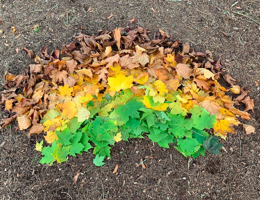
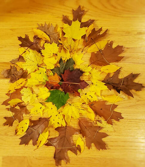
My artwork uses entirely leaves that have fallen on the ground. I collected leaves of different color, size, and texture. Then, I put green leaves in front and blend in the other colors in a fan shape: yellow and maroon. This shows the beauty of autumn and the diversity of the world. The idea was originally inspired by the trees in my yard that had similar patterns on their branches. One element of art that I used was color because the colors had different brightnesses and shades; one principal of design I used was balance because I tried to put larger leaves in the middle and smaller ones on the sides symmetrically.
Artist: Muzi Y. |
|
|
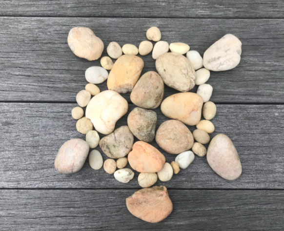
In this piece, I used different sized rocks for different parts of the turtle. One element of art I used was shape. For the rim of the turtle shell, I used small rocks and to fill that in with bigger rocks. I then used medium rocks for the head, limbs, and a small rock for the tail of the turtle. One principal of design I used was rhythm. I used rhythm for the turtle scutes by trying to find rocks that were similar in size and shape. The steps I took:First I gathered medium and small sized rocks that were round, and one rock that was more triangular. Then, I formed a circular shape with the medium rocks and filled it in, which would be the scutes. After that, I made a rim around the medium rocks with small sized rocks. Finally, I added the head, limbs, and tail.
Artist: Kateland Z. |
|
In this piece of work, I used small rocks and leaves of different color. When I was looking for materials, I saw this bush made up of green leaves, red leaves, and a mix of both, so I found a place to build and started working. I created a spiral of leaves that get darker and redder as you get deeper.
Artist: Sennan L. |
|
|
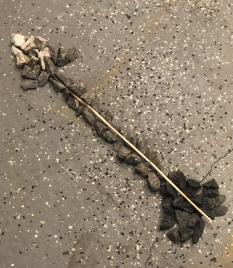
This piece is called "Shadows Pierced by Light." This artwork was created using twigs and stones of various shades. One Element of Art in this piece is "Value." I chose this because this artwork emphasizes the different hues of black and white. One Principle of Design in this piece is "Movement." This is highlighted by the arrow pointing to a direction and the hues changing in that direction. This piece was created by gathering rocks and stones and meticulously sorting them by color to eventually be able to arrange them in the desired pattern then add finishing touches such as the twig.
Title: Shadows Pierced By Light Artist: Vivek M. |
|
I want the viewers to know that this art with nature as well which is very unique. It has only leaves and rocks and pebbles and still looks very nice and unique. The color and shapes are different from normal art. The rock is also a very interesting shape. There is balance in the art as well, with the leaves all around and the rocks and pebbles right in the center balancing everything.
Artist: Suhana N. |
|
|
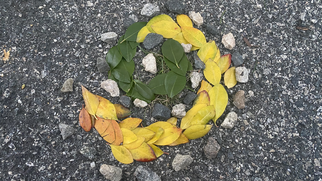
The seasons are changing. The circle of life goes from spring to winter. The rough edges we bump into. Life doesn't go perfectly like everyone thinks. It can snow one day then can be sunny the next. This is the circle of life! I used leaves with a smooth surface, grass, and rocks. I element of art that I used is shape and the element of design that I used is color. I wanted to do something related to seasons, so my theme went to the circle of life. I always loved doing something with seasons. The rocks symbolize the rough edges in life, the green leaves is symbolizing how early life was fresh, and the yellow leaves symbolize the end of the road is coming in life.
Artist: Kenisha R. |
|
Artist: Ahmed R.
|
|
|
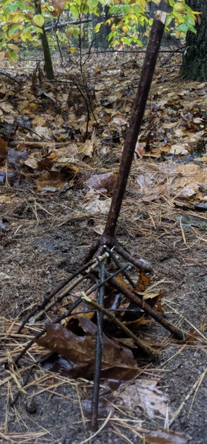
In order to make my Environmental Art piece, I first took a large stick I found in my backyard and let my dog tear off pieces of it. Then I took the small pieces and put them into a pile, and took a picture of them. Then, I arranged the twigs into a triangle shape. I made sure to use the twig that had a lot of miniature branches branching off from it as one of the vertices. After that, I took some dead leaves from around the yard and put them in handfuls into the area surrounded by the twigs. I thought about adding more parts on top from leaves, but I realized that it might make the shape not as effective. Once I was done, I wasn't entirely sure how to take the picture, so I took 10 pictures from different angles to see if I could avoid glare. I picked #2 because it had no glare, but I had to crop myself out because my piece was barely visible with me in the picture.
Artist: Samuel T. |
|
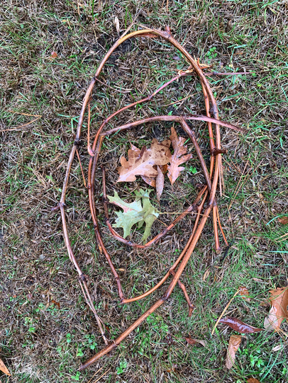
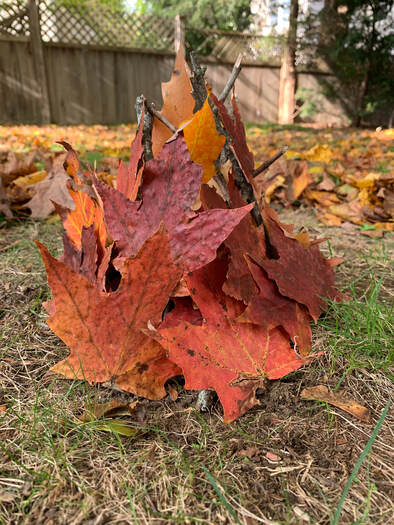
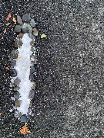
For my project, I created the shape of a leaf using leaves in my back yard. The piece contains elements like value and principles such as rhythm. These can be found in the many shades and colors the leaves take on as they are all put together in the leaf formation. It shows the idea of many little pieces coming together to form a work of art.
Artist: Eugene W. |
|
|
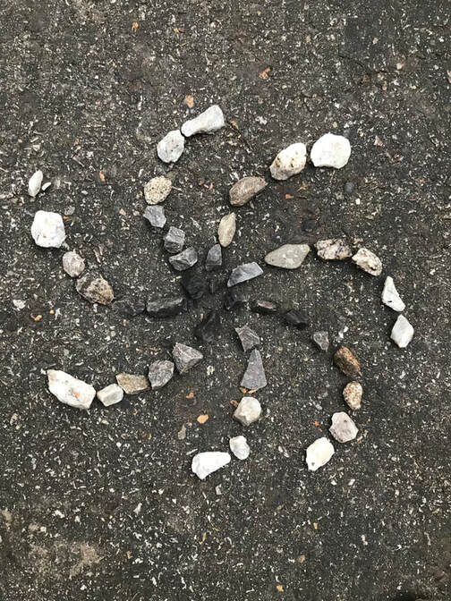
While taking a walk in my backyard, I noticed piles of dark and light small rocks. I realized that I could sort them into a gradient color from dark to light. I decided to assort these rocks into balanced lines that curved into a spiral. My process in making this was fairly simple, place the darker rocks in the center and slowly change into whiter rocks on the outside.
Artist: Katie Y. |
|
I used 3 different kinds or leaves to make this. There are a lot of different colors that contrast each other in this picture like the orange and green leaves. I piled up the orange leaves into a circle, then filled the circle with big green leaves. Then I sprinkled some tiny leaves and make an "E" in the center. Then when I took the photo, I made one side of the photo really light and one really dark to represent day and night.
Artist: Emily Z. |
|
|
For this weeks project, I made a flower out of white-colored stones and fallen leaves. By using color, I created a gradient from redder - orange leaves, to yellow, to green, making each part of the flower fade to brown at the tips. I wanted to use the fallen leaves because I found it unique how this year, there were so many leaves, still colorful, on the ground. The early snow, weighed the leaves down, causing many to fall, even when not ready. I organized some of these leaves into piles by color, and placed them in a radical pattern around a circle of stones that I previously prepared.
Artist: Maggie Z. |
|
Made only from leaves, and shows a spiral by using space and proximity in a new perspective. Started off as a pile of leaves on the backyard. Not damaging the environment it was then turned into a glamorous spectacle for the eyes. A spiral drawn with orange leaves. Contrasted with the brown ground.
Artist: Parth K. |
|
|
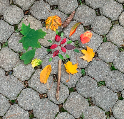
I used colored leaves (green, orangish, red and yellow), A stick, berries, and a pinecone. I wanted to incorporate the element of color, so I chose multi-colored leaves, and I wanted to add the principle of pattern so I continued the flower pattern. Creating the art was a lot of fun. I found the materials in a wood near my house, and I got to work. I took the pictures and I am glad I did then, because the wind kicked in and my art was gone by the next day. I first added the berries and then worked from in to out, so outward. At the end I got the second picture (see above, final product) and the first picture is a picture of my art in progress. I was inspired by the seasons, so I decided to make the berries symbolize winter because berries are one of the plants that survive in the winter, the colored leaves (orange, yellow and red) are fall because the leaves color changes in the fall, the green leaves are spring because the green leaves come out in the spring, and the flowerish design is the summer (I couldn't find any real flowers so I had to make do). I titled my art "The Environmental Cycle". I hope for people to enjoy my art and I had a lot of fun making it!!
Artist: Sireeta B |
|
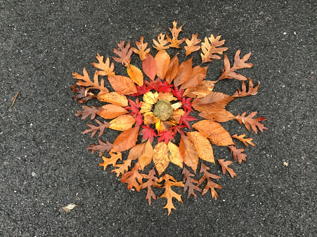
The environmental art I made was called, "Autumn's Cycle". The materials I used to make this were rocks, leaves, sticks, and twigs. A element of art I used in this project was color, and I used this through leaves. This helps us understand the difference in the colors of leaves based on the part of autumn's cycle they are on. A principle of design that I used was pattern. This was used through the rocks in the art. If you look close enough there is a pattern between the rocks, and this is the number of times they occur. For the outer circle there is 8 rocks every quarter, for next circle there are 4 per quarter, then 2, then 1, this is the reoccurring pattern in the art. The process of this art began with the creation of the circle, then the addition of the sticks, and then the inner rock circles. After that I added the 4 leaves on twigs to the end of each stick, to help show the change of color that takes place in autumn.
Title: Autumn's Cycle Artist: Claire K. |
|
|
My art piece is supposed to represent the different types of leaves, on trees and plants. The materials that were used were different types of leaves, and a few white flowers. The form of the piece is shaped in a way that makes it seems sort of like a flower, or a rangoli design. The pattern of the piece done in a very parallel way, so that the leaves and flowers end up opposite of each other. The process of making this piece I had to look around my yard to find different types of leaves and flowers, to eventually put the together.
Artist: Tanmayi K. |
|
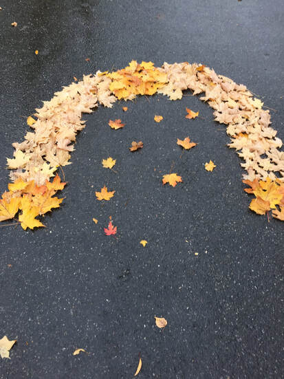
I used leaves to make my piece of art. I had a bunch of leaves in my yard, so I figured I would use them, and I saw some in a kind of squiggly line, which reminded me of an arch, so I decided to build a arch. I found a spot to make it, and started placing the leaves in position. I started with the top, then I moved on to the sides. I used shapes in my art piece, as I made a arch, and an arch is a shape. I used contrast, as the red-yellow flip side of the leaves is different to the white/light brown main part of the arch.
Artist: Anonymous |

|
|
The materials I used were some leaves, rocks, and seashells. One element of art I used were shapes. The shapes were mostly circle-like, but some of the rocks were oval. I don't know what shape to call the leaves (maybe a oval with a pointy end). A principal of design I used was rhythm. There were repeating circles, as you can see with the circle of leaves, rocks, and seashells. The progress of making this was pretty simple, I first made a circle of red leaves then put a little seashell inside. Then, I made a circle of rocks around it, and then a circle of seashells around the rocks.
Artist: Ivy Q. |
|
I made this piece of art using different types and colors of leaves. I used the shades of green for my color. I started in the middle and then worked my way outwards. I used pattern with my piece of art.
Artist: Armann T. |
|
|
In this piece I used rocks, and leaves, a piece of wood, mulch and pebbles. and for the leaves surrounding the one in the middle I was really gravitated to the bright yellow leaves. Then I found one green leaf with a red stem and I thought that really emphasized my point and exaggerated the contrast a bit. overall it was really fun to just go outside and have my art go along with my thought process like I would plan to make it one way but then I would see how I could use that in art.
Artist: Isabella W. |
|
In this piece of art, I used an old soccer ball, 3 similar leaves, and snow. I used the "shape" element of art, when I looked for the shape of the leaves. I also used it when selecting my centerpiece item, when I chose a circle(sphere). I also used the "texture" principle of design, when I used snow. The base texture is a little bit gritty, but the grooves in the snow are smooth, due to it melting and freezing into ice. To make it, I had to wait until a fresh blanket of snow covered these items. Then, I used my finger to carve grooves into the snow on top of the soccer ball. I left it alone for another 2 minutes, and then took the pictures.
Artist: Olivia B. |
|
|
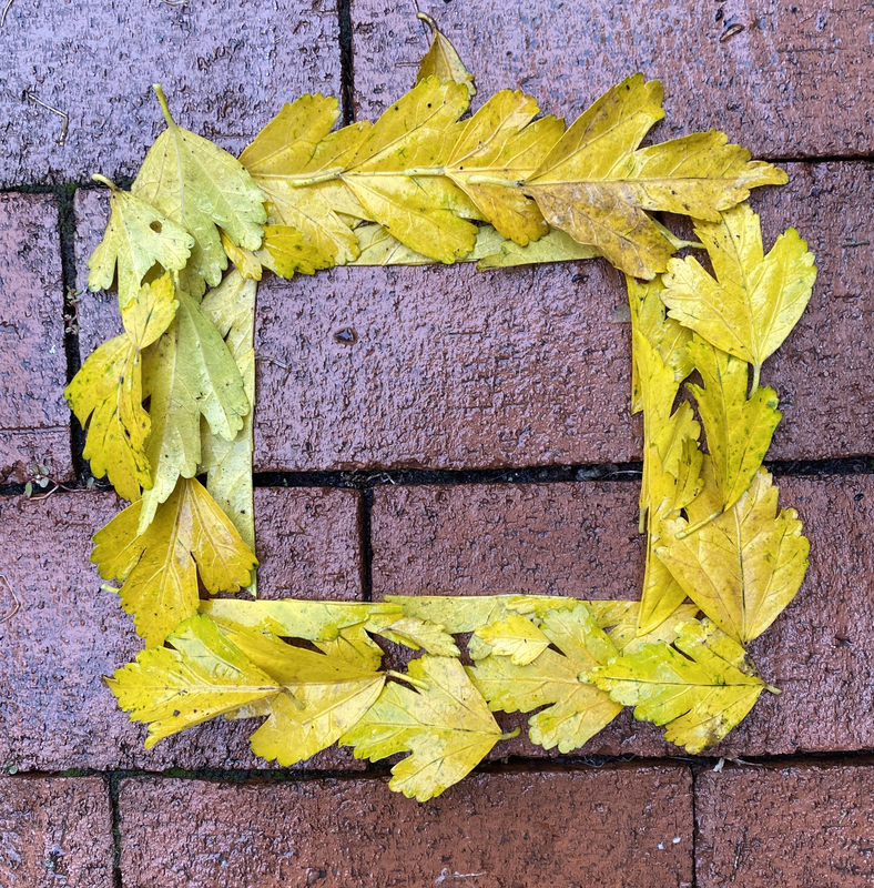
I used some fallen leaves that I found in my backyard. How I made this was by finding more flat leaves, so they would be able to lie on top of each other smoothly. I also cut some of the leaves to create a sharp edge, which I used to make the square in the middle. One element of art I used was shape, because the leaves made a square in the middle. One principle of design I used was contrast, because the bright yellow leaves stood out against the darker brick floor.
Artist: Grace C. |
|
For my piece of Environmental Art i tried to incorporate things like shapes into it . i wanted my viewer to see the shapes out front and the spiral like pattern . i first started bye racking up the levees and then putting them into a square shape . after that i used some rocks to make a circle in side on it and then put a clump of moss in the middle . lastly i just put some acorns in between the layers . i hope my viewers can see the symmetry of the layers.
Artist: Seraphina D. |
|
|
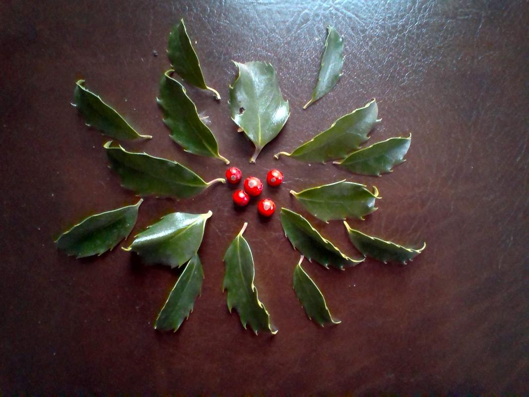
In this piece of art, I used the leaves and the berries of blue princess hollies for my materials. The viewers could see that I created circular patterns by arranging the leaves around the berries. The reddish color of the berries and the greenish color of the leaves create contrast in my work. By picking leaves and berries from the blue princess holly in my front yard, I created my environmental installation.
Artist: Emma H. |
|
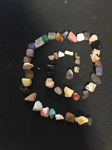
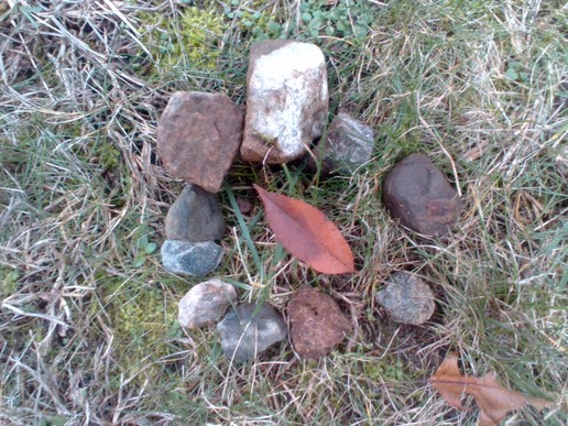
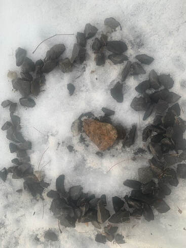
These rocks are from my rock collection. All the rocks here are special and rare types of rocks. I made them in a spiral shape. The rocks go from smallest to largest. There are also a variety of different rocks here including obsidian, lapis, and emerald.
Artist: Aryan J. |
|
|
When I was doing my work, I tried to use emphasis by making the texture fire stick out from everything. For my project I used many multi-colored leafs. At first I had to find the leafs. then I made a ring on the outside of the fire be kind of like rocks. when I finished that i put all the yellow leafs I found in the middle and made them stick up.
Artist: Panagiotis K. |
|
I used dead leaves to make this art piece. All of the leaves I used were brown and I formed them into a circle. I aligned the middle leaf to be in the middle of the circle so it looked balanced. When I did this, I first wanted it to be just 2 rings of leaves that are concentric. Then, I realized that I felt like it would be more interesting to put a single leaf in the middle. Another thing I changed was that I decided to put more leaves on the circle making it pop out more. That is how I made this piece of environmental art.
Artist: Luke L. |
|
|
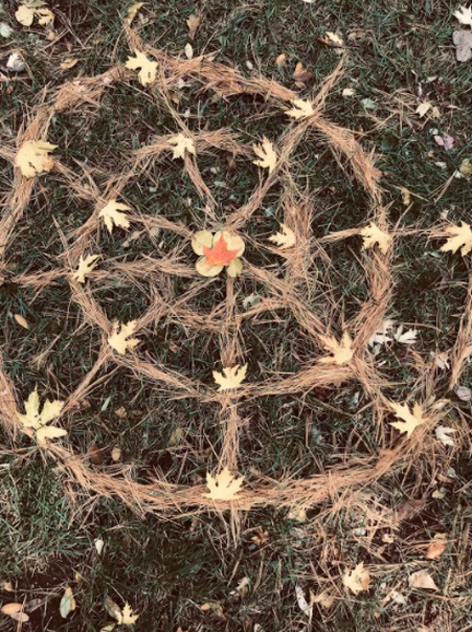
I did this project with my sister so I will be using the phrase "we". I hope that's okay. We used pine needles and fallen leaves. We used lines curved and straight as our element of art and we used a pattern as a principle of design. We started by collecting the leaves and pine needles then we made a spiral with the pine needles. After that we placed the pine needles on the spiral to make lines like a spider web (which was our main inspiration). Finally we got our leaves and put them and each cross section we saw fit. This was a fairly simple process that required easily found materials.
Artist: Rishit S. (+ sister) |
|
I used the flowers in my back yard for the project. I used a different shades of flowers. I tried to put most of the dark colored flowers and light colored flowers on different sides because it would look like one side had less light. I tried to look for good materials such as rocks and twigs, but there weren't any in our back yard. So my dad let me take some flowers that had fallen from his plant. I used them to make a heart and a DNA strand thing.
Artist: Safin U. |
|
|
This environmental art installation was made with snow and leaves. The Snow was covered with beautiful brown leaves, making this an elegant piece of art. The brown leaves were arranged into a star pattern on the blank white snow. This image was taken on a snowy October day in the year 2020.
Artist: Monish V. |
|
In my Leaf Clock, I used leaves from all over my backyard and I only picked out a few colors. Red, green, yellow, and brown to make it feel like the changes from the warm and sunny part of Autumn to how fast it can change to the cold and dreary part. Although there is many Elements of Art and principles of Design, I picked out the ones that stand out most. I shaped out a circle or an oval to make a clock like feature and I used contrast between Red and Green with Yellow and Brown. I made this "clock" inside because the yellow matching with the leaves made it seem somewhat transparent. One little thing I added was around the clock. I cut each stem from almost every leaf to make a base or outline of the "Clock".
Artist: Aman V. |
|
|
Artist: James X.
|
|
I created my environmental art installation from leaves and pebbles. I used contrast and texture in my installation. By pairing the smooth pebbles with the rough leaves, I used texture. I used contrast by using many different looking and feeling materials in my photographs. I created my installation by first raking leaves into a pile, then collecting pebbles from my front yard, and finally arranging them in the way that I wanted to.
Artist: Audrey Z. |
|
|
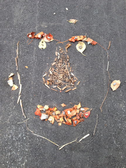
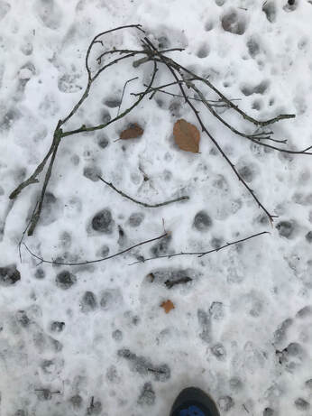
In my artwork, I wanted to make a human face with natural objects. I used leaves, rocks, wood chips, and sticks. Overall, I tried to make each part of the face a different texture, like how the nose is filled with wood chips and the eyes are leaves. I tried to make this symmetrical, but because of how nature is, it is not perfect. To make this, started making the top, then moving down. And this is what I made.
Artist: Sophia Z. |
|
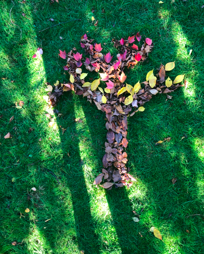
In this piece I used leaves from various trees around my neighborhood. I sorted the leaves out into different colors and then placed them on the grass in a way that made them look like a tree in fall. One element of art I used is color, I found brown leaves to act as the tree trunk and I found leaves which ranged from red to yellow for the leaves. One principle design in my piece is emphasis, the contrast of the brown leaves and the bright colorful leaves creates emphasis.
Artist: Anna L. |
|
|
I used dead twigs from our grape vine and fallen leaves to recreate a birds nest. I broke the twigs and entwined them similar to how a bird makes its own nest. Then I carefully placed the leaves of specific color in the center of the nest. The green leaf is the bird and the 3 brown leaves are the eggs. I used the texture element of art when I used the twigs to create the nest because their texture and color is very similar to a nest. I used the contrast Principle of Design to make the bird very bright in contrast to the rest of the brown nest because it's alive and lively.
Artist: Shivani B. |
|
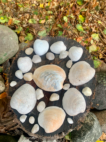
My installation is called "Arbre De La Mer" which is French for "Tree of the Sea". I showed a tree stump with white shells and rocks on it. One Element of Art that I used in my installation was color because I chose only white shells and little white rocks. I did this because I have always loved how white shells look on the sand at the beach, and I have always found that they are always so pretty to look at. One Principle of Art that I used in my design was the pattern, because I put seashells all around the stump, and put little white rocks all around the rest of the Tree stump. When we looked at the other examples, I noticed that someone else incorporated a tree stump in their installation, and I got inspired to do the same.
Title: Arbre De La Mer Artist: Karina B. |
|
|
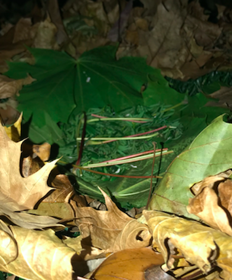
My installation is made out of sticks and leaves that I found after they fell off trees. One element of art I used is form. I used form because I caged the leaves in which exemplifies 3 dimensions. One principle of art I used is emphasis. I emphasized the leaves by caging them in sticks and focused the view with the stick in the back that resembles a tree with the top cut off. When I went to the woods, I didn’t know what I was going to make, but then I saw something that someone else made: broken branches holding up another branch to form a hut or a cage type model. I took inspiration from their creation and made something similar. I decided to trap leaves inside and push all the other leaves away, to represent that the other leaves wanted to stay away from the caged leaves, but in the cage I picked the kind of leaves that were most common among the ones I found.
Artist: Ayaan G. |
|
I used pine needles, leaves, and sticks that I found. For the elements of art, I used color. The design I made is mainly one color. For the principles of design, I used contrast by adding leaves that were a different color. I started making this by collecting a lot of pine needles, then arranged them so they looked like mountains. Then I decided to add some leaves and sticks for contrast.
Artist: Anonymous |
|
|
|
The materials I used were leafs, rocks, sticks, and a log.The elements of art I used were shape and color.How I used shape was I made the sticks into a circle and I used color by using bright colored leaves.My process of creating my environmental art was first I would go outside and take a walk and just look for things that I thought I would want to use for my art, then I thought the idea of making some sort of leaf pattern.That didn't work because the wind just blew it away so it would have to be on the grass but more stable.Then I thought of making a circle out of sticks and making a leaf circle on the edge of the the inner circle.After that I started to get idea of putting large sticks around the circle but I had to support it so I took big rocks to keep them from falling down.Then I put in the leaves and the rocks for the finishing touch.
Artist: Marcus K.
Artist: Marcus K.
|
I took this picture outside, in my backyard. I used leaves twigs, tree branches, and a stump of a tree I found. To take the photo I used my phone. One element of art I used was color, because I wanted the green leaves to be the "center of attention" so I thought that I would use the tree stump and all the twigs and leaves on it as the background because the colors are not that vibrant. One principle of design I used was contrast, because I used a large tree stump to showcase the small flower made of leaves. When I went outside to create this photograph, I took some leaves and made them into a flower shape on the ground. Then I saw a tree stump, so then I thought why don't I arrange them on the tree stump instead, and I really liked it.
Artist: Zainab K. |
|
In this art project, I used materials I found in my backyard. I collected fallen leaves from the trees, and put them in a heavy book so they could dry and straighten out. Without too much of a solid plan in mind, I went outside and let the project create itself. I took inspiration from a fire pit near my work space, and decided to build a fake fire out of leaves and some small fallen branches. To attract the viewer to the artwork, I used the design principle of rhythm/movement. I brought some fresh leaves and created a small wall around my "fire," making sure that the inside of the circle was empty of leaves and/or sticks. This made my artwork stick out from the fall mess that was my backyard, and caught the viewers eye.
Artist: Myrto K. |
|
|
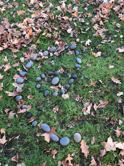
This piece of art was made with grass, leaves, and a nearby flower. Elements of art can be found in this piece, such as value, texture, and space. The layers of naturally fallen leaves creates dimension, while the heart manifests negative and positive space. Several principles of design are also included, like balance and emphasis. I used recognizable shapes that brought attention to the focal point of the piece.
Artist: Esther M. |
|
This is my environmental installation called circle shelves. I wanted to do something that would emphasize on the color of nature. So I decided to make circles to represent shelves and I filled them with different color of leaves I found on the ground. The leaves made a contrast for my principle of design. I also choose to do shapes as my element of art. One challenge I faced while making this was collecting leaves since everything was wet from the rain.
Title: Circle Shelves Artist: Ridhi S. |

|
|
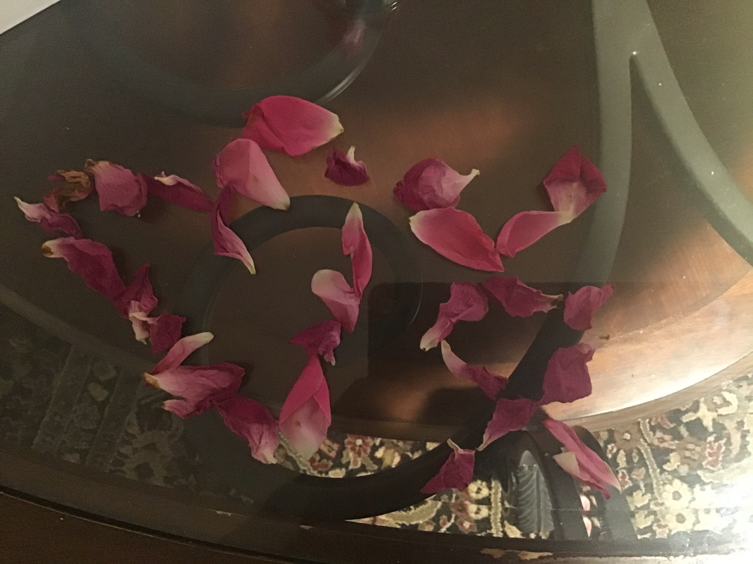
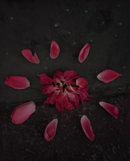
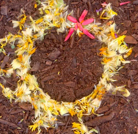
I used flower petals from a pink rose that had fallen off. Some were wrinkled and dried up, while others were still fresh and soft. I think I used the shape and color elements of art. I tried to arrange the petals in a circle shape with the lightness of the petal facing towards the inner circle. I also think I used the contrast and emphasis principals of design. I think the bright pink of the petals contrasted with the dark stone that they were set upon. I also think the light parts of the petal in the center of the circle help provide emphasis to my work. The process: I was trying to think of an idea and wanted to incorporate some sort of gradient like I had seen with the leaf examples you had provided us. Then, I realized the petals had a sort of gradient themselves, fading from pink to white. I worked with that and decided to have the petals lay in a circle with the white facing in to incorporate an element of art/principle of design.
Artist: Tasbia U. |
|
My artwork showcases few of the many types of leaves in my backyard. The materials I used were different leaves, a rock in the middle and an iPad to take pictures. One element of art I used is shape. This is because the leaves are all different shapes (and sizes). One of the principles of design I used was Harmony. This is because at the end, the arrangement of all the materials made the artwork look like a flower. The steps I took to making this was gathering the leaves arranging each type of leaf in a separate circle and placing a rock in the middle of it.
Artist: Guhan Y. |
|
|
I not really sure how it would look in display of public view but I think compared to the rest it would be different. My process of creating this installation was finding some branches and leaves. I had to go to the backyard and on the rode to see if there were any leaves. I picked up the leaves and branches. I wanted to add something else I added rocks I got it from the side walk from my rode. After that I just created anything that came up to my mind.
Artist: Bariza Q. |
|
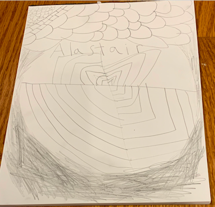
I used lava rocks for the art work because of how cool the rocks are together. Also I made this as a type of shrine I suppose I did not really know what I was doing but I did like how it turned out.
Artist: Alastair J. |
|
|
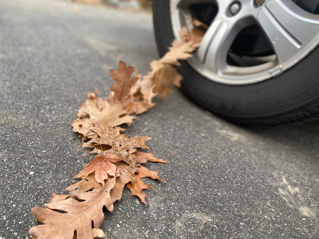
In this environment installation, my main materials were short curvy sticks and fall leaves. I bent the line of leaves and made them look like they were flowing out of the tire. I placed the curved twigs just off the tire and started slowly gathering leaves and wrapping them into and around the tire and the sticks. Sadly, I had to take it down afterwards as it would probably pop my dad's tire next time he used it.
Artist: Varun K. |
|
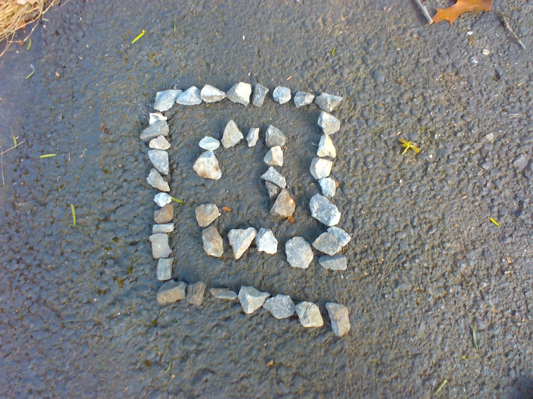
I would want people to know that my artwork was made out of things that I found in my back yard. I wanted to use leaves but I couldnt becuase everything was wet. One principle of art that I used was shapes because the rocks i used were all different. One principle of design that I used is contrast because the white rocks contrasted with the dark pavement.
Artist: Jayvardhan K. |
|
|
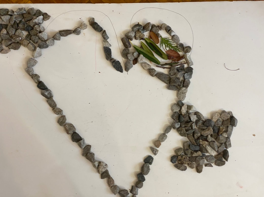
In this project, I used leaves, sticks and rocks. I first gathered leaves and placed them in a tree position. Some elements of art that I used were the space element and the texture element. Some Principles of Design were the balance between colors principle and the Alignment principle. When I firsted, I outlined a heart using a pencil. Then, I put the rocks down under the underline. After that I filled the arrow with rocks. Finally I put my leaves and sticks in that small place that I made at the top.
Artist: Tejas T. |
|
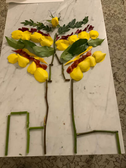
For this project, I wanted to create the outlines of some buildings in NYC and have a huge firework in the background. I wanted to do buildings in NYC, because that was where I was when creating the project. For certain reasons, I was not able to go to places like Central Park to make the art in, so I got some random flowers and made it from those. I used the stems to create an outline of the empire state building, and some other smaller ones. I used petals or different colors to create a firework in the background.
Artist: Daniel S. |
|
|
When I was first thinking of my art installation it was raining out, and for some reason I though of the song purple rain, and that made me think, what if my installation could be purple rain, so at first I tried poking holes into a cup, and that proved to be too difficult. Then I though what if I pour the water? That got me thinking I could pour multiple different colors to make kind of a waterfall of colors. And that got me to my installation!
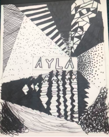
The water flowed very fast so that made the photos really pretty because it was kind of a give and take, while some of the water was pretty densly colored a lot of it was super clear which let the sun shine through which was super pretty in the light of the photos. the yellow especially, it was very clear and not super colored so when the sun shone through it was very nice. this was a super fun project and i really liked making all the photos! Artist: Ayla M. |
|
My art installation came to mind when I was thinking that it was the years first snow, so I could make something related to that. I also wanted to make some sort of color spectrum so I decided, I could gather a few rocks and surround it around the snow. The lighter ones closer and the darker ones farther. It kind of reminds me of relationships. I'm the snow, my friends are the white rocks, the people I'd like to remember are the brown rocks, and the dark ones are the ones that are not close. I would like people to look at my artwork and remind them about their surroundings. Because "Every color can be bright, dull, dark or light" and "Balance is the comfortable arrangement of things in art".
Artist: Saifan I. |
|
|
Artist: Adhiti H.
|
|
Artist: Snehal B.
|
|
|
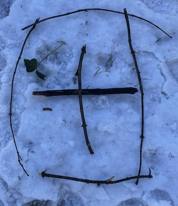
My Environmental art piece is a picture frame representing the four seasons of the year - spring, summer, fall and winter. I used 3 elements of art - Line, Shape and Color. The branches are the lines which give the frame its shape and form. the leaves and grass and snow are the colors of the seasons.
Artist: Nikhil V. |
|
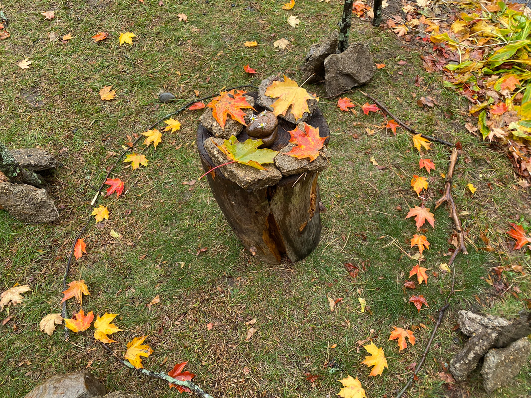
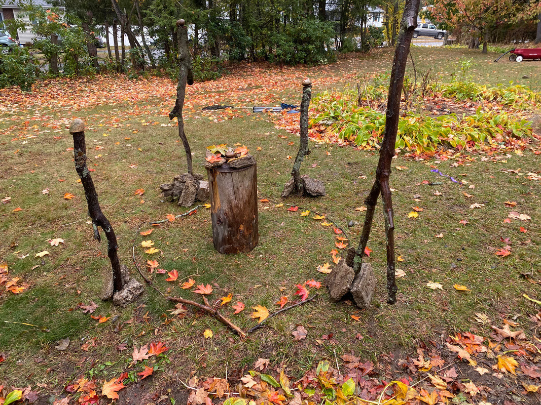
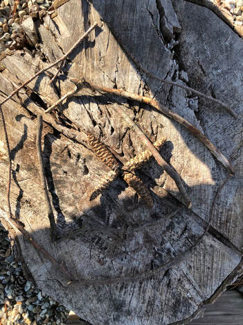
This piece is a spiral of sticks resting on a stump in my backyard. I used texture to make something interesting to create something wood on a background of something wood. I used shape to make the spiral shape by progressively using small sticks as I neared the center. I went out into my backyard and collected fallen sticks from the pine tree that has been there for a long time. I then walked over to the stump, and constructed the piece by progressively using smaller and smaller bits of wood.
Artist: Julian H. |
|
|
Artist: Danial N.
|
|
I'd want them to know I wanted to be creative gather sticks and leafs and put them together, I'd want them to know that everyone can make environmental art and all you need are a couple things like sticks and stones. And soon your art could be hanging up just like mine.
Artist: Milton B. |
|
|
"Imaginary Solar system on the bottom of the ocean." My first picture represents a beautiful multi-colored solar system in the deep clear water of the ocean. I used a dark background to show the strength, depth, and darkness of the ocean. At the same time, I brought bright colors into my picture to let my viewers know that even in the dark, there is the beauty of light. My bright colors represent the different shades of sunlight, reflecting across the glistening water and the stars in the sky. Materials used: Granite, Seashells
Artist: Brian P. |
|
|
"The four seasons of Massachusetts." My next picture represents all four seasons of my favorite home state. You can see the snow which represents Winter, cold and barren. The patches of dry grass represent Autumn, the arrival of which indicates the end of Summer and the coming darkness of Winter. The leaf stands for Spring, which is a time of rebirth and reawakening. Finally the shell represents Summer, which is a time of fun, rest, and the joy of life. Even though I used some of the same objects in both pictures, I used them in different ways to show that the same object can stand for many different ideas. Material used: Dry grass, Snow, Green leaf, Seashell.
Artist: Brian P. |
|
If my art was at a gallery I wish that people would know that it was used with rock in my backyard. I made it with rock because I like wanted to make the rock kind a looking like a sundial to show the sun direction. So I found same similar sized stones and arranged it to look like a circle. Also I put a different color rock in the middle. The elemental of art I used was form because It took the most of the mini garden in my backyard. The principle of design I used is unity.
Artist: Nathan O. |
|
|
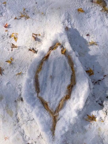
In this environmental art I put, leaves, stones, and snow together to make a creature to represent my mood. One of the image is when I thought I was done. The other one has added stuff that would make the visual more accurate of how I felt. It resemble a fish with a tail like an animal and I chose that because I liked how they paired together.
Artist: Arul A. |
|
I used leaves to complete this work. This work is spiral. It has two rows, one is the front of the leaves and the other is the back.
Artist: Jiaming X. |
|
|
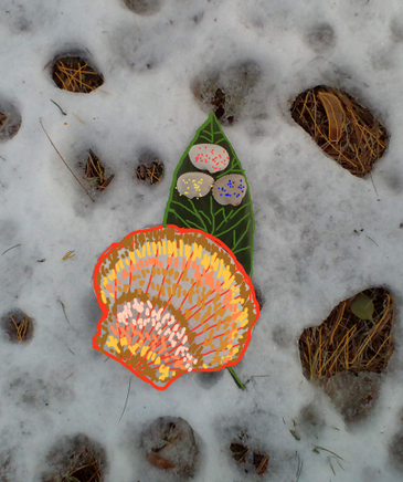
For my creation I combined nature, to make nature. I decided made a flower. The colorful patterned shells I had were perfect for petals, and I picked some small leaves with color contrast. I had a bright orange shell perfect for the middle, and layering the pieces gave the art a flower texture.
Artist: Kalina L. |
Photo Credits & Artist Statements: Courtesy of Individual Artists ©2021 All Rights Reserved.