May 21, 2020
Photo Credits & Artist Statements: Courtesy of Individual Artists ©2020 All Rights Reserved.
Photo Credits & Artist Statements: Courtesy of Individual Artists ©2020 All Rights Reserved.
|
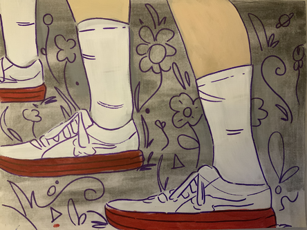
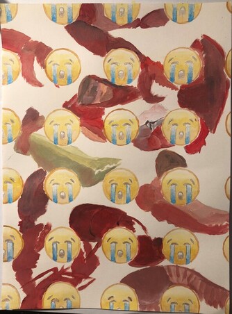
If my piece was hanging in a gallery, I'd want people to notice the repetition I used of the shoes and legs. Repetition can be used to create a pattern in a piece, and in my piece I think it brings attention to the subjects, which are the shoes I like. I like to use repetition because it can bring together many spots on the piece that are far away from one another if you repeat something all over it. I used an outline which cleaned up the edges of the paint and used the same dark color for the dark background which helped things pop out even more. I wanted to make them stand out so that it is easy to see which thing is being repeated in the piece.
Artist: Lucas H. |
|
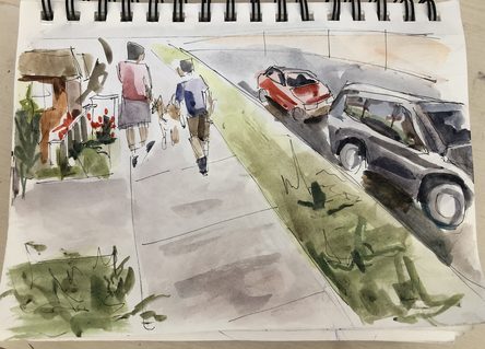
I chose to explore one of the theme of Assignment #1 through this piece. The purpose of this piece is to portray the importance of self care during quarantine. For me, walking outside is always self care. When someone looks at this piece I want them to be able to feel the environment of the landscape. This piece was done in watercolor and ink.
Artist: Ruchira H. |
|
|
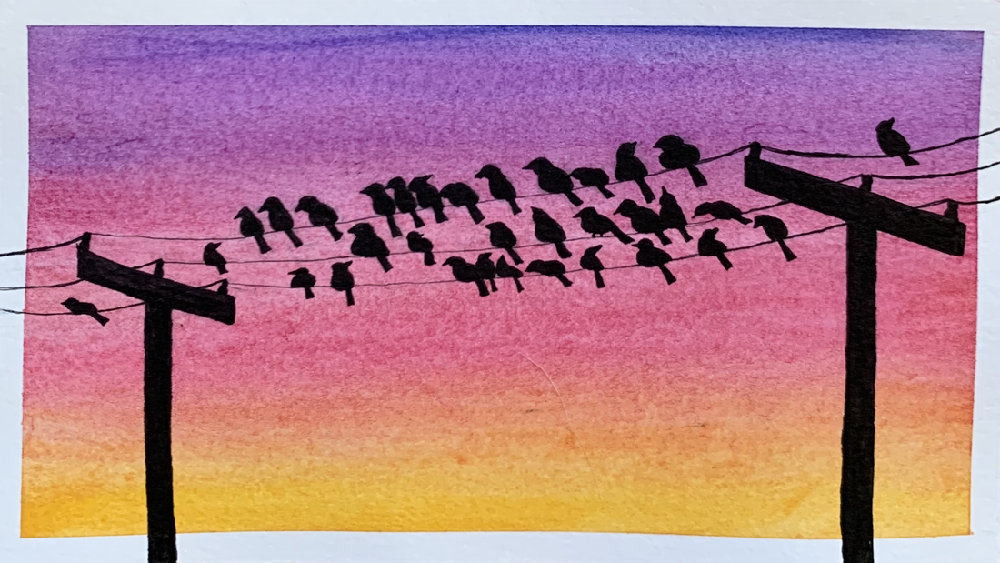
For this assignment I painted birds sitting on a power line. Repetition was used throughout the piece in multiple ways. I used repetition by including birds in a repeating order. I also included multiple power lines that repeat. To create this piece, I used watercolor and ink on a 4 inch by 7 inch piece of paper.
Artist: Francesca P. |
|
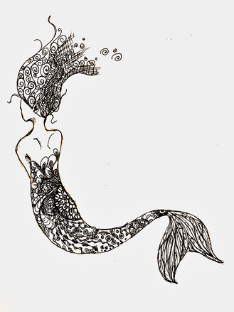
This was drawn with pen on paper. It looks like that because I put a few filters on the photo to make it clearer. It's repetitive because, as a zentangle, it's pretty much made of patterns. I did a zentangle for that reason, and stress relief. It's a mermaid because why not? It doesn't have much meaning in that way.
Artist: Liana X. |
|
|
This piece is a the 3rd work of art in "Lobster Empathy", a project I began about a month ago succeeding with an impactful encounter with a live lobster . This piece uses repetition to show the way language loses it power and individuality to talk about grief as it becomes cliche. I also wanted to show how many cooking tradition regarding lobsters (and other animal/animal products) normalizes devaluing life. In the background various parts and vague representations the lobster show the abstraction of life into just an anatomy or a archetype.
Artist: Chase V |
|
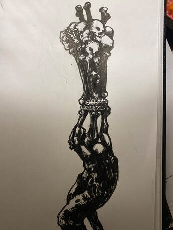
This is a piece composed of brush pen and India ink which adds to the rather grim subject matter. While the piece doesn’t incorporate traditional pattern, it has the repeating object of the skull and the bones composing the top half of the twisting, gothic column. The two contorting figures almost mirror each other as well as they hold up the pedestal. The piece also incorporates heavy contrast to illustrate the mood and themes of goth and death. The bones seem to be coming out of each other and are almost fused together in the column.
Artist: Gilmer W. |
|
|
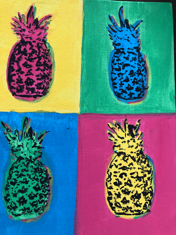
This is a painting impaired by pop art. I wanted to use bright colors, and repeated the same painting of a pineapple in different colors. It was hard to replicate the same details on all the pineapples.
|
|
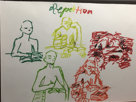
My artwork was inspired by my recent experience with schoolwork and AP tests. I found the experience of studying for my AP tests very repetitive. I tried to convey the increasing levels of stress that came with each repetition. I did this through the colors and line art. While the colors became increasingly intense, the lines became more messy.
Artist: Annika B |
|
|
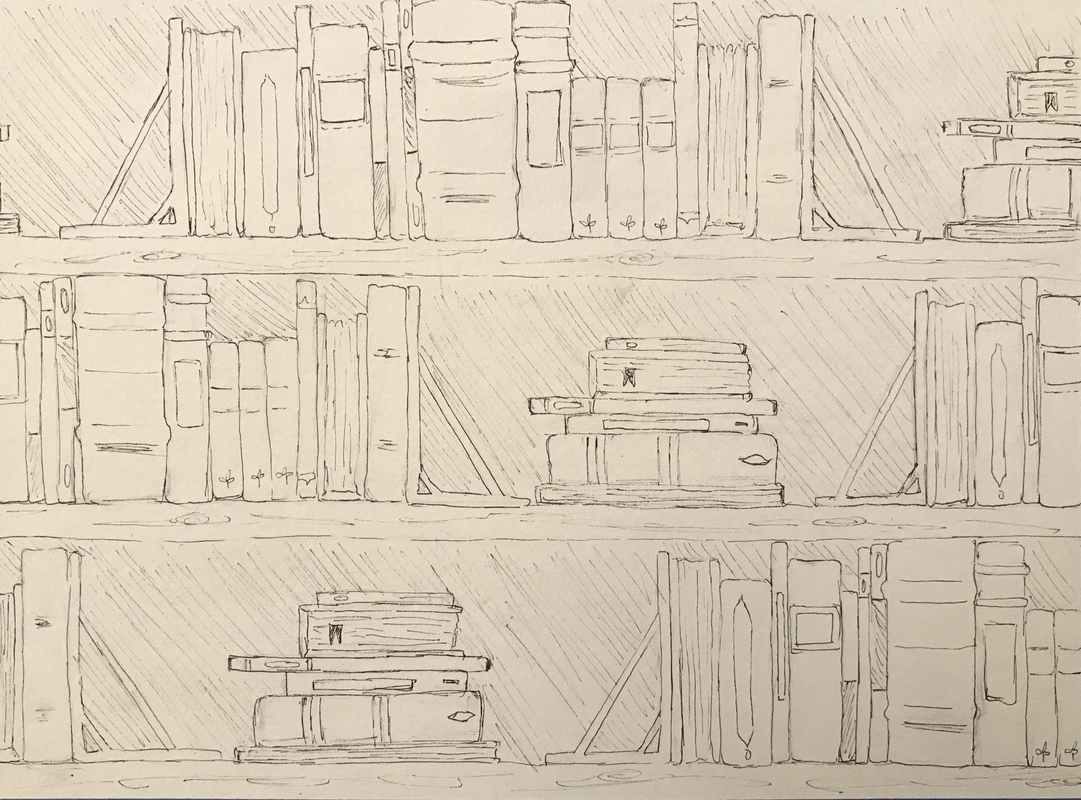
I have always enjoyed observing bookshelves and how each book, and even shelf, has its own character. Even without reading its contents, a book can convey a story all on their own by their appearance. I also find the bookshelves can reflect on their owners: are the books neatly stacked, are some of the books reversed, are the books falling, do they store other other items on the bookshelf. Likewise, the owners may be hyper organized or maybe they were simply rushed when they placed the books on the shelves or possibly they care about other items more than books. With all of these aspects in mind, I chose a bookshelf as my subject for this piece. This piece consists of three bookshelves with a repeating sequence of books and other items at different intervals. The arrangement of books may also reflect my own character as I can be organized with books all in a row at times, but in other times I can be easily distracted and leave some things half done, such as the stack of unsorted books.
Artist: Zoë C. |
|
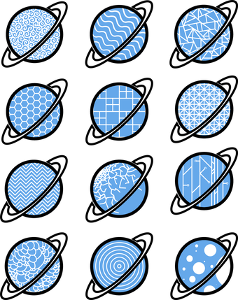
This artwork was specifically designed with repetition in mind. I started with the same basic planet shape repeated 12 times before expanding on more details within each icon. I decided to fill the main planet portion of each icon with a certain pattern that each displayed some version of repetition. The main types of repetition I used for the patterns were connecting the same shapes together, repeating a line across the planet, and organic patterns with a similar theme. This artwork was made in Adobe Illustrator in order to properly make uniform sizes and lines with each repetition pattern.
Artist: Keller E |
|
|
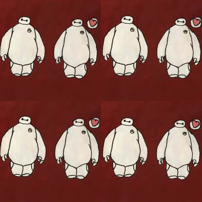
I wanted to capture repetition with a pattern. In the painting, I have a repeating pattern of Baymax from Big Hero 6. I wanted to keep the background simple, as well as the Baymax. The painting is similar to phone wallpapers. It has an object or two repeated with a simple background.
Artist: Paige F. |
|
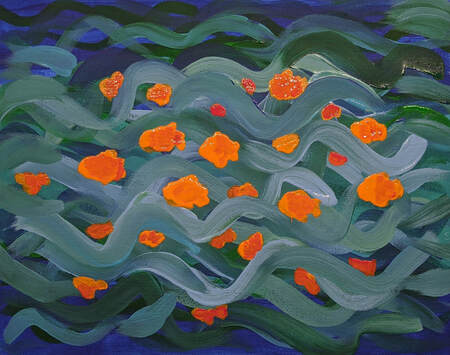
This piece was originally supposed to be abstract, with the lines being more defined and serving as the only source of repetition. As I was painting, however, I noticed that the lines were largely blending together, sort of defeating the purpose of using repetition in the first place. I noticed that the colors I was using made the piece look like water, and I decided to add fish to add both contrast and another area of repetition.
Artist: Daly G. |
|
|
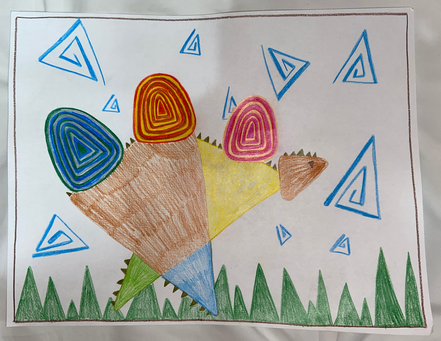
In my peace I chose to represent representation with repeated shapes. All the things I made were made out of triangles; the dinosaur, the grass, and the clouds are all made of the same shape. On the horns of the dinosaur, I also use repeating color patterns. I wasn’t quite sure how this picture was going to turn out, I started with the horns and saw what I can make from there. It ended up being a more abstract piece, with lots of bright colors and things that pop out for you to look at.
Artist: Annabelle I. |
|
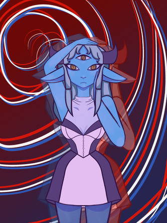
If my art was hanging in a gallery, I would want the viewer to see the repetition and vibe this work gives off. The line work in the background creates movement for the viewer to play. The red and blue shadows create definition for the subject. I chose this simple yet affective color palate of her clothing to give the subject more attention. I used symmetry to capture the viewers eye and her arms to create more movement.
Artist: Paisley J |
|
|
while making this painting I hard a really difficult time coming up with ideas on what to draw and how I could subtly/ creatively incorporate repetition. I decided just to break down what I was going to do so I didn't stress out too much. first, I chose something to draw, drew it and then planned on painting a pattern on top or painting on squares with reoccurring colors. I even drew a grid of 1 cm squares after I finished my final sketch. Sadly, after I found that my idea wouldn't work out and I needed a new one. I was talking to my friend, asking her others ways I could incorporate repetition or already have. We discovered then that my piece has geometric shapes (mostly squares and rectangles) all over, giving it a very put together/ organized feel.
Artist: Angelina O. |
|
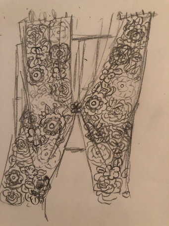
I had a hard time deciding on what to draw, so I looked around in my room and decided to draw my curtain which is full of flower patterns that are repeated several times to fill up the area.
Artist: Annika O. |
|
|
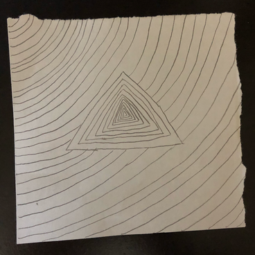
With this artwork I decided to create something a little more simple. It's an optical illusion done with just repetition of lines. By putting the lines closer together at the center of the triangle it gives it more depth. By just focusing on the main object of my piece I don't have to worry about distracting the viewer with other parts of my piece.
Artist: Zane S. |
|
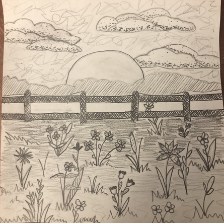
I decided to draw a field with flowers for this assignment. I used the scumbling technique for the sky and the scrippling technique for the clouds with a gradual effect, but I kept the sun empty since it is technically the lightest part of the sky. The fences are the darkest part of my drawing with cross hatching. For the field I made a gradual scumbling effect from light to dark leading up to the dark fence.
Artist: Karina A. |
|
|
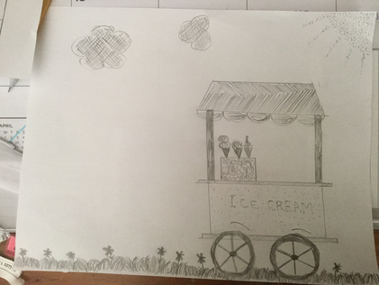
I was inspired by my love for ice cream and current desire to eat it. The nice thing about mark making was that it required thought but was also very simple. I enjoyed drawing the flowers and finding ways to draw items using marks. I hope the viewer is inspired by my art and tries the same. I like assignments that explore different types of drawing and making art which is what this assignment entailed.
Artist: Leili D. |
|
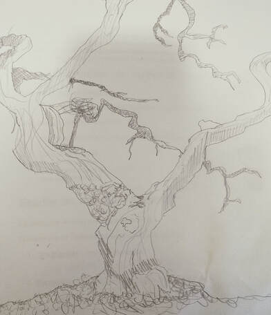
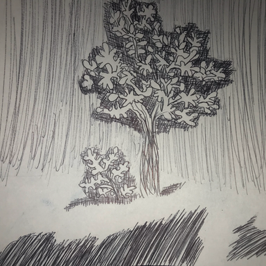
For this drawing, I decided to use the different shading techniques and values to try and create depth. I used cross-hatching to create the darker values, and hatching to create some of the lighter shadows. I also used scumbling to add texture and depth to areas that I wanted to come off as moss or grass. I used different values to show which branches of the tree were closer and which were farther, or to show what was behind another object. I also used extra lines to create some texture on the trunk and larger branches or to show wood grain.
Artist: Nora H. |
|
|
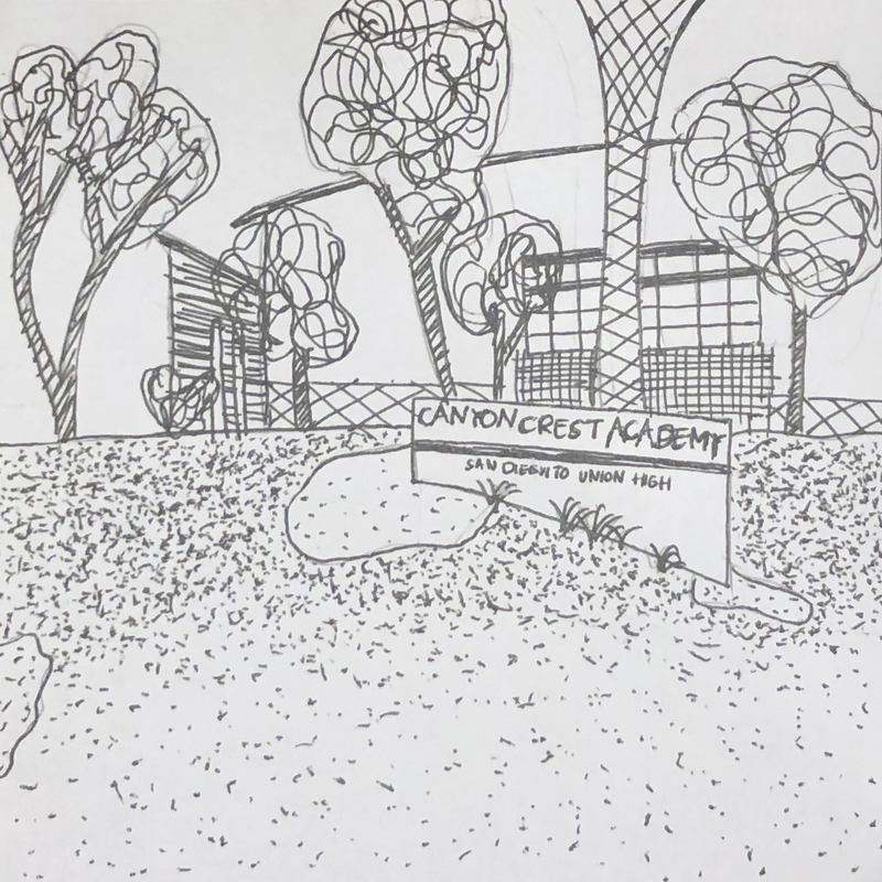
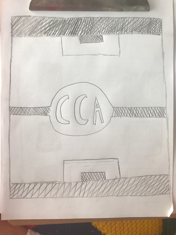
For my artwork, I used mark-making techniques to portray Canyon Crest Academy. It's been over two months since I was last at school, so I wanted to draw something that commemorated CCA. I drew its main entrance because that was what I saw each morning when I arrived to school. The mark-making techniques I used reminded me a lot of zentangle. The repetitive motions of the cross-hatching, stippling, and scumbling was very relaxing.
Artist: Niki H. |
|
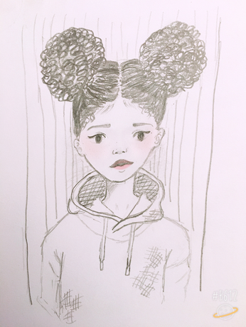
I used a few mark-making techniques to create my own character. Some of the mark-making techniques that I used were broken cross-hatch, cross-hatching, hatching, and scumbling. The techniques that stood out the most for me were the scumbling and hatching. Hatching stood out because it was the background. Scumbling stood out because I used for the hair, which is a key feature of the character.
Artist: Hila K |
|
|
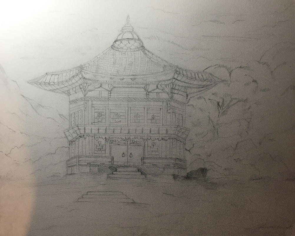
As a Korean-American girl who was born and raised in America, I admit there were times when I struggled to find myself within the cultural differences. In elementary school, I went to a small private school, dominantly white students, and although I cherished and loved my friends there, I admit part of me felt secluded deep down. After 6th grade promotion, I moved back to a public school, Carmel Valley, where there was much more racial diversity, and while it sounds quite childish, a part of me felt relieved at the familiar feeling of being with those who shared traditions and got the Korean inside jokes. Now in high school, after many years of trying to fit into two very different standards of two very different nations, I realized that it wasn’t others around me who wanted me to change, but myself who wanted to change. In my drawing, I left the drawing of a traditional Korean house grey, because the idea of ‘home’, the idea of ‘fitting in,’ isn’t always black and white, right or wrong, but accepting those who love you just the way you are, and loving yourself as an individual blessed to experience the beauties of two different, but truly endearing cultures.
Artist: Hannah S. |
|
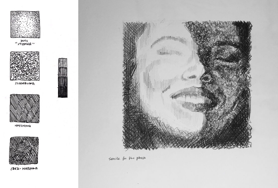
I included both the mark-making practice and the 5x5 drawing in this photo. The drawing consists of three different techniques: hatching, cross-hatching, and scumbling. With variations spaces, directions, and repetitions, I wanted to create a clear contrast of light and dark for this drawing. In the shadow, where it is generally blurry, lines are messy and layered to create value. In contrast, I drew simple vertical lines on the side of the face that receives lightings.
Artist: Eecho Y. |
|
|
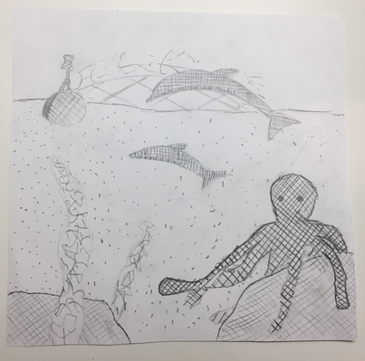
This peace of artwork is based off of ocean sea life like the common octopus and dolphins. The art peace uses 4 different light and dark values and 4 different mark making techniques. The animal theme was based off of other animal themed ideas for this project. Space is shown by how some objects are in front and behind others to help show dimensions which helps the peace work looks more realistic. The picture also helps the observer be more creative because of how some objects go off the paper so that people can imagine what the rest of the scenes look like. Finally by making crisscrossed lines more compact it helps create darker and lighter values.
Artist: Ryan Z. |
|
|
This drawing is very simple, it is just a tree and a bush. I decided to go very simple in order to put lots of detail into the tree and the bush with the Mark - Making. The tree is primarily done with cross - hatching and for the trunk I used scumbling. The bush is completely done with cross - hatching. Finally, the foreground and background were just done with hatching. In my drawing I tried to use all of the Mark - Making techniques but I could not figure out a way to add stippling into it without making the image to cramped or chaotic.
Artist: Whitney S. |
|
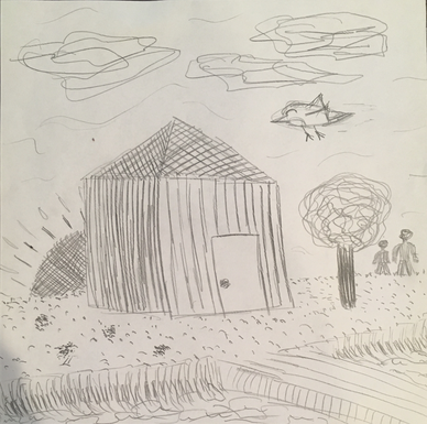
What I want my viewers to know about my art work is first of all the scene I was going for. I drew a simple scene of a small shed at the edge of a lake during sunrise (the sun in the back isn’t as obvious as I wanted it to be). I included some elements like the clouds and the tree to use more mark making techniques. For the house and dock, I used mostly hatching and cross hatching. On the other hand, for the grass and sky, I used more stippling and scumbling. Lastly, I tried to incorporate some darker/lighter values to bring out shadowed things or if the object would be a dark/light color.
Artist: Sammi D. |
|
|
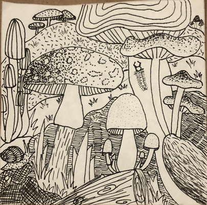
For my artwork this week I decided to draw mushrooms. I wanted to draw mushrooms because of the many different types of texture I could draw with mark making. In my artwork I wanted many different types of mushrooms and textures, so by using the different mark making techniques, I created those different textures and mushrooms. I also wanted to convey a wonderland effect with the mushrooms by adding a variety of some small, some large, some packed together, and some alone. I also tried to add some depth with closer objects and farther away objects. I also used mark making techniques in the shading of some mushrooms with darker compact hatching and lighter shadows with stippling or less hatching.
Artist: Emma C. |
|
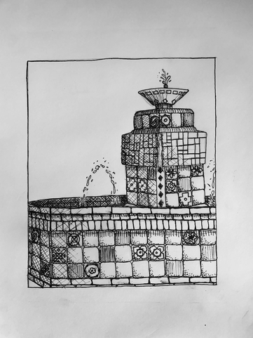
When I began this project, I was feeling a little sad about missing out on so many of my favorite things, especially our annual trip to Catalina Island. I chose to draw one of the staples of Avalon, the only town on the island. This fountain sits in the center of the roundabout, right on the waterfront, and colorfully displays its authentic Catalina tiles, made on the island and a huge part of its history. Although the drawing is in black ink, I want the viewer to be able to imagine the beauty of the colors, complimenting each other and the ocean backdrop. I hope to be able to return there soon.
Artist: Lilly C. |
|
|
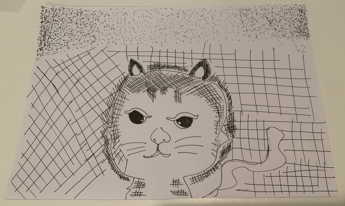
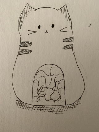
In my artwork, I included 4 drawing techniques and 4 different shades of colors. In the top of the drawing, I have drew some stippling dots. In these dots, they are from darkest to lightest dots and repeated. Next in the cat's background, I have drew some cross hatching and scumbling techniques for her tail. Inside the cats, there are more cross hatching techniques but in different shades, some were lighter; some were darker. And around cat's body, there are some dark cross hatching lines to make the cat look more stand out. The idea of drawing this cat is because my cat is really cute and during this quaratine, I have played with her most of the time.
Artist: Meijia H. |
|
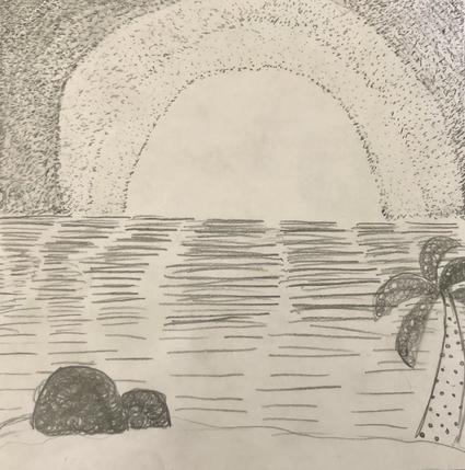
I decided to draw a sunset with a couple rocks and a palm tree. I drew this because I personally feel that viewing a sunset can be calming and relaxing for me. I hope that when you view my art, you can sense a feeling of calmness and relaxation. I used techniques such as scumbling, stippling, and hatching to create this piece of art. I also used different shades of grey to illustrate the different dimensions. I used scumbling when drawing my rocks, and leaves of the palm tree then I used stippling to draw the sunset. Lastly I used hatching to draw the water and horizon.
Artist: Mya H. |
|
|
I just cut my right hand recently and got 7 stitches in it so I had to draw with my left hand. It’s pretty horrible I know. With the actual artwork I was tryna make like this pattern almost in the fashion X and just have random stuff under it to make it look cooler but that kind of failed miserably due to the lack of abedextrious in me. On a positive note, drawing with your non dominant hand should be a challenge because you have to learn to be frustrated with what you make since it will never turn out pretty. Very nice teaching moment.
Artist: Nemo L. |
|
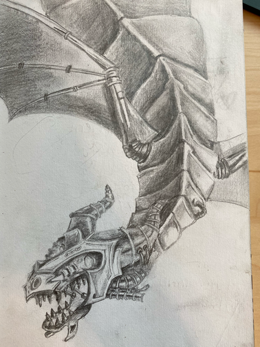
I chose to do option #2. Quarantine has started to feel really long now. I miss the feeling of freedom and adventuring. What came to my mind when I was thinking of adventuring and being free, was a dragon. Therefore, I decided to sketch a dragon to represent this feeling. I wanted to take the time to make it detailed so I would have something that would motivate me during quarantine. I also chose to make the dragon look a little more mechanic because being in the house a lot makes it feel like the day are on repeat sometimes, so I decided to portray this in my piece.
Artist: Anonymous |
|
|
I drew a picture of a sun in the mountains. I looked at the examples as inspiration for the sky. This took a lot of time because there are multiple circles and to get the ideas. In the sky I use light and dark to show the distance of the sun rays. I got the idea of the sun in the mountains because it looks like the view from my house.
Artist: Mia L. |
|
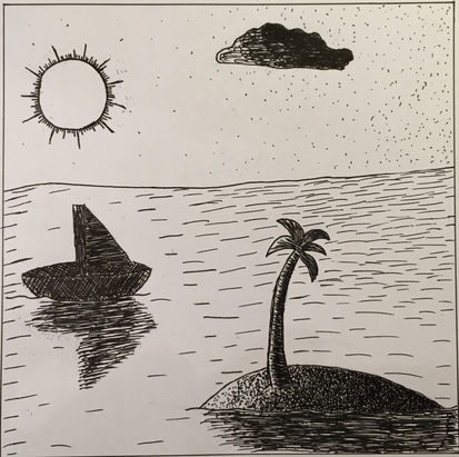
I drew a boat and an island surrounded by ocean. The drawing uses hatching, cross hatching, stippling, and scumbling. I chose to do this drawing because there are many different textures and the sunlight creates many shades of light.
Artist: Alex T. |
|
|
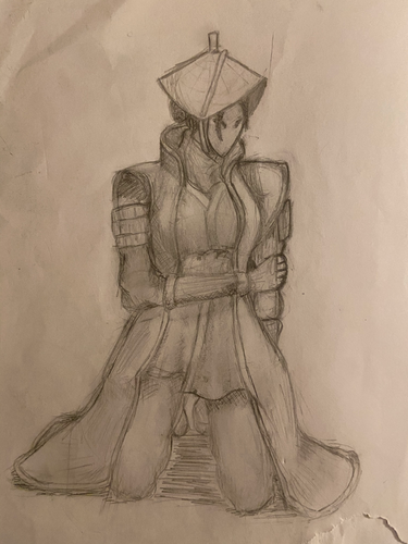
I wanted to do a recreation of a drawing I did a year ago. I play a game called For Honor, which is set in a fictional period of time representing the medieval time periods of the samurai, European knights, and Vikings. The character in the drawing I did is one of the samurai known as “Nobushi” which is roughly a combination the Japanese words field and warrior. The “nobushi” is said to protect the out lying villages which surrounds the larger samurai fortifications. In the lore the nobushi are supposed to be nameless and faceless as you can see from the mask that she wears. In my previous drawing of her, I didn’t shade all too well, seeing as it was made a year ago. I never usually used stippling or cross -hatching instead opting to hatch, then blur with tissue or my finger. However this time since it was a requirement I decided to stretch my understanding of 3-dimensional art, and my understanding of shading to use cross hatching and stippling to shade different materials.
Artist: Ben T. |
|
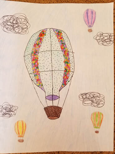
I chose Option #2 for my artwork. I was inspired by the colorful hot air balloons I see sometimes whenever I take a walk in the evenings. I incorporated some mark-making techniques in my artwork, including cross-hatching, stippling, and scumbling. I incorporated stippling in the balloon part of the hot air balloon and cross-hatching in the basket part. I also incorporated scumbling in the clouds. Not only that, I added some sparkles to parts of the hot air balloon.
Artist: Elise V. |
|
|
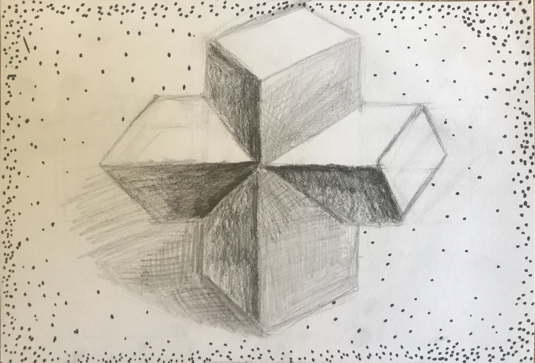
When creating my artwork, I first had trouble deciding on what to draw. Then I was inspired by an art piece I saw awhile ago that had two shapes going through each other, and I decided to do something similar to that but with an easier 3D shape; rectangular prisms. It was easier to include all the light values needed when drawing a 3D object. It was hard for me to include 3 mark making techniques but I found a way to do so in my shading. I also struggled a bit with getting the correct shading areas, like which areas should be shaded darker or which areas should be left blank. I added stippling to create a "border" like thing for my artwork but personally I preferred the artwork without it.
Artist: Katie W. |
|
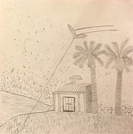
This drawing was inspired by a time I went kite flying with my sister. It took place at Del Mar Beach at sunset. I remember that it was very difficult to get the kite up that day because the wind was not strong enough. As the sun set, the wind grew stronger and I was able to get about ten minutes of peaceful flying before there was not any light left. I will always remember this moment with my sister.
Artist: Darius Y. |
|
|
When my artwork were to be in a gallery, I would want my viewers to be confused. At least until they new what style of art I was using. When my viewers look at my work I want them to notice a slight change in every bit of line segments. That’s all I want my viewers to know because I do t have much insight about this artwork or the art style. I just don’t have much to say about it.
Artist: Ethan Z. |
|
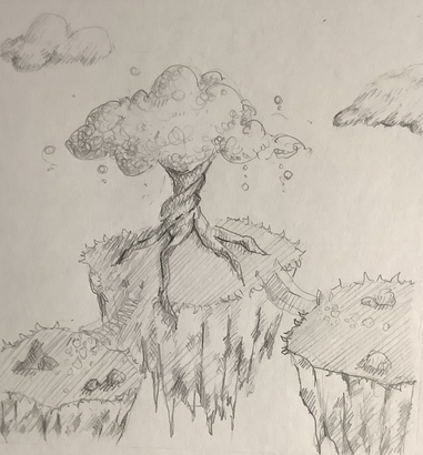
These floating isles are simply that-- floating isles. It's concept art for a game that a handful of friends and I are working on, and a primary world creation plot point is when the land is split in 3 on accident. The picture is meant to be tranquil: there are no signs of civilisation and nature is free to act as nature pleases.
Artist: Carolyn C. |
|
|
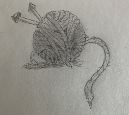
This week I decided to sketch a yarn ball because there's a lot of repetition in drawing the individual yarn strands in the ball and it's texture. I wanted to make the sphere shading exercise harder by drawing it as a spherical yarn ball.
Artist: Natalie C. |
|
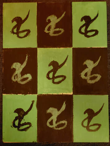
My goal with this piece was to demonstrate how the element of repetition can be visually appealing. In order to achieve this, I used a stencil to multiply a cobra that I drew. I then added these snakes to a checkered background that I used to add color. Making the snakes also vary in color and rustic each in their own way, I used repetition to create a piece that is attractive and good looking. There is no significance behind this piece or deeper message to found, it is simply a show of repetition.
Artist: Lars G. |
|
|
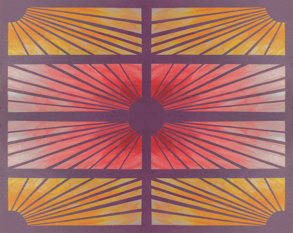
I created this artwork by cutting very thin strips of tape and arranging them in the pattern I wanted, in two rectangles with the lines coming out of opposite corners. Then, I painted over them with gradients of yellow and pink colors. I removed the tape once the paint was dry and photographed the piece, then duplicated the image 3 times and rotated it it to create the design I wanted. I used repetition both in the repeated lines made by the tape strips as well as the mirrored design that created the overall image.
Artist: Sonja R. |
|
What came to mind for me when thinking of repetition was some of the scenes in movies, where the character looks into a mirror or multiple of them are created and shown to showcase the duality of their personality. I really tried to capture the essence of insignificance and the infinity of the world with a basic drawing of a world being exactly mirrored and can be viewed from both sides, both are similar in feeling but can have some very different outcomes.
Artist: Dagin G. |
|
|
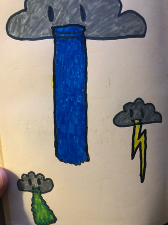
In this piece I wanted to emphasize the fact that there are rainy days. If my artwork was in a gallery, and people were looking at it, I would wan't them to first see that it is a picture of a couple clouds. Clouds with a grayness to them are usually associated with rain and have a feeling of sadness or melancholy to it. This relates to the current world situation we are all going through. There may be some who aren't affected, but there are many who have been severely impacted by Covid-19. This piece is for those who are feeling down to cheer back up, with the sighting of these cute/ rainy clouds.
Artist: Zami H. |
|
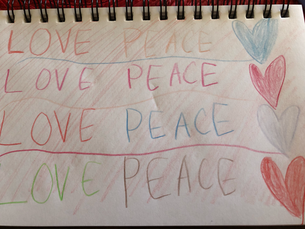
As people are viewing my artwork I would want them to know that its important to spread love and kindness and peace because that's the kind of thing that keeps the world moving. There are times in our lives when things don't go the right way and we don't know what to do so we end of taking it out on the people around us. This can lead to people becoming depressed and hurt. I think if people just took a chance to spread kindness, peace, and love to each other instead of hurt more often that the world would be a much better place and humans could make more progress into making the world a better place as well. And its especially important to spread peace, love, and kindness while we are in quarantine because some people may be having a really tough time with it and you never know what could happen.
Artist: Galina K. |
|
|
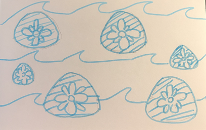
What I'd like my viewers to see in my art is the serenity of the ocean. I had a beachy scene in mind, because beaches tend to have a lot of repetition, especially with shells and rocks that wash up on shore. So, I decided to draw some sand dollars and waves, to show the constant repetition of the ocean. I hope people can look at my art and feel relaxed. While it's not my best work, it's the thought I put into it that counts. I hope this piece can give someone calmness during this time.
Artist: Brooke L. |
|
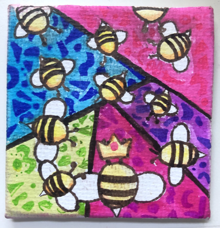
I like bees! and bright colors! save the bees baby!!!!
Artist: Isaac H. |
|
|
Artist: Marley W.
|
|
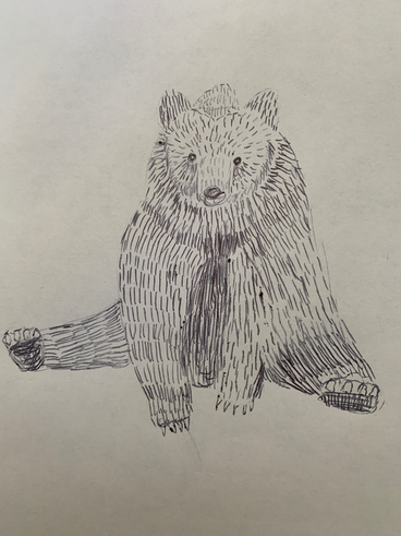
Bears are representative of all initial stages and primal instincts. Since bears could walk upright, they were thought to be special and know all things, and so they were symbols of wisdom and medicine. Bears are also associated with the warrior spirit, prosperity, and the harvest.
Artist: Mia E. |
|
|
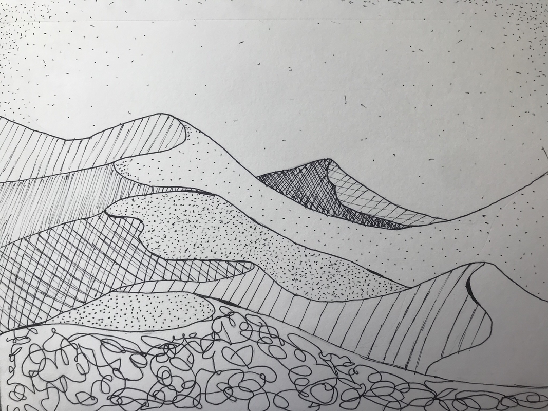
Drawing sand dunes is one of my favorite things to do. This is because it's good practice for drawing skills such as shading. As I looked at the mark-making techniques and the different values of light and dark for them, I thought sand dunes would be perfect for this. With sand dunes, I was able to incorporate the mark-making techniques into different dunes, making it look like shadows.
Artist: Talia A. |
|
This picture is of the CCA soccer field. It is one part of the thing i miss most in these times of quarantine, school. I miss going to classes and seeing friends and hanging out after school and during lunch and being able to joke around with them and have fun at baseball and on road trips to see other schools. I can’t wait till that all comes back whenever that will be because i enjoy it so much. School is a place i can see my friends and have fun and also learn about things i need to learn. CCA is a very fun and safe learning environment and everyone is so amazing and it makes it such a great place to be.
Artist: Andrew S. |
|
|
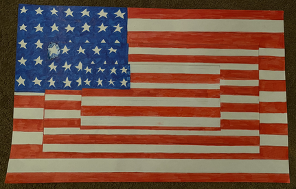
I would want someone to know that my artwork explored repetition. It is three repeating and separate American flags. It explores repetition by overlapping all the flags as well as altering the colors of the stripes to make each separate flag stand out.
Artist: Haley F. |
|
I want people to look at my first piece and think of the thread in their clothes or blankets. I want people to see the little patterns that are there in the everyday life. Just think of the holes on your shower head or the bristles on your toothbrush, it all has repetition built into it.
Artist: Jessica S. |
|
|
I want my viewers to know that time can go by so fast. For the class of 2020, the important parts of our senior year was taken away, but we managed. This artwork is supposed represent our childhood to now, bringing back the memories of our lives before we move to the next chapter.
Artist: Amelia M. |
|
For this artwork I tried mostly to focus on the marking instead of what I was drawing. I let my hand do the art and my brain focus on what parts I would need to mark up for the drawing to be 100%
Artist: Nadia S. |
|
|
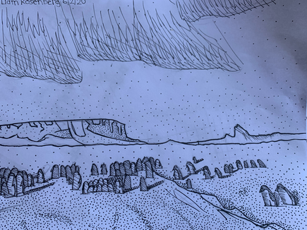
For this piece, I was interested in utilizing the method of stippling the most. I have previously used this technique last year and, while it had been challenging at first, left a lasting result that was unique and subtle. I also decided to experiment with the aurora and the groups of penguins, which was fairly out of my comfort zone. The photo itself is very interesting as It was captured at the “just-right” moment when the penguins were under the northern lights. Personally, I felt this drawing was both challenging and gratifying work.
Artist: Liam R. |
Photo Credits & Artist Statements: Courtesy of Individual Artists ©2020 All Rights Reserved.