April 15-16, 2020 (PART I)
Photo Credits & Artist Statements: Courtesy of Individual Artists ©2020 All Rights Reserved.
Photo Credits & Artist Statements: Courtesy of Individual Artists ©2020 All Rights Reserved.
|
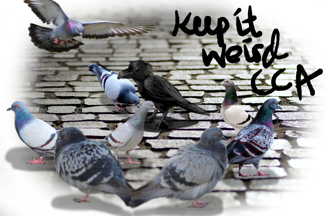
First, I would like to thank all of the people out there who put no copyright photos on the internet for people like me to use, because I relied on those photos for all the pigeons and the background. The raven being the only illustrated bird (and non-pigeon) is done to make it look 'different' and 'weird' to some extent. It also has a darker shadow, which could be interpreted in some cool, philosophical ways, probably. This was my first time using gimp for a project (thank you gimp, for being free, unlike *coughphotoshopcough*). The white background was transparent before, but I guess gimp doesn't support transparent backgrounds.
Artist: Liana X. |
|
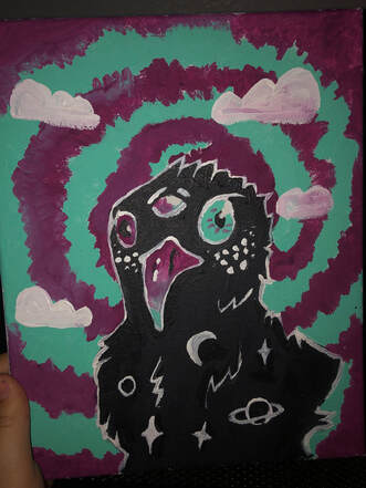
The day I painted this I wasn’t very inspired. So much was happening in my life that painting was the last thing on my mind. I ended just going outside and painting the first thing I saw. I happen to be a raven that was flying Over the neighborhood. So I combined both the chaos of the world combined with something a simple as a crow.
Artist: Marley W. |
|
|
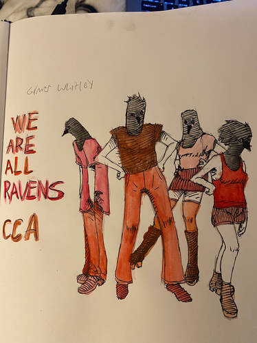
The piece I made for this project is meant to illustrate an overall message of community at CCA. The statement "we are all ravens" pushes the point that while students have individual lives, they are still important members of the CCA community and should wear that statement as a badge of honor. The characters featured in the piece are meant to represent typical CCA students, and while they may differ in their appearances, They all have raven heads which groups them into being members of CCA and helps further the point, even if a bit blatantly. The color palette is of course composed of red, black and white to show off the school colors and present the characters as being part of the same group. Though I'm not entirely sure what inspired me to create the design for this piece, I was interested in the theme as I find it to be one of the most notable and important things about CCA.
Artist: Gilmer W. |
|
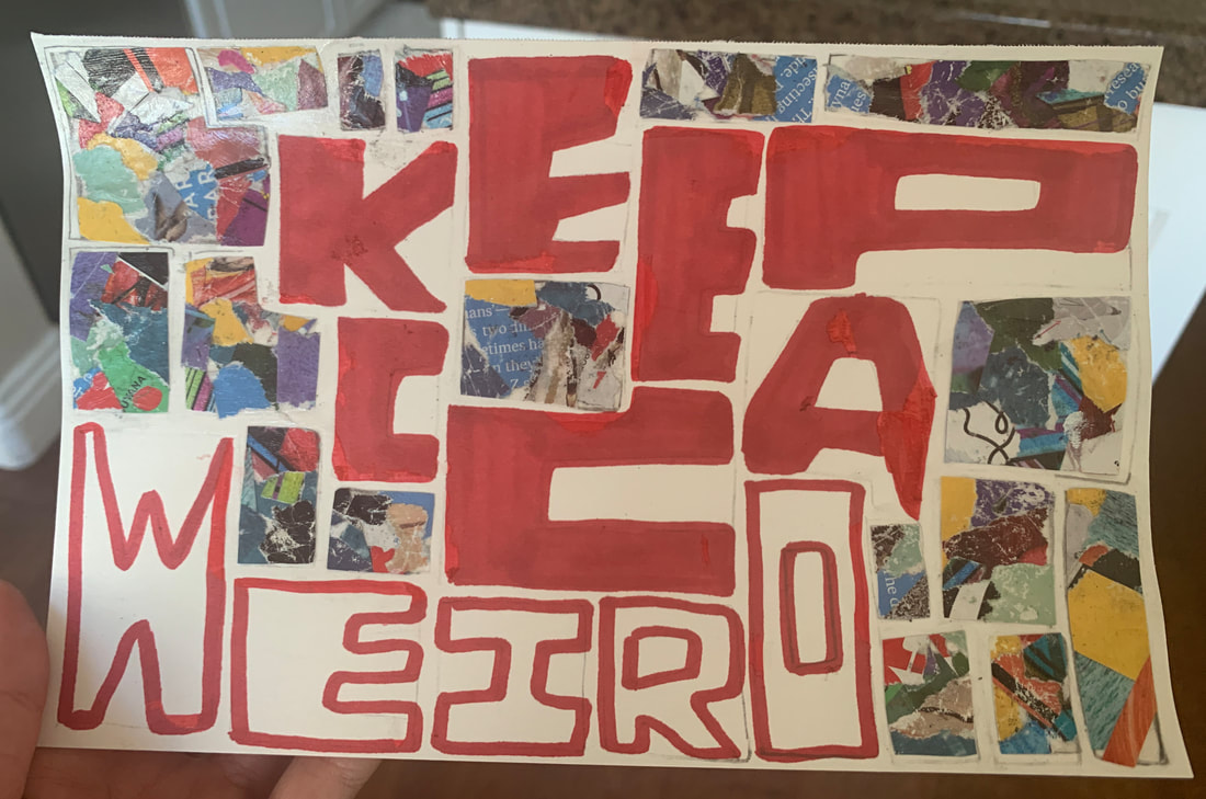
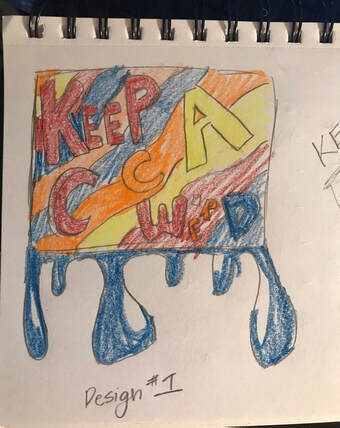
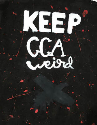
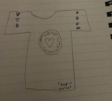
I decided on this sketch for two reasons. The first was to recycle the magazine scraps I was using last month to decorate my room. The second was to represent what I think “keep CCA weird” represents. I put it in the boxy confined shape to represent the predetermined “boxes” students sometimes feel they must fit in. But the random assortment of colors and shapes represents how CCA students also are creative and unique.
Artist: Maggie W. |
|
|
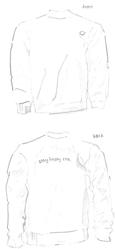
This is my sweater design that represents the CCA community. Though it’s a simple design, it represents the positivity that thrives through our community. The minimalist design is to show how simply CCA students can spread positivity. The words “Stay happy CCA” is inspired by the similar sayings the cca hosts would remind everyone after the video. These three words can affect someone greatly.
Artist: Megan W. |
|
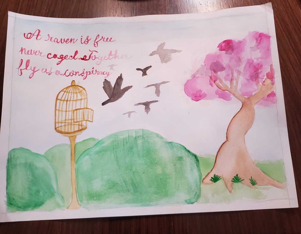
I hope that my viewers understand meaning of standing out and being true to themselves. Cage symbolizes being trapped by stereotypes. Being free and flying with others is breaking free from the stereotypes and uniting together.
Artist: Vanessa V. |
|
|
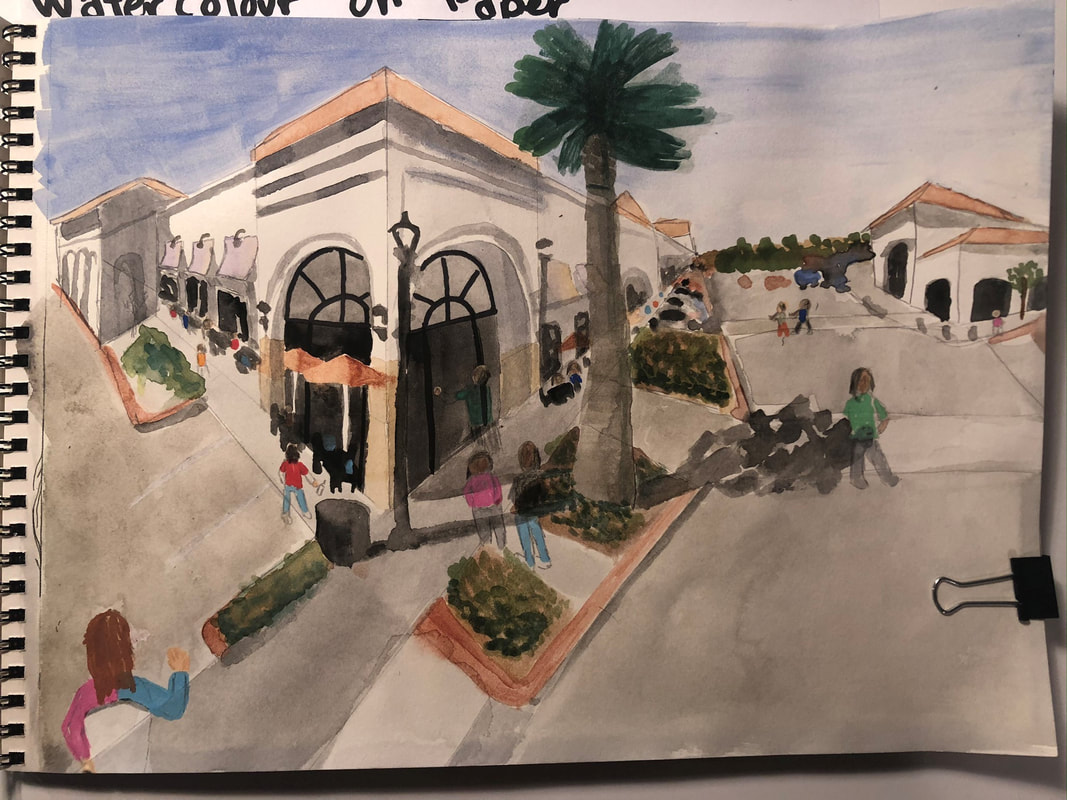
I attempted to answer various observations about the community, Using the symbol of the village loop I represented the passions, conversations that were separate from school, yet still maintaining the CCA community. The people depicted are simple in their designs, showing how a community does not rely on set individuals and concrete describers, and the people and community are not tied to a specific archetype and are ever changing. While there are over 2,300 Panera’s in the US, yet this one is commonly recognized as one embedded with the CCA community. This showcases one of the most beautiful parts of community, not that we are in the CCA community because we go there, but that we create traditions, comradery, and importance around the spaces that we are in to make a community for ourselves.
Artist: Chase V. |
|
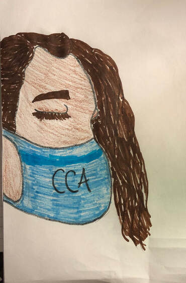
Famous artist Zane Schwab delivers another symbolic masterpiece. To the uneducated viewer, one may see a person with a face mask on, protecting herself from the dangers of COVID-19. However, the mask with CCA written on it represents the protective nature and care for students mental health and well being that CCA provides. This was crafted in a the room of the troubled artist that he was locked into under local quarantine. Luckily the ability to communicate and continue with our education has kept us all sane.
Artist: Zane S. |
|
|
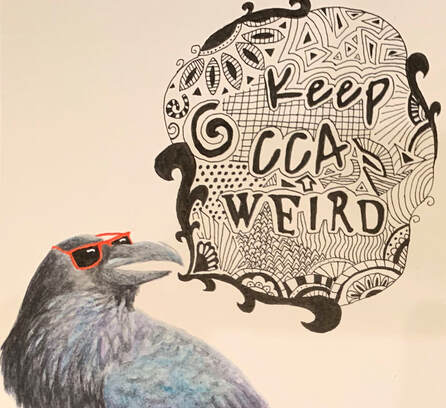
This painting is a design for a shirt for CCA. It combines the phrase "Keep CCA Weird" with other elements to create an interesting design. The painting contains mostly black and white, along with a colorful raven and bright red sunglasses. This design is meant to show that CCA is a unique, welcoming place. Instead of painting a standard raven, I included some bright sunglasses to show that every CCA student is cool in their own way. The zentangle pattern surrounding the phrase "Keep CCA Weird" represents how CCA creates a creative environment that allows students to grow. This painting was created using watercolor and ink pens on an 8.5 inch by 8 inch piece of watercolor paper.
Artist: Francesca P. |
|
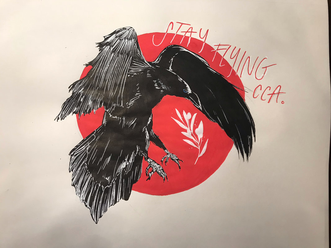
This T-shirt design is meant to encapsulate the essence of CCA's community, as it encourages the students to "keep flying" and doing what you love. I feel that CCA's community feels less judgmental than other communities, as it advocates for the flourishing of all students in their respective passions. The olive branch symbolizes a sense of peace in the community, as the different communities within CCA are able to thrive symbiotically.
Artist: Kirsten N. |
|
|
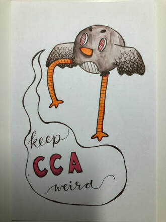
What I'd want people to know about the artpiece I created is that CCA is an flexible, ever changing school, and it's dynamic consists of out of the box ideas. I hope people understand through this painting that everyone is unique in their own way, and not just at CCA. Everyone should be able to feel happy about their self image and selves, even if they cannot scream to the world who they truly are. I hope someone benefits from looking at my piece of art.
Artist: Brooke L. |
|
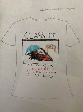
This shirt is meant for seniors to remind them that their graduation is coming up. I used the main colors of black and red to show school spirit, along with the raven. The raven is shown in his pajamas at home on a screen as if he is in a google meet call. There is also toilet paper behind him to show these are times during the coronavirus and he wanted to hoard some. The text on the shirt "CLASS OF 2020(social distancing)" tells you that seniors will be graduation soon, but at the main possibility it will be during social distancing.
Artist: Gabrielle K. |
|
|
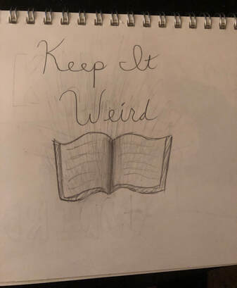
My design is a combination of the academic and creative sides of CCA. I choose this design because a large part of CCA is academics which is represented by the book. I also wanted to show how creative our school is by adding the phrase Keep it weird. This shows that our school isn’t one or the other it has both elements.
Artist: Katelyn K. |
|
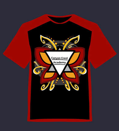
For my assignment, I decided to represent CCAs spirit. The red and black represent our school colors as a whole. The yellow represents our creativity and unity. The triangles represent the men, women, and everything in between in our school. The design, as a whole, represents our school motto to always “Keep it weird CCA” and to be creative and unique whenever we can.
Artist: Paisley J. |
|
|
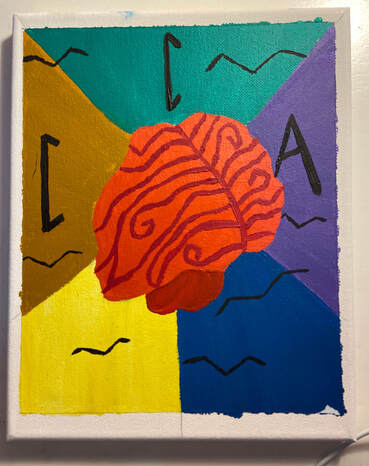
In my art piece the brain represents the mind of a CCA student. The colors that are coming out from it are supposed to represent all the different passions CCA let’s their students explore. I wanted to show that CCA Offers multiple opportunities to discover more interests and study them in great depth. The ravens that overlap multiple colors are supposed to represent the well roundedness students can achieve by pursuing not one for all of their passions at CCA. CCA has many great classes, sports, arts, and other extracurricular activities it’s students can participate in. This piece is supposed to represent all CCA has to offer and how easy it is for students to learn new things about themselves and dive further into their passions
Artist: Annabelle I. |
|
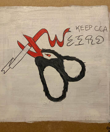
If this painting was hanging in a gallery, I would want its viewers to recognize first the "weirdness" that makes CCA the school what it is. I wanted to symbolize a departure from conformity and what is considered "normal" to illustrate the culture of acceptance that CCA has cultivated. I think this piece is a weird one in that I turned our mascot into a scissor. It looks strange but is still recognizable as our school's animal logo. The scissor is cutting a ribbon in half. Half of it is a uniform, pristine white ribbon that represents what is conventional and perceived as normal (something that you may find in the culture of an ordinary school), and the other half is a wiggly red ribbon (which is also our school color) which represents the quirky and accepting qualities that many of us associate with CCA. The scissor is cutting the two halves apart, which indicates that CCA is distinguishable in its weirdness. The "weird" ribbon is also integrated into the actual word "weird" to make the message more obvious and to simplify the logo.
Artist: Lucas H. |
|
|
i just thought cca deserved a little funky raven doing a little funky dance. even if he doesn’t look exactly like a raven, that’s okay because we love and accept him either way. his little funky dance fits in perfectly at cca because he’s obviously an art student who’s doin a little dance to procrastinate his ten different projects.
Artist: Isaac H. |
|
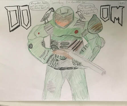
During quarantine I've turned to video games, and especially Doom, as an outlet for much of my free time. There's something about the Doom series that I really connect with and always have, and I've gone through the trouble of downloading a DOS emulator to play all of the doom originals, up to the latest DOOM eternal. Doom is a perfect outlet for any pent up rage accumulated maybe from failing a couple personal projects, or something in your life isn't quite working out the way you want it too, you can turn on the computer, and shred your way through hordes of demons in a fun and creative way that never gets old and makes you want to keep coming back for more. I also included some ravens on Doom guys shoulder's that are on opposite ends of each other to show that you can still interact with your friends even though you can't see them in real life, and the bridge that connects the two of you can be video games.
Artist: Dagin G. |
|
|
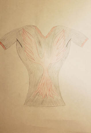
With the final shirt design, I wanted to create something a bit out of the ordinary, as any artist wishes. No words, this shirt serves the pure purpose of good aesthetics and wanting to get more people involved in the Raven/school community. Although this type of "fashion" may not work for everyone, I am quite happy with the way it turned out and I would definitely wear it. This shirt sports more of just a cool design that is made for anyone, and my personal experience says that people will bond over anything, even a common shirt. Although it looks more like a phoenix than a raven, the shirt is more meant to provide a different approach to school spirit wear.
Artist: Lars G. |
|
|
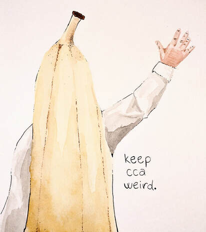
This artwork is based on Mr. Steinberger's last day at CCA, when he wore a banana costume around campus for the day. I remember coming out of Painting and passing by him, then doing a double take and looking back. Even before the slow clap during homeroom, it uplifted me. I thought that this event was a good symbol for the general feel of our school. Teachers and staff are always there to support you, and also to keep CCA weird! Also, this keeps the design simple and easy to interpret. I wanted to choose something to paint that isn't already a symbol of our school, but that nevertheless shows who we are as a community. Plus, it turns out that painting a banana is pretty fun.
Artist: Daly G. |
|
For my t-shirt design, I wanted to create something that everyone at CCA would wear. In the first picture, the front, the t-shirt is all black with splatters of red to represent our school’s colors. In the second picture, the back, I added “Keep CCA Weird” in different fonts to show how even though we might be different, we show it and embrace it. I also added a silhouette of a raven, our school’s mascot. I wanted the design to be simple yet still connect with CCA’s message: keep it weird.
Artist: Paige F. |
|
|
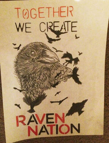
I would want someone to know that my artwork resembles a raven because we are the ravens. However, upon further inspection you begin to see that there are many ravens that come together to form the bigger raven. That is alike to CCA community because each of us are individuals but we still all come together and create one big, united, and diverse school. I also used the colors red and black because they are our school colors. I also used red for the word together because it also symbolizes that our school is a community and we are united and together.
Artist: Haley F. |
|
This shirt design I made with the school colors in mind to act as a major compositional portion. I used the phrase “Keep CCA Weird” to make the design, and used a somewhat pyramidal shape to frame the letters to allow the design to feel more clean and lead the eyes through the composition. The coloring is a bit rough as it is hard to get precise small areas with markers, but I alternated the colors and outlines to provide easily visible differences between the layers. I made the first two layers very angular and measured to contrast with the “Weird” part with more softer passive edges and varied designs to enhance the concept behind the phrase of individuality and expression. Overall I kept the design simple as simple designs are usually better for shirts than complicated artworks that might be muddied by the shirt printing process.
Artist: Keller E. |
|
|
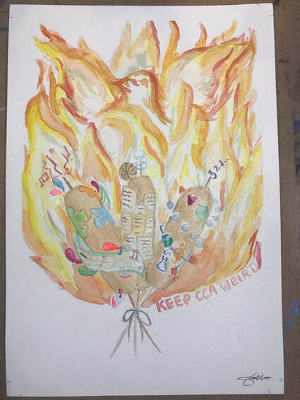
This piece represents the different aspects of the CCA community and the its product in a fun, “weird”, way. In the center of the painting are three corndogs, each representing a different aspect of the CCA community: the arts (left), the humanities (middle), and STEM (right). Sports are also represented with the basketball and tennis ball resting on the middle corndog. These different unique aspects are symbolically bound together at the bottom of the corndog sticks to show how they are all equally important to the CCA community. All of the corndogs use vibrant colors to show the vibrancy of the elements that make up CCA. The bound corndogs all fuel the flames, similarly to a torch, to allow a phoenix/fire raven to emerge (in the center of the piece with a flaming head and spread wings). This also symbolically shows how different unique raven students are allowed to be molded and emerge from the diverse CCA community. The different components of the piece could be considered “weird” with corndog and phoenix symbols, however, I believe that this embodies the phrase “Stay Weird CCA”, as similarly phrased at the bottom of the piece.
Artist: Zoë Chan |
|
I decided to make a raven with little color, then add the wonderful array of color behind its flight path. I wanted it to symbolize how a simple raven could create a beautiful rainbow, as anyone at CCA has a lot of potential to do many great things. I chose to make a t-shirt design to show just that.
Artist: Natalie C. |
|
|
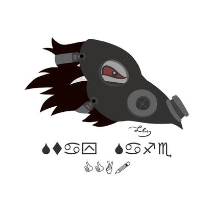
We're all currently stuck in quarantine. Art teacher wants us to make a T-shirt design. So, why not combine the two? I present to you, our Raven mascot wearing a gas mask! Pretty original, huh? Since this is the one and only CCA raven we're talking about, I tried to keep the design of the main logo as close as I could to the original. Hope it turned out well. (The text at the bottom translates to, "Stay Safe CCA!")
Artist: Elizabeth C. |
|
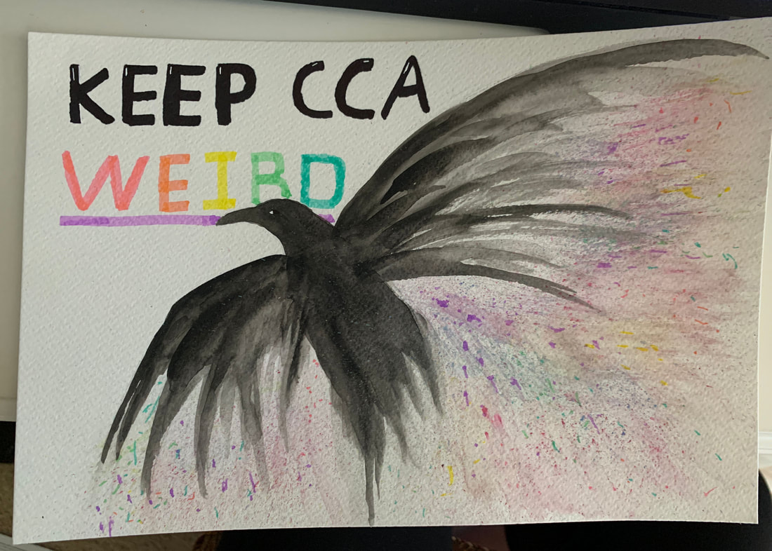
My artwork was inspired the mediums I had on hand, those being watercolor and ballpoint pen. I wanted to create a design that used both of these mediums in their unique way. I ended up using the ballpoint pen on top of the watercolor to add texture to the wings around the slogan in order to define shadows and set it apart from the background. For the background I used the wet on wet technique to contrast the defined wings. I think the combination worked out nicely and that my design is representative of CCA culture.
Artist: Annika B. |
|
|
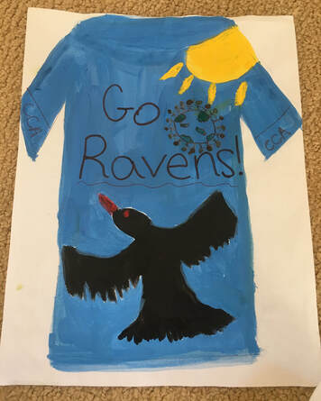
If my artwork, was hanging in a gallery, I would want people to know why I made it. It is a raven on a shirt with a sun representing sunny San Diego and Canyon Crest Academy. I also included the earth with people around it to show that the world is a community. Since CCA’s mascot is a raven, I thought this design would be good. Also, this was made during the Coronavirus time. The raven is flying through the sky, in the gorgeous sunshine, happier than ever. To me, this represents our school because of all the friendly people.
Artist: Anonymous |
|
This is a t-shirt design that conveys the most important value to the CCA community. Unity. The diversity in our school makes us stronger. Everyone is free to express themselves however they want, that is why we say “keep CCA weird”. Everyone is unique and that is what makes this school great.
Artist: Nirel B. |
|
|
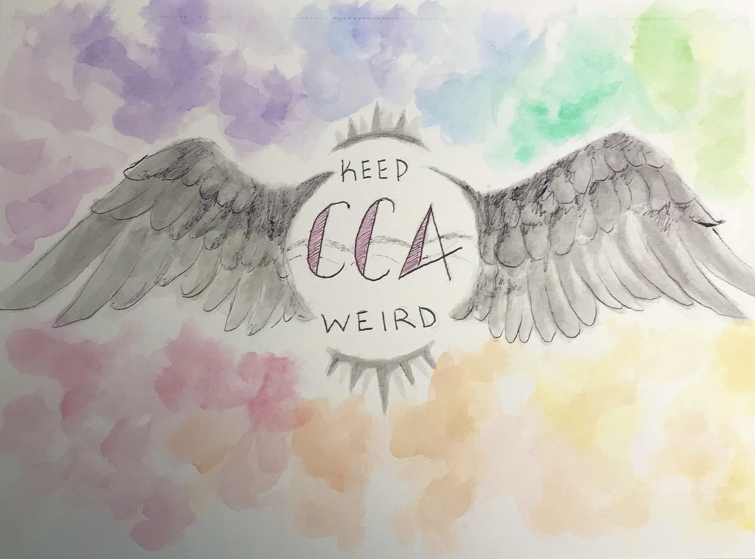
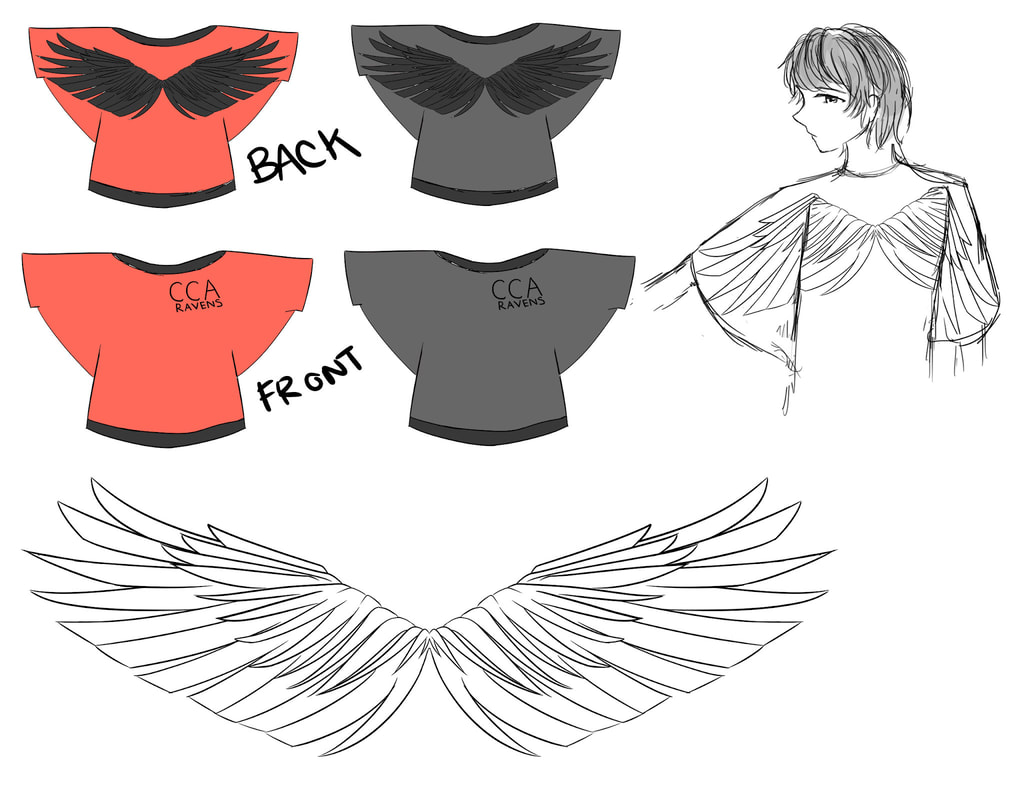
I'm not sure if my design counts as a "T-shirt", but I wanted to create a design where as the wearer spreads their arms, their wings will spread, like a raven. I thought it would be a cool design to wear, and to see as well. It symbolizes the spreading of wings and flying high to the student's future goals.
Artist: Annika O. |
|
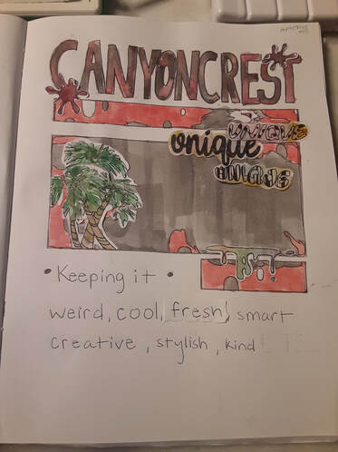
While making this artwork I was considering what elements would I want to make up this piece and why I would add them. I wanted a clean, geometrical outline which reminds me of our uniform schedule at school. One of my favorite things about CCA is that we have the same classes everyday and I enjoy having a simple/ organized schedule. I had also originally chosen to use school colors and have the main focus be a raven. It wasn't until after I finished sketching my final draft that I realized my design was a little too plain and that's just not what CCA is. I decided to add palm trees in the corner, bc there are so many around the school and it gives me a very summer like mood when I go to school. In the mid right corner I also decided to add different fonts of the word "unique" bc I feel no other word better fits the description of our school. Ultimately I wanted to incorporate these elements to add a pop of color and personality to the original design, signifying what I think when I think about my school and how prideful I am to go there.
Artist: Angelina O. |
|
|
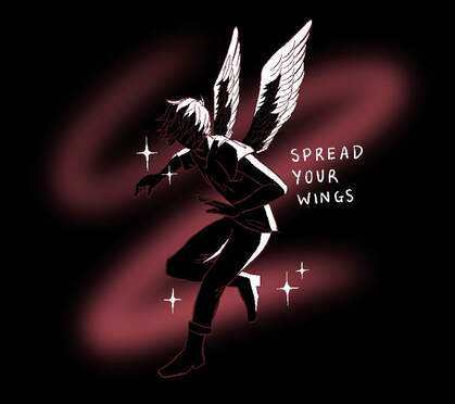
If my artwork was hanging in a gallery, I would want my viewers to know that my art is about the accepting community in CCA. My art includes the text, “Spread Your Wings,” and portrays a person with wings taking flight. Spreading your wings means to extend your horizons and try new things, going out of your comfort zone. The CCA community allowed me to find my wings. As this is a t-shirt design, I wanted to keep the colors and design simple; I used black and red which are CCA’s school colors. The CCA community helped me spread my wings as I stepped out of my comfort zone and found many new interests. At first, I was scared to try new things but this community has been so supportive and encouraging to me. I am glad I can call CCA my community.
Artist: Sarah L |
|
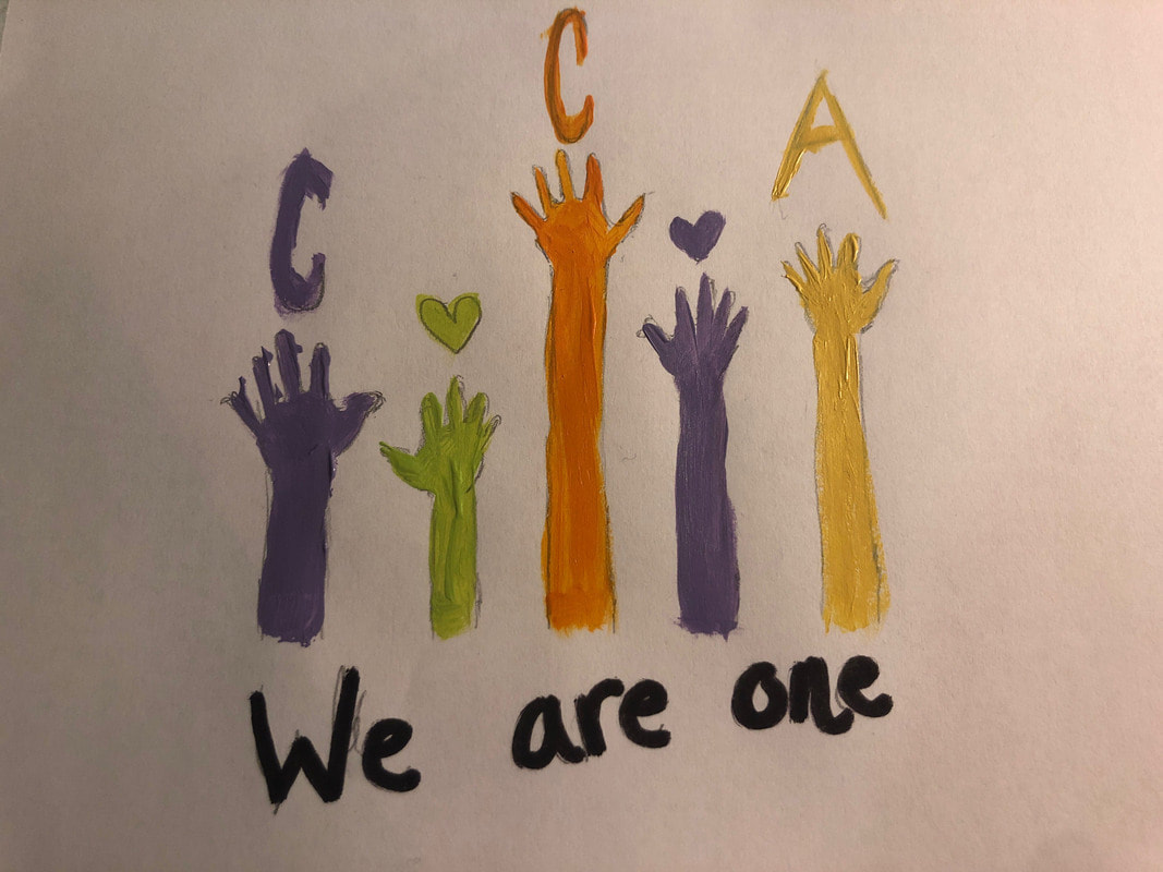
As the creator of this design, I want my viewers to feel my minimalistic creativity. I want it to be viewed as not to much and not to little. I want them to pay close attention to how meaningful a CCA earth shirt can be. It means we are all one and part of the same community. I would keep the shirt red black and white.
Artist: Zami H. |
|
|
This piece symbolizes how even two different things can come together to create a beautiful piece. I feel that our school is a beautiful and unique piece of art just like this.
Artist: Jessica S. |
Photo Credits & Artist Statements: Courtesy of Individual Artists ©2020 All Rights Reserved.